If you have a long column of numbers and want to see how many values fall into each range, a frequency distribution table is what you need. Staring at raw readings tells you almost nothing about their spread.
The tricky part is deciding the ranges, called bins. Once the bins are set, the counting is quick. This guide shows three ways to build the table: a FREQUENCY formula, a PivotTable, and the Data Analysis ToolPak.
Method #1: Using the FREQUENCY Function
The FREQUENCY function is built for exactly this job. You give it your numbers and a list of bin cut-off values, and it counts how many numbers fall into each bin. This is my recommended route because it updates the moment your data changes.
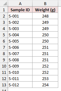
Below I have a dataset of 12 weight samples pulled off a production line, measured in grams. I want to know how many samples land in each 2-gram range.
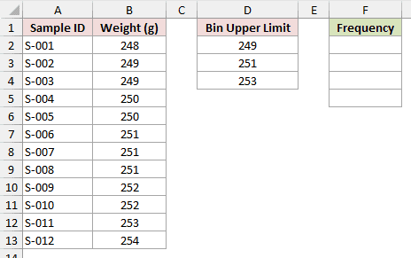
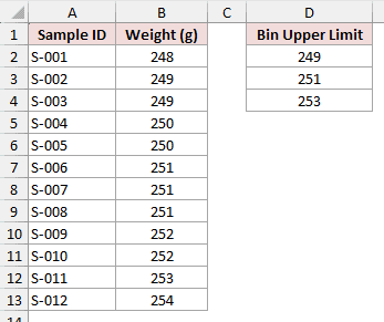
First, set up a small bins column. Each value is the upper limit of a range. I put 249, 251, and 253 in cells D2:D4.
These cutoffs define values at or below 249, values above 249 and at or below 251, values above 251 and at or below 253, and values above 253.
Because 248 is the minimum in this dataset, I can label the bins 248-249, 250-251, 252-253, and above 253. The 248-249 label is dataset-specific, not the full definition of the first bin.
Now select the cell where you want the counts to start and enter this formula:
=FREQUENCY(B2:B13,D2:D4)
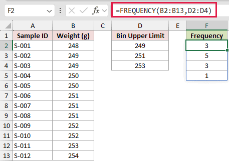
In Excel 2021, Excel 2024, or Microsoft 365, the formula spills down the column automatically and returns 3, 5, 3, and 1. These counts total 12, which matches the sample count.
How does this formula work?
FREQUENCY takes two arguments. The first, B2:B13, is the data array, the actual weights you want to count.
The second, D2:D4, is the bins array, the list of upper limits. The first result counts values at or below 249.
Each later result counts values above the previous cutoff and at or below the current cutoff. The extra result counts values above 253.
Notice the result has four rows even though I gave it three bins. FREQUENCY always returns one extra value for anything above the last bin, so the 254-gram sample shows up as that final 1.
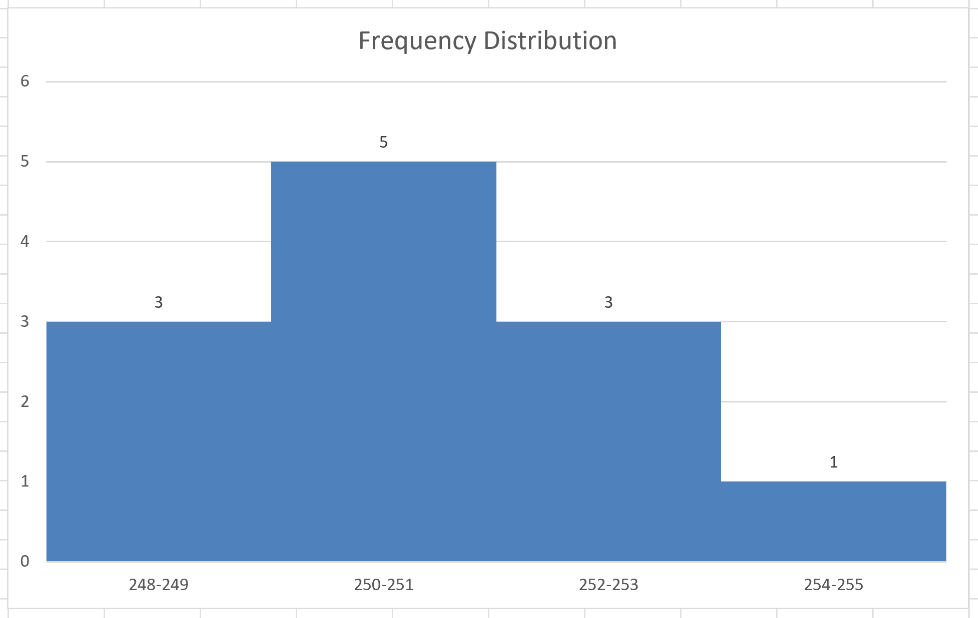
To see the distribution, select the bin labels and counts, then insert a column chart from the Insert tab. Set the data series Gap Width to 0% if you want the bars to touch like a histogram.
Note: If you are on Excel 2019 or earlier, FREQUENCY does not spill. Select four cells first, type the formula, then press Ctrl + Shift + Enter to enter it as an array formula.
Method #2: Using a PivotTable
If you would rather not write a formula, a PivotTable can bin the numbers for you. You drop in the weights, then use its Group feature to bundle them into ranges.
It also gives you quick subtotals. You can create a PivotChart from the result, but Excel does not generate one automatically.
I am using the same 12 production-line samples, with the Sample ID and Weight in grams.
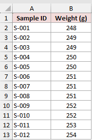
Here are the steps to build the frequency distribution table with a PivotTable:
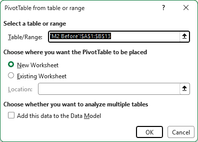
- Select any cell in the dataset, then go to the Insert tab and click PivotTable. In the dialog box that opens, choose New Worksheet and click OK.
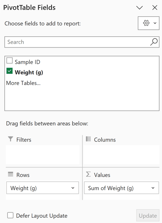
- In the PivotTable Fields pane, drag the Weight field into the Rows area, and drag Weight a second time into the Values area.
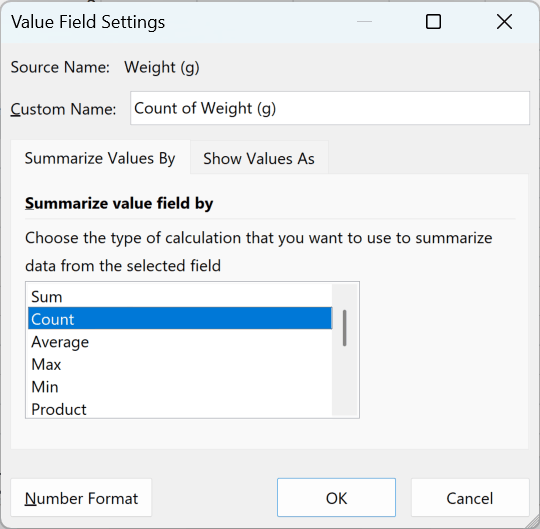
- By default Excel sums the weights. Click the Values field, choose Value Field Settings, pick Count, and click OK so each row shows a count instead.
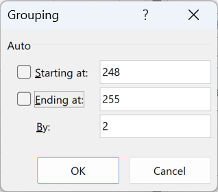
- Right-click any weight value in the Rows area and choose Group. Set Starting at to 248, Ending at to 255, and By to 2, then click OK.
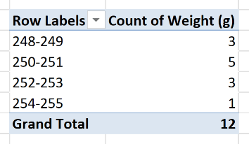
Excel now groups the weights into 248-249, 250-251, 252-253, and 254-255. Each group includes its lower boundary and stops before the next group’s lower boundary.
For these whole-number weights, the counts are 3, 5, 3, and 1, the same distribution the FREQUENCY formula gave.
Note: A PivotTable does not refresh on its own. After you change or add data, right-click the table and choose Refresh to update the counts.
Method #3: Using the Data Analysis ToolPak
The Data Analysis ToolPak has a Histogram tool that writes the frequency table and, if you select Chart Output, a chart in one pass.
It is handy when you want the visual straight away, though the output is a static snapshot rather than a live formula.
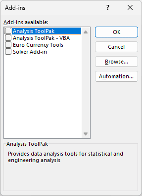
The ToolPak is an add-in that may need to be activated. The steps and screenshot below are for Excel desktop on Windows. The Analysis ToolPak is not available in Excel for the web.
- Go to File, then Options, then Add-ins. At the bottom, next to Manage, pick Excel Add-ins and click Go. Tick Analysis ToolPak and click OK.
In Excel for Mac, choose Tools, then Excel Add-ins. Select Analysis ToolPak, click OK, then quit and restart Excel. The Data Analysis command will appear on the Data tab.
I am working with the same production-line samples, and I have the bin limits 249, 251, and 253 sitting in D2:D4 to feed the tool.
Here are the steps to build the table with the Histogram tool:
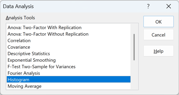
- On the Data tab, click Data Analysis, choose Histogram from the list, and click OK.
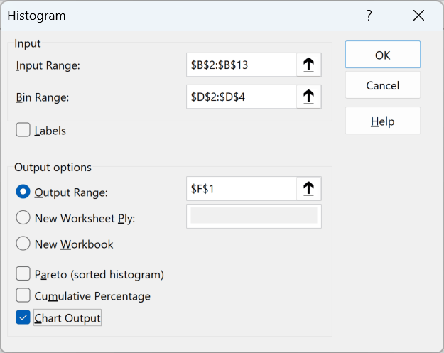
- Set the Input Range to B2:B13 and the Bin Range to D2:D4. Choose an Output Range or a new worksheet, tick Chart Output, and click OK.
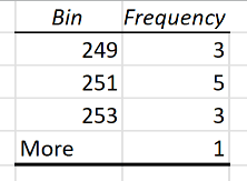
Excel writes a table with rows for 249, 251, and 253, plus a More row. These rows mean at or below 249, above 249 and at or below 251, above 251 and at or below 253, and above 253.
The frequencies are 3, 5, 3, and 1. The 1 appears in the More row for the 254-gram sample.
Note: The Histogram output is a one-time snapshot. If your data changes, you have to run the tool again, since it does not recalculate like a formula.
Additional Notes About Frequency Distribution Tables in Excel
- Keep your bins equal in width where you can (my 2-gram bands, for example). Uneven bins make the counts hard to compare at a glance and can distort a chart.
- FREQUENCY and the ToolPak use upper-inclusive cutoffs: at or below 249, then above 249 and at or below 251, and so on. PivotTable numeric grouping uses lower-inclusive intervals that stop before the next group, so 248-249 means at least 248 but less than 250.
- All three methods align here because the weights are whole numbers and the boundaries are coordinated. For decimal measurements, document your interval convention and coordinate the cutoffs. Use COUNTIFS when you need exact control over the lower and upper comparison operators.
- FREQUENCY includes values below the first cutoff and above the last cutoff in its full output. If the total does not match, check for an incomplete source range, blanks, text, errors, filters, or another source issue rather than assuming values fell outside the bins.
- If you only need the proportion in each bin rather than the raw count, divide each frequency by the total. That gives you a relative frequency distribution.
Frequently Asked Questions
How do I choose the right bin size for a frequency distribution table?
There is no single rule, but a common starting point is to aim for 5 to 15 bins across your data range. Take your highest value minus your lowest, divide by the number of bins you want, and round to a tidy interval.
Can I turn my frequency distribution table into a chart automatically?
Yes. With a FREQUENCY result, insert a column chart from the table. From a PivotTable, select a cell and insert a PivotChart. The PivotTable does not generate it automatically.
Set Gap Width to 0% for touching bars. The ToolPak’s Histogram tool draws the chart only if you tick Chart Output.
What is the difference between a frequency table and a histogram?
A frequency table is the numbers, how many values sit in each bin. A histogram is the same information drawn as a bar chart, with the bars touching to show the bins are continuous ranges.
Does the FREQUENCY function include the highest value in the last bin?
Any value above your last bin limit is counted in the extra overflow row that FREQUENCY adds automatically. To capture your true maximum inside a named bin, make sure the last limit is at least as large as your biggest value.
Conclusion
You now have three ways to build a frequency distribution table in Excel: FREQUENCY, a PivotTable, and the Data Analysis ToolPak.
FREQUENCY updates automatically, PivotTables group without a formula, and the ToolPak produces a static table with an optional chart. I hope you found this article helpful!
Other Excel articles you may also like: