Excel’s KURT function returns excess kurtosis, a measure of tail heaviness that is especially sensitive to values far from the average.
An unusually late payment or a mistyped order quantity can push it sharply upward. That makes KURT useful when an average hides an occasional extreme value.
A normal distribution scores about 0 on the excess kurtosis scale. Positive values suggest heavier tails; negative values suggest lighter tails.
I’ll show you how to use KURT to compare suppliers beyond their averages, check the effect of a typo, and examine extreme values in your data.
KURT Function Syntax in Excel
KURT accepts numbers, cell references, or ranges containing the data you want to examine.
=KURT(number1, [number2], ...)
- number1 (required): The first number or range of observations.
- number2, … (optional): Additional numbers or ranges, up to 255 arguments in total. KURT combines them into the same calculation.
You need at least 4 numeric values with some variation. Otherwise, KURT returns #DIV/0!.
When to Use KURT Function
- Check whether unusually late invoice payments dominate a payment history.
- Compare suppliers whose average lead times and standard deviations look identical.
- See how a suspicious data entry affects your summary statistics.
- Examine tail heaviness when describing a distribution’s shape.
- Compare separate groups without manually splitting the source data.
Example 1: Examine Invoice Payment Times
Let’s start with payment times that mostly cluster together.
Below is the dataset. Column A lists invoices, column B contains days to pay, and the labelled cell in column D will hold kurtosis.
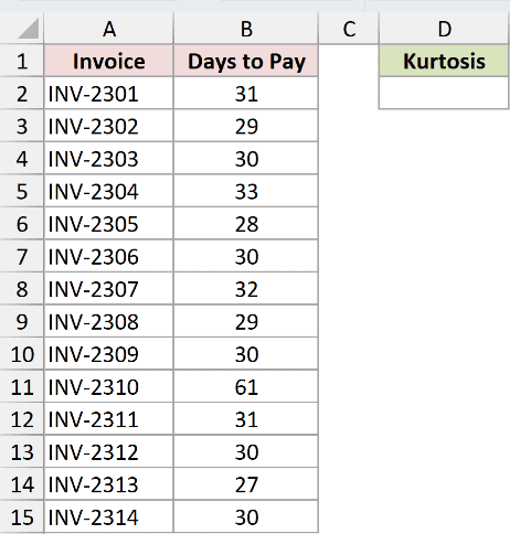
We want to measure how strongly extreme payment times affect this set of invoices.
Enter this formula in D2:
=KURT(B2:B15)
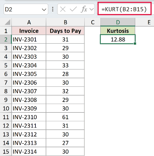
The result is 12.88. Most invoices were paid in roughly 30 days, but invoice INV-2310 took 61 days.
That late payment sits far from the main cluster and drives kurtosis strongly positive. The result describes the whole range; it doesn’t identify the invoice for you.
KURT returns a single value from the range. It doesn’t spill a separate answer for each invoice.
Pro Tip: Read KURT as a measure of tail heaviness and sensitivity to extreme values. Treating it as a measure of how pointed a chart looks can lead you astray.
Example 2: Compare Suppliers Beyond Average Lead Time
An average and a standard deviation can hide different delivery patterns.
Below is the dataset. Columns B and C hold supplier lead times, while the summary in E:G has labelled rows for average, standard deviation, and kurtosis.
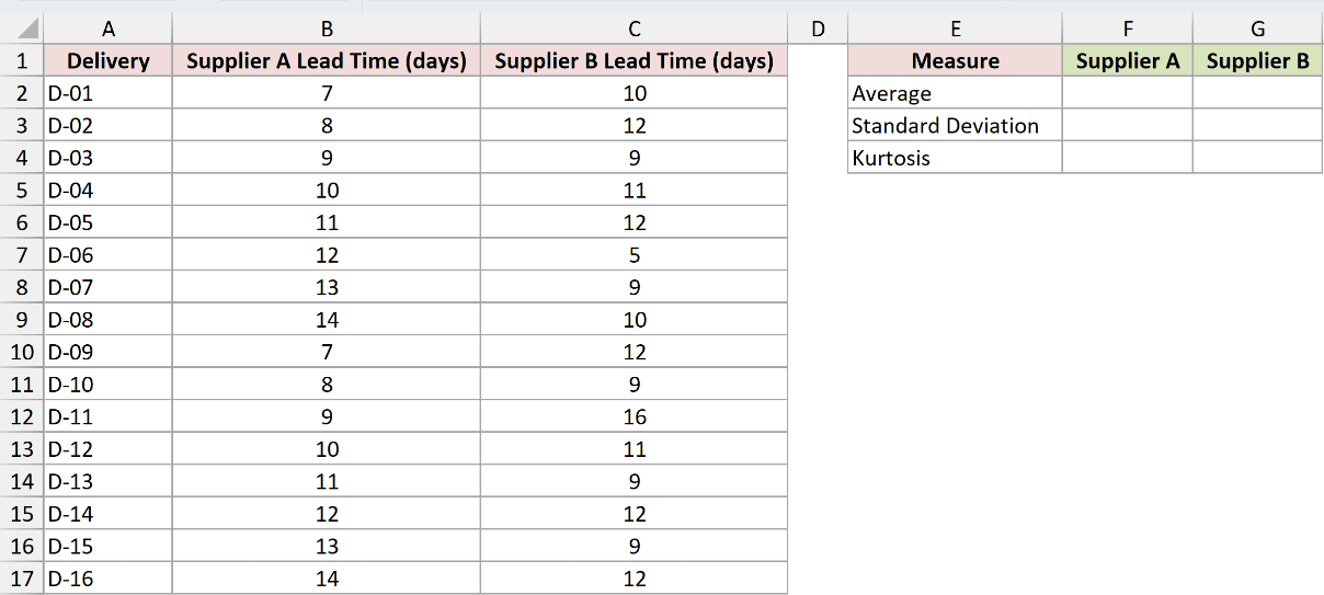
We want to compare the suppliers’ tail behavior after checking their average lead times and spread.
AVERAGE calculates the arithmetic mean. Here, it gives us a baseline for comparing lead times before KURT reveals differences in the tails.
Calculate the average for Supplier A in F2:
=AVERAGE(B2:B17)
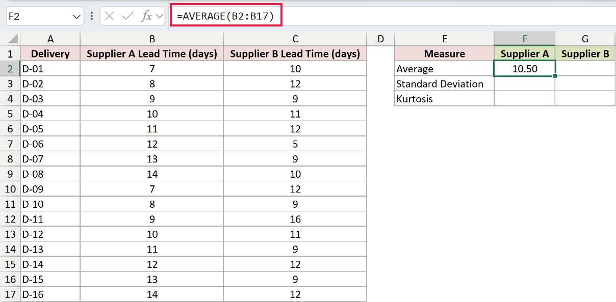
The average is 10.50 days.
For Supplier B’s average, enter this in G2:
=AVERAGE(C2:C17)
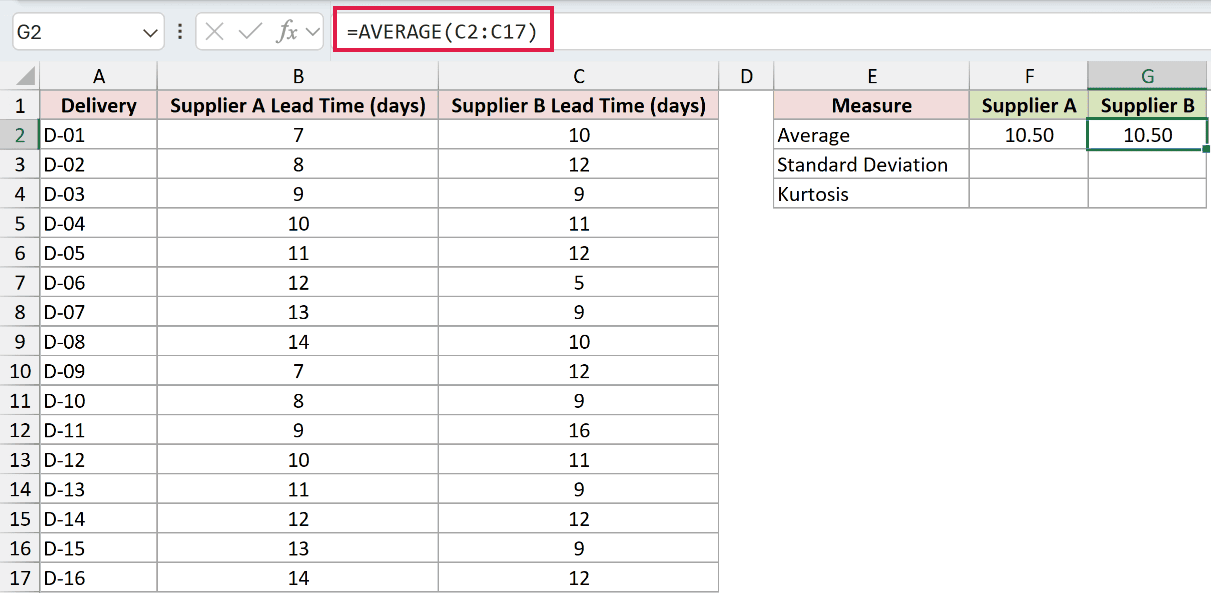
Supplier B’s average is also 10.50 days, so average lead time doesn’t separate them.
STDEV.S calculates sample standard deviation, a measure of spread around the average. Comparing it before KURT helps us check whether overall spread explains the suppliers’ different patterns.
Next, calculate Supplier A’s standard deviation in F3:
=STDEV.S(B2:B17)
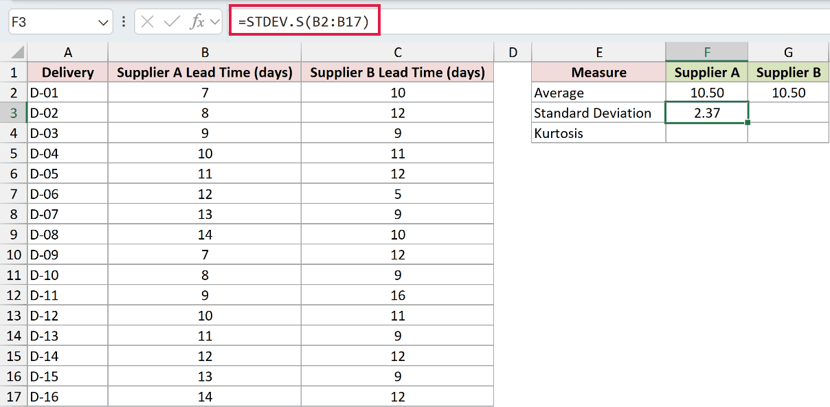
The standard deviation is 2.37 days.
Enter Supplier B’s standard deviation in G3:
=STDEV.S(C2:C17)
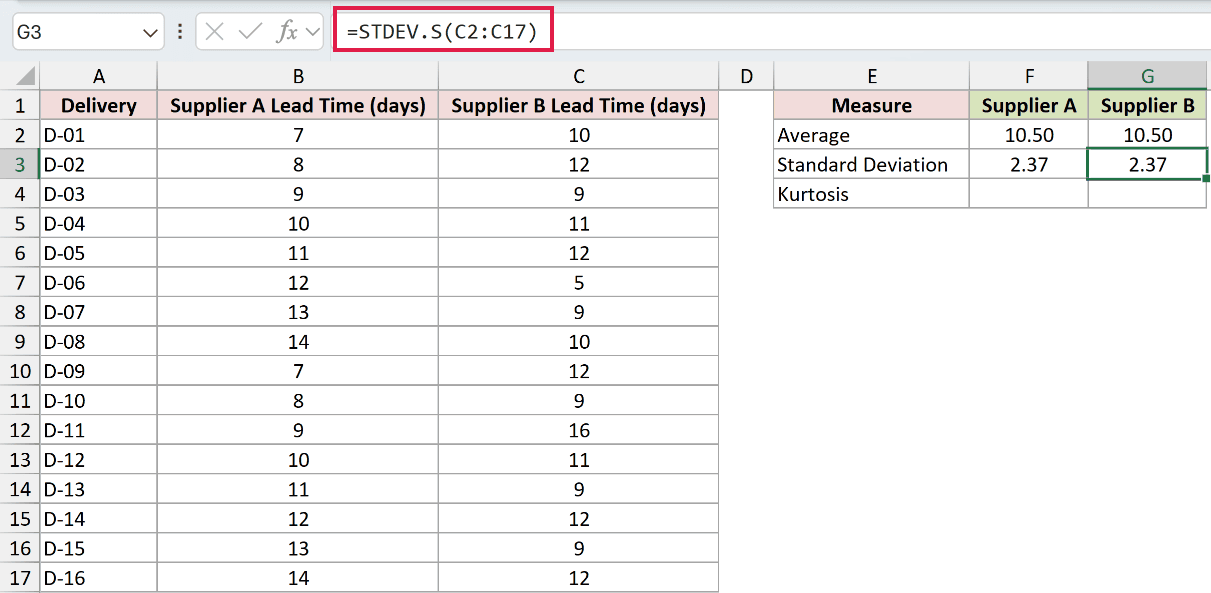
This also displays 2.37 days. The average and standard deviation comparison cannot distinguish the suppliers’ patterns.
Now calculate Supplier A’s kurtosis in F4:
=KURT(B2:B17)
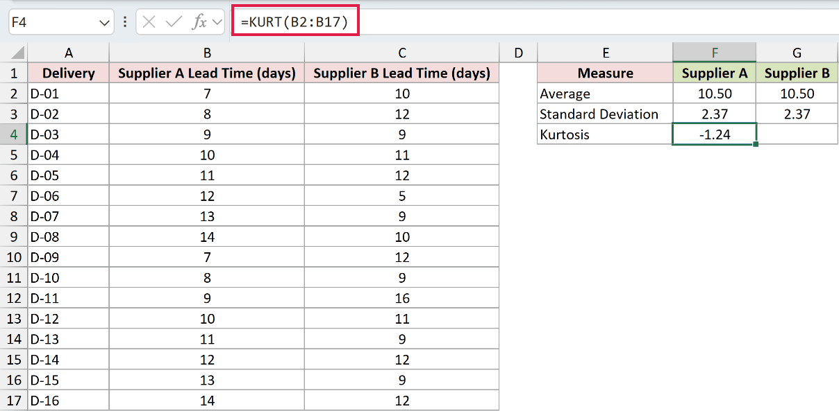
Supplier A returns -1.24. Its lead times are evenly spread between 7 and 14 days.
Calculate Supplier B’s kurtosis in G4:
=KURT(C2:C17)
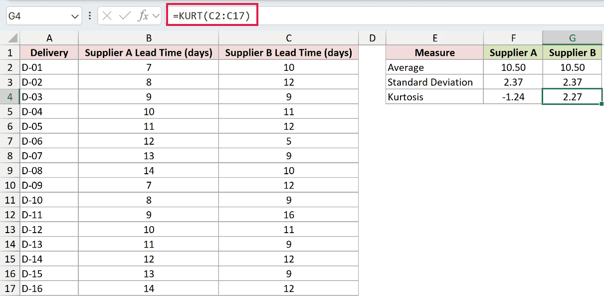
Supplier B returns 2.27. Most deliveries cluster together, with more extreme lead times of 5 and 16 days.
KURT reveals a difference those statistics miss. Supplier B has more extreme observations relative to its overall spread.
Example 3: Check the Effect of a Typo
A large kurtosis can also be a reason to inspect the source entries.
Below is the dataset. Columns B and C hold recorded and corrected order quantities; columns E and F have labelled cells for their kurtosis results.
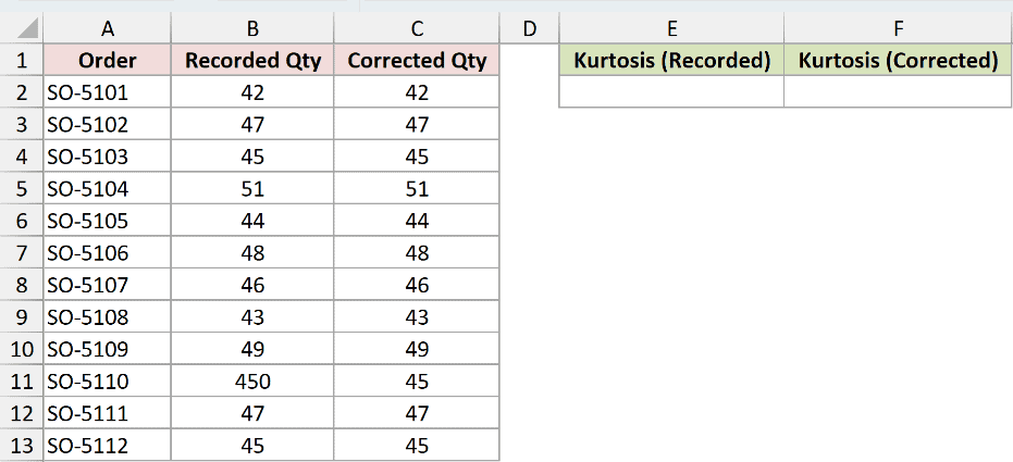
We want to compare the recorded quantities in column B with the corrected quantities.
First, calculate kurtosis for the recorded data containing the mistake in E2:
=KURT(B2:B13)
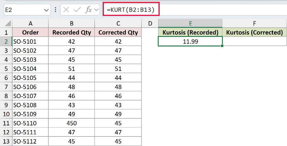
The recorded data returns 11.99. Order SO-5110 was recorded as 450 in B11, but the corrected quantity in C11 is 45.
Now calculate the corrected data’s kurtosis in F2:
=KURT(C2:C13)
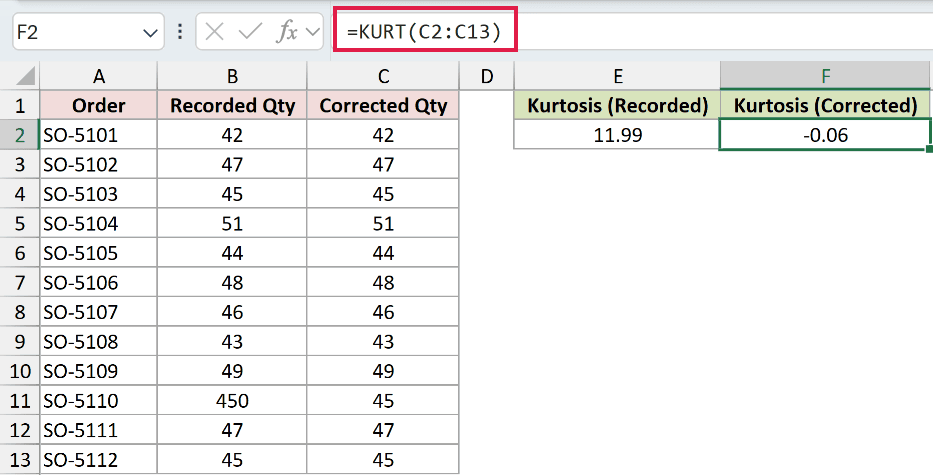
The corrected result is -0.06. The bad entry caused the large positive value in the original data.
KURT doesn’t know whether an extreme quantity is a typo or a genuine large order. Check the original record before changing it.
Pro Tip: Sorting the quantities can help you locate a suspicious entry. Use KURT as a reason to investigate, never as an automatic instruction to delete an outlier.
Example 4: Read KURT Alongside SKEW
SKEW measures how unevenly data extends to either side of its average. It helps explain the direction of the tails, which KURT alone doesn’t tell us.
Below is the dataset. Column B contains daily website signups, and D:E provides a summary card for average, standard deviation, skewness, and kurtosis.
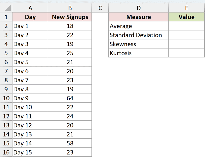
We want to describe both the extreme signup days and which direction they pull the distribution.
Calculate the average in E2:
=AVERAGE(B2:B16)
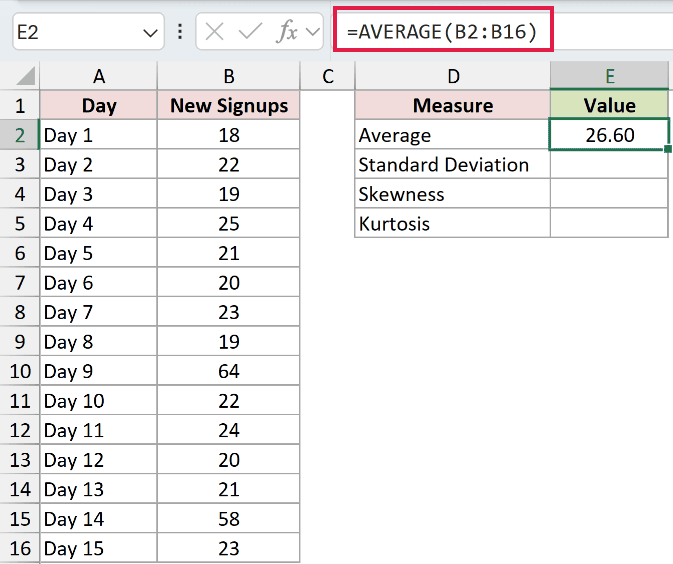
The average is 26.60 signups.
Calculate the sample standard deviation in E3:
=STDEV.S(B2:B16)
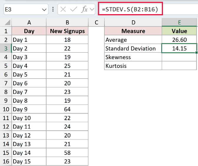
The standard deviation is 14.15, describing the spread around that average.
Next, calculate skewness in E4:
=SKEW(B2:B16)
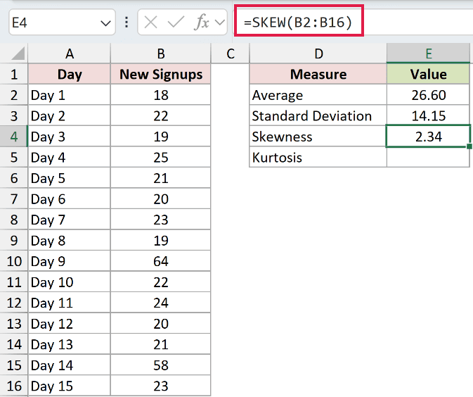
SKEW returns 2.34. The positive sign indicates a longer tail toward higher signup counts.
Finally, calculate kurtosis in E5:
=KURT(B2:B16)
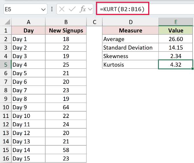
KURT returns 4.32 because extreme observations strongly affect the result. The days with 64 and 58 signups sit well above the main cluster.
Together, the results describe a heavy tail on the high side. KURT alone wouldn’t tell you which side contains those extreme values.
Example 5: Calculate Kurtosis for Each Shift
You can also calculate kurtosis separately for groups in a shared list.
Below is the dataset. Columns A:B hold warehouse shifts and hourly picking rates, while D:E lists the shifts beside empty kurtosis result cells.
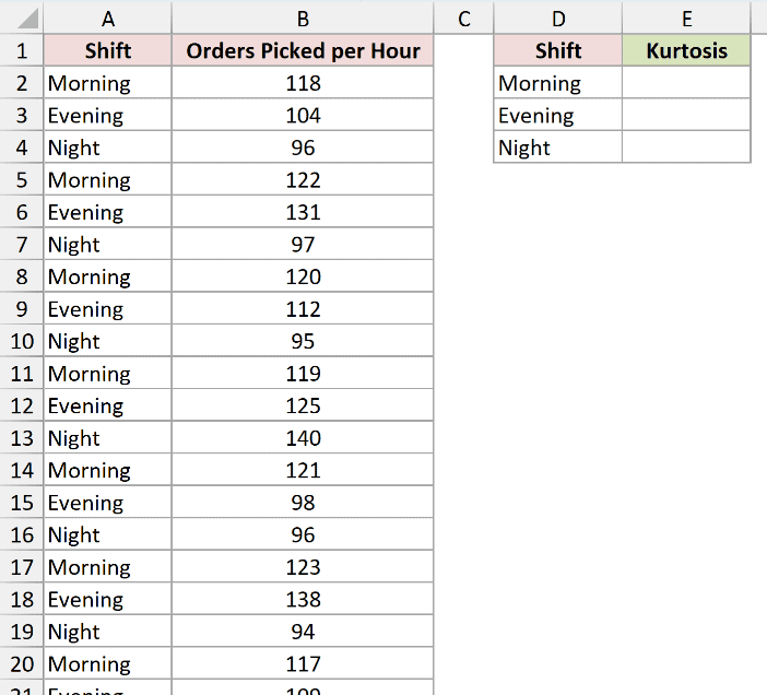
We want a separate kurtosis result for each shift without moving its records into another range.
Enter this formula in E2, then copy it down through E4:
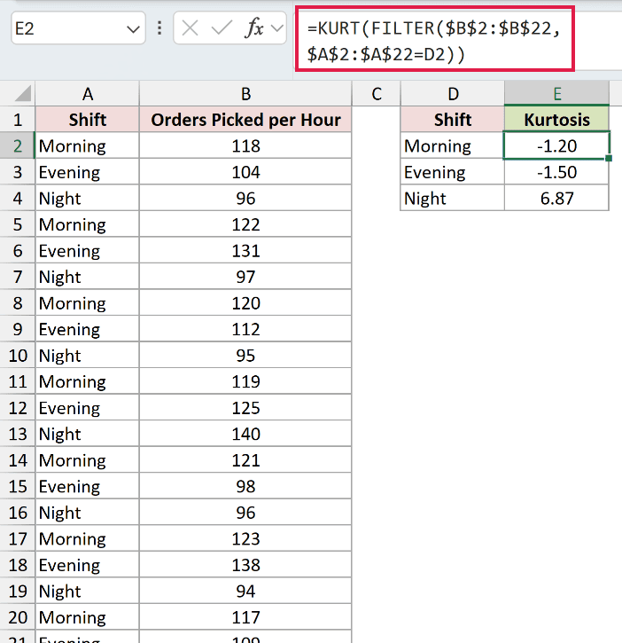
=KURT(FILTER($B$2:$B$22,$A$2:$A$22=D2))
How this formula works:
- FILTER selects picking rates from
$B$2:$B$22where the shift in$A$2:$A$22matchesD2. - KURT calculates a single result from those selected rates.
- The dollar signs keep the source ranges fixed. The shift reference changes as you copy down.
The results are -1.20 for Morning, -1.50 for Evening, and 6.87 for Night.
The Night shift’s reading of 140 orders per hour sits far from its other observations and drives kurtosis positive.
The negative results for Morning and Evening indicate lighter tails.
These are copied-down formulas, not a spilled result column. FILTER passes its selected values directly into KURT, which returns a single answer for each shift.
This FILTER version needs Excel 2021, Excel 2024, or Microsoft 365. In older versions, place each shift’s observations in a separate range and apply KURT there.
Tips & Common Mistakes
- Check the numeric count and spread. KURT needs at least 4 numeric observations and a nonzero standard deviation. Too few values or identical values return
#DIV/0!. - Watch imported data. Text, logical values, and blanks inside a referenced range are ignored. A number stored as text can therefore be missing from the calculation.
- Direct arguments behave differently. A logical value or numeric text typed directly into KURT can be counted, even though the same type of value in a referenced cell is ignored.
- Errors pass through. An error such as
#N/Ain the source range prevents KURT from returning a numeric result. Investigate the source error first. - Changing units won’t change kurtosis. Scaling every observation by the same nonzero factor, or adding the same amount to each, leaves the result unchanged.
- Keep the interpretation focused on tails. A positive result doesn’t tell you which side holds extreme values or prove an entry is wrong. Read the source data alongside it.
KURT can flag patterns that an average misses. Use a high result as a reason to inspect the records before drawing conclusions.
Revisit Example 2 to compare suppliers or Example 3 to check how a bad entry affects the result.
Related Excel Functions / Articles: