Autocorrelation in Excel helps you check whether values in a time series are related to earlier values, such as sales in consecutive months.
Running CORREL on two shifted ranges gives a slightly different result from the standard autocorrelation calculation.
I’ll show you both calculations, build an ACF table and correlogram, and use the Durbin-Watson statistic to check regression residuals.
What Is Autocorrelation?
Autocorrelation compares a series with a lagged copy of itself. For monthly sales, lag 1 compares January with February, February with March, and so on.
Lag 2 compares months two steps apart, such as January and March. You can increase the lag to check relationships over longer gaps.
The result runs from -1 to 1. Positive values suggest similar movements, negative values suggest opposite movements, and values near zero suggest little relationship at that lag.
A list of these values across lags is called the autocorrelation function, or ACF.
You can use it to spot seasonality or trends and check regression residuals. Excel has no built-in autocorrelation function, so you’ll need a formula.
Method #1: Using the CORREL Function
For a quick lag 1 estimate, you can use CORREL to compare each month’s sales with the following month’s sales.
Below I have a dataset with Month and Units Sold for an ice cream shop, covering January 2024 through December 2025.
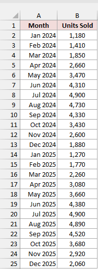
On the Lag 1 Autocorrelation sheet, months are in A2:A25 and sales are in B2:B25.
Type Method in D1, Lag 1 Autocorrelation in E1, and CORREL in D2. Then enter this formula in E2:
=CORREL(B2:B24,B3:B25)
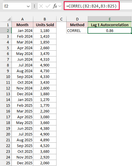
The formula returns 0.86, which suggests a strong positive relationship between neighboring months.
The first range, B2:B24, contains every month except the last. The second, B3:B25, contains every month except the first.
That one-row offset pairs January 2024 with February 2024, then February with March, continuing through the series.
Both ranges must contain the same number of cells. If their sizes don’t match, CORREL returns #N/A.
For a larger lag, shift the second range down by that many rows and shorten both ranges so their sizes still match.
For lag 2, use =CORREL(B2:B23,B4:B25).
Note: CORREL gives you a quick estimate. It treats the shifted ranges as separate variables, so its result differs from the standard ACF calculation in Method #2.
Method #2: Using SUMPRODUCT and DEVSQ
For the standard autocorrelation calculation, I recommend SUMPRODUCT and DEVSQ. This version uses the average and squared deviations of the whole series.
Below I have a dataset with Month and Units Sold for an ice cream shop, covering January 2024 through December 2025.
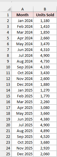
On the Lag 1 Autocorrelation sheet, the sales values are in B2:B25. Type SUMPRODUCT and DEVSQ in D3 as a label.
Keep the CORREL result from Method #1 in row 2 so you can compare. Then enter this formula in E3:
=SUMPRODUCT(B2:B24-AVERAGE(B2:B25),B3:B25-AVERAGE(B2:B25))/DEVSQ(B2:B25)
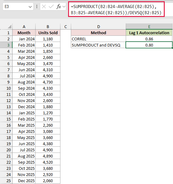
The formula returns 0.80, compared with CORREL’s 0.86 in the row above. Both indicate positive lag 1 autocorrelation.
How does this formula work?
AVERAGE(B2:B25) calculates the mean sales across all 24 months. You use that same mean for both shifted ranges.
B2:B24-AVERAGE(B2:B25) subtracts the mean from months 1 through 23. B3:B25-AVERAGE(B2:B25) does the same for months 2 through 24.
SUMPRODUCT multiplies each month’s deviation by the next month’s deviation, then adds those products together.
DEVSQ(B2:B25) adds up the squared deviations from the mean for the whole series. Dividing by that total returns the lag 1 autocorrelation.
The result is lower because CORREL uses each shifted range’s own average and spread. Here, you use one average and the whole series’ squared deviations.
This is the standard autocorrelation function, or ACF. It matches R’s acf() and Python’s statsmodels acf() with its default adjusted=False setting.
How to Calculate Autocorrelation for Multiple Lags
One lag shows you neighboring months. To look for a yearly pattern, let me show you how to calculate lags 1 through 12.
Below I have a dataset with Month and Units Sold, plus a Lag column in D containing the numbers 1 through 12.
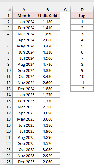
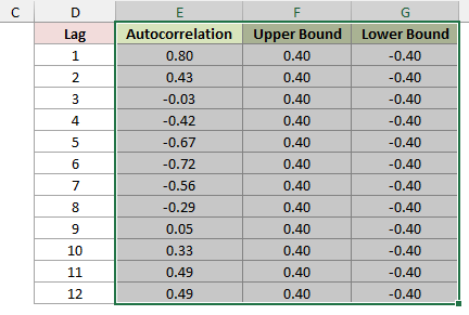
On the ACF by Lag sheet, sales are in B2:B25 and lags are in D2:D13. Type Autocorrelation in E1.
I’m using a formula you can copy down in any Excel version. Enter it in E2, then copy it through E13:
=SUMPRODUCT(OFFSET($B$2:$B$25,0,0,COUNT($B$2:$B$25)-D2)-AVERAGE($B$2:$B$25),OFFSET($B$2:$B$25,D2,0,COUNT($B$2:$B$25)-D2)-AVERAGE($B$2:$B$25))/DEVSQ($B$2:$B$25)
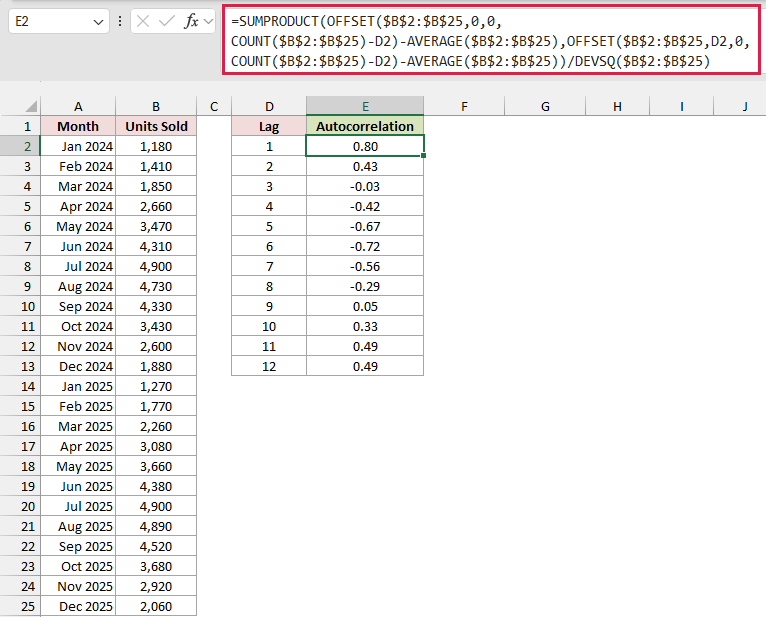
You now have an autocorrelation result beside each lag, using the standard ACF calculation from Method #2.
How does this formula work?
COUNT($B$2:$B$25)-D2 calculates how many pairs you can compare. At lag 1, you have 23 pairs; at lag 12, you have 12.
The first OFFSET starts at B2 and drops the last D2 values: one at lag 1, two at lag 2.
The second OFFSET drops the first D2 values and keeps the same number of values as the first range.
Both ranges use the whole series’ average. SUMPRODUCT adds the paired deviation products, and DEVSQ provides the whole series’ sum of squared deviations.
The dollar signs keep B2:B25 fixed when you copy down. D2 changes to D3, D4, and so on, picking up each lag.
In Excel 365 or Excel 2024, you can calculate all 12 results with one formula instead.
Enter this in an empty cell such as E16. It spills down 12 rows (E16:E27) and matches E2:E13:
=MAP(D2:D13,LAMBDA(k,SUMPRODUCT(DROP(B2:B25,-k)-AVERAGE(B2:B25),DROP(B2:B25,k)-AVERAGE(B2:B25))/DEVSQ(B2:B25)))
Here’s what the results tell you about the shop’s sales:
- Lag 1 is 0.80. A good month tends to be followed by another good month.
- Lags 3 through 8 are negative. Lag 6 is the lowest at -0.72, because pairing months six apart puts a summer high next to a winter low, like July and January.
- Lags 11 and 12 are both 0.49. The positive relationship returns around a year apart, showing the yearly seasonal pattern.
How to Check if the Autocorrelation Is Significant
A number away from zero might reflect a pattern or random variation. You can add approximate 95% bounds to help judge which lags stand out.
On the ACF by Lag sheet, type Upper Bound in F1. Then enter this formula in F2 and copy it through F13:
=1.96/SQRT(COUNT($B$2:$B$25))
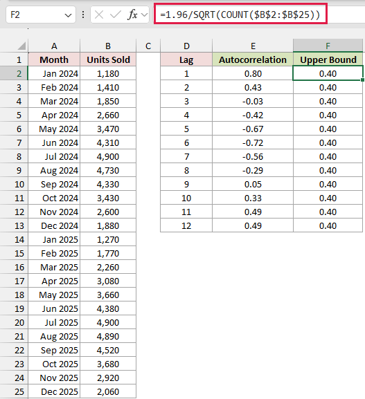
With 24 months of sales, the upper bound is 0.40 to two decimal places.
The value is the same in every row, but the chart needs one per lag to draw a flat line.
For the lower bound, type Lower Bound in G1. Then enter this formula in G2 and copy it through G13:
=-F2
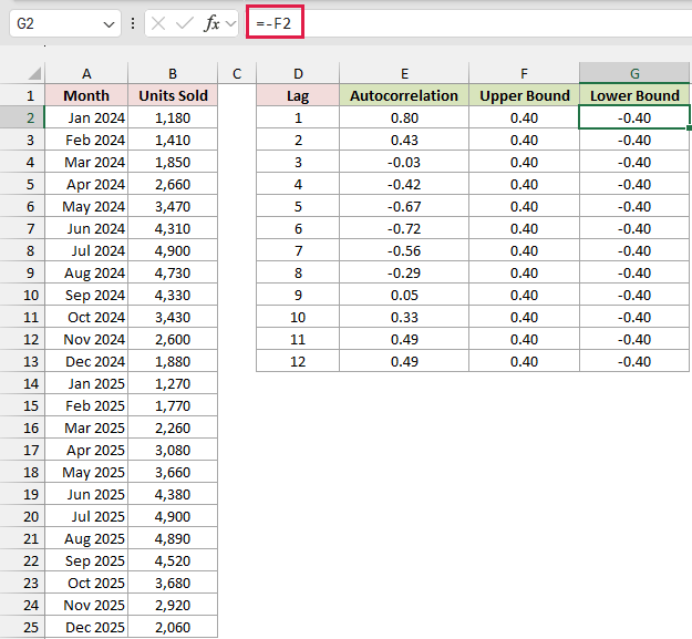
You now have a band from -0.40 to 0.40. Autocorrelations outside it suggest a pattern that is unlikely to come from random data.
For this dataset, you can separate the lags into two groups:
- Outside the band: lags 1, 2, 4, 5, 6, 7, 11, and 12.
- Inside the band: lags 3, 8, 9, and 10.
How to Plot a Correlogram (ACF Chart) in Excel
A correlogram is a column chart of your autocorrelations, with the bounds drawn as lines. It makes the pattern across lags easier to see.
Here are the steps to chart the results on the ACF by Lag sheet:
- Select E1:G13, including the Autocorrelation, Upper Bound, and Lower Bound headers.
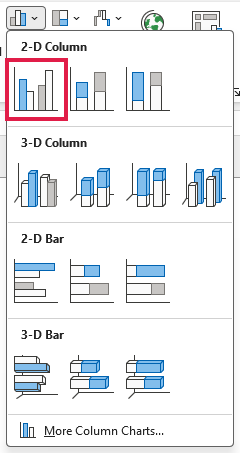
- On the Insert tab, go to the Charts group, click Insert Column or Bar Chart, and choose Clustered Column.
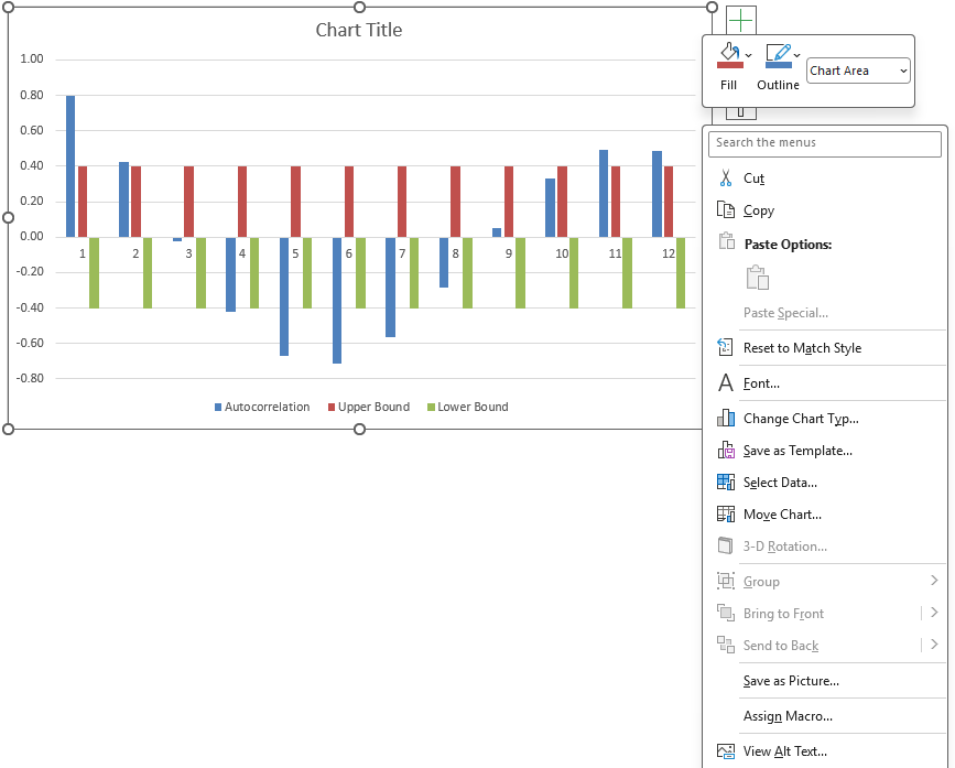
- Right-click an empty spot inside the chart (not on a column) and choose Change Chart Type.
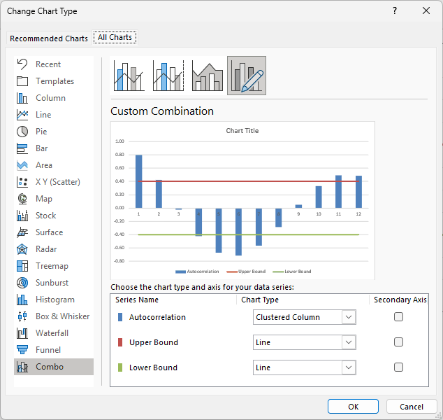
- In the Change Chart Type dialog, open the All Charts tab and choose Combo. Set Upper Bound and Lower Bound to Line, keep Autocorrelation as Clustered Column, leave the Secondary Axis boxes unchecked, and click OK.
- Click the chart title and type Correlogram (ACF).
- Right-click the lag numbers on the horizontal axis, choose Format Axis, and under Labels set Label Position to Low, so the numbers sit below the chart instead of on top of the negative columns.
Your finished correlogram is titled Correlogram (ACF), with a column for each lag, two flat lines at 0.40 and -0.40, and lag numbers along the bottom.
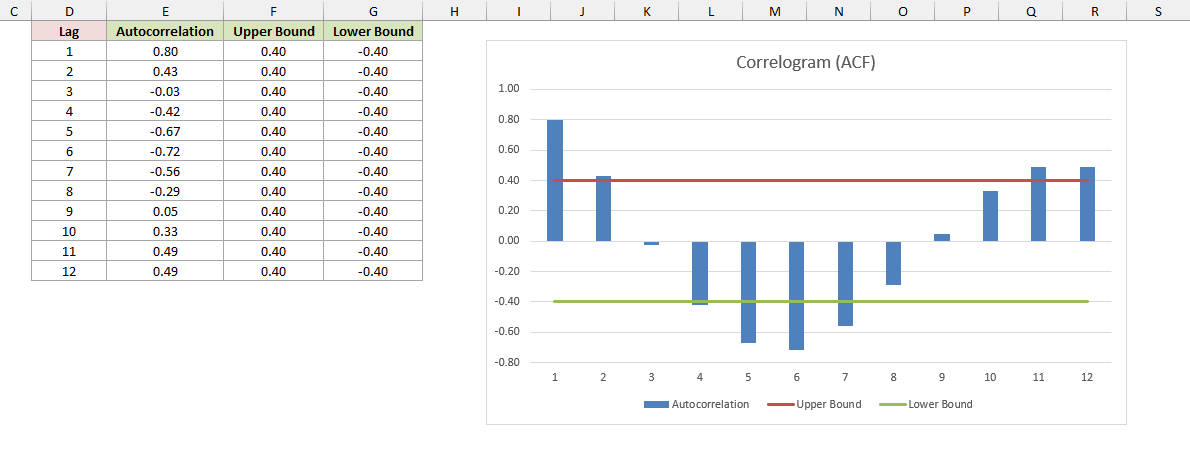
Columns extending past either line show the lags outside the significance band.
Because you didn’t select the Lag column, Excel numbers the categories 1 through 12 automatically. Those category numbers match the lags here.
How to Test for Autocorrelation With the Durbin-Watson Statistic
When you’ve fitted a regression or trend line, you can check what’s left unexplained. Those leftover values are residuals, and Durbin-Watson checks their lag 1 autocorrelation.
Below I have a dataset with Month and Units Sold for an ice cream shop, covering January 2024 through December 2025.
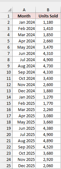
On the Durbin-Watson sheet, sales are in B2:B25. Type Residual in C1.
To calculate residuals from a straight trend line, enter this formula in C2:
=B2:B25-TREND(B2:B25)
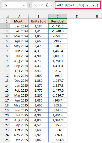
In Excel 365 and Excel 2021 or later, the formula spills through C25.
In older versions, select C2:C25, type the formula and press Ctrl+Shift+Enter.
TREND fits the line using the positions 1, 2, 3, and so on as the time values.
Subtracting those fitted values from your actual sales leaves the residuals. The first three are -1,421.2, -1,240.9, and -850.6.
If you already have regression residuals, use those instead. The Analysis ToolPak’s Regression tool can produce them when you check the Residuals box.
Type Durbin-Watson Statistic in E1, then enter this formula in E2:
=SUMXMY2(C3:C25,C2:C24)/SUMSQ(C2:C25)
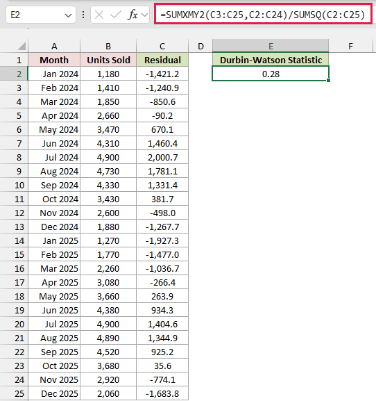
The formula returns 0.28.
How does this formula work?
SUMXMY2(C3:C25,C2:C24) adds up the squared differences between each residual and the one before it.
SUMSQ(C2:C25) adds up the squared residuals. The formula divides the first total by the second.
Durbin-Watson ranges from 0 to 4. Around 2 suggests no lag 1 autocorrelation, near 0 suggests positive autocorrelation, and near 4 suggests negative autocorrelation.
Your 0.28 result points to strong positive autocorrelation in the residuals. The straight trend line misses the shop’s seasonal sales pattern.
As a rough guide, 1.5 to 2.5 is often treated as acceptable. For a formal test, you’ll need the exact critical values from a Durbin-Watson table.
Additional Notes About Calculating Autocorrelation in Excel
Keep these points in mind when you apply the formulas to your own time series:
- Keep your data in time order. You need equally spaced observations with no gaps or blank cells, so each lag represents a consistent time interval.
- Be careful with higher lags. They compare fewer pairs, so their results are less reliable. A common rule of thumb is to check lags up to about a quarter of the series length, and go further only for a known season, like 12 months.
- Treat the bounds as approximate. The 95% band assumes random data. A result outside it is a useful signal, rather than a guarantee about your series.
- Check for a trend. A strong trend can create high autocorrelation at many lags. Consider removing it first if you want to examine the remaining pattern.
- Expect smaller differences with longer series. The gap between the shifted-range CORREL estimate and the standard ACF generally shrinks as you add observations.
Frequently Asked Questions
Here are a few questions you might have when choosing how to calculate autocorrelation in Excel.
What Is the Difference Between Correlation and Autocorrelation?
Correlation compares two different series. Autocorrelation compares one series with earlier values of itself, so you can examine relationships across time.
Does the Excel Analysis ToolPak Have an Autocorrelation Tool?
No. The Analysis ToolPak has a Correlation tool, but it doesn’t have an autocorrelation tool. You need a worksheet formula to calculate the ACF.
Can I Calculate Partial Autocorrelation (PACF) in Excel?
Excel has no built-in PACF function. You’d need regressions using lagged columns or an add-in, rather than the ACF formulas shown here.
Conclusion
I’d use SUMPRODUCT and DEVSQ for standard autocorrelation, then plot a correlogram to see how the relationship changes across lags.
When you’re checking regression residuals, use the Durbin-Watson statistic to look for lag 1 autocorrelation that your model hasn’t explained.
Other Excel articles you may also like: