If you have two columns of numbers and you want to know how strongly one relates to the other, linear regression is the tool for the job.
It fits a straight line through your points and gives you the slope, the intercept, and a number for how well that line explains the data.
Excel can do this in a few different ways, from a quick chart trendline to a full statistics table. In this tutorial I’ll walk through four of them, using the same small dataset each time so you can see how the results line up.
Method #1: Adding a Trendline to a Scatter Chart
If you want a quick visual answer plus the regression equation, a scatter chart with a trendline is the easiest route.
You plot the points, drop a straight line through them, and let Excel print the equation and R-squared right on the chart. This is the method I reach for first.
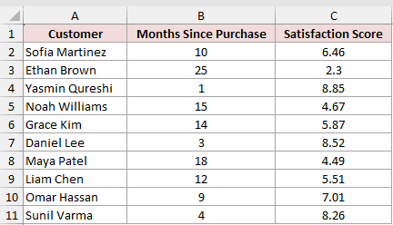
Below I have a dataset of 10 customers. Column B has the months since each person bought the product, and Column C has the satisfaction score they gave (on a 1 to 10 scale). I want to see whether satisfaction drops as more time passes.
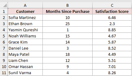
Here are the steps to add a trendline for linear regression:
- Select the range B1:C11 (just the two number columns, not the Customer names).
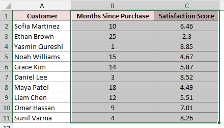
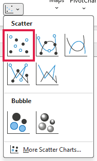
- On the Insert tab, in the Charts group, click Insert Scatter (X, Y) and pick the first plain Scatter option.
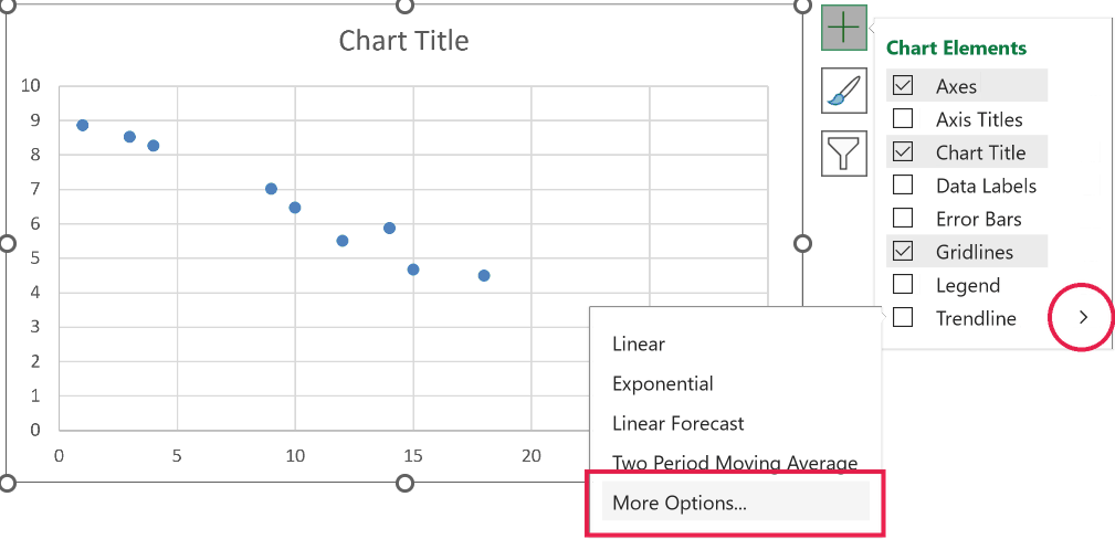
- In Excel for Windows, click the chart, then click the Chart Elements button (the plus sign at the top-right of the chart). On Mac, click Chart Design, then Add Chart Element.
- In Windows, hover over Trendline, click its arrow, and choose More Options. On Mac, choose Trendline > More Trendline Options.
- In the Format Trendline pane, keep the type set to Linear, then check both Display Equation on chart and Display R-squared value on chart.
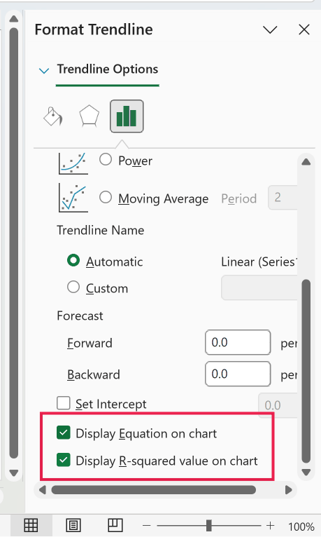
Excel draws the best-fit line and prints the equation and R-squared on the chart. For my data it shows:
- y = -0.2776x + 9.2755
- R² = 0.9804
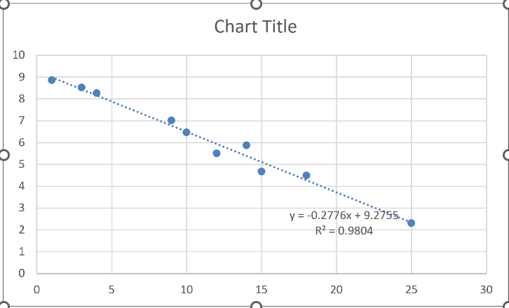
The slope of -0.2776 means satisfaction drops by about 0.28 points for every extra month since purchase. The intercept of 9.2755 is the predicted score at month 0.
The R-squared of 0.9804 tells me the line explains about 98% of the variation, so it’s a strong fit.
Note: The label rounds the equation to a fixed number of digits, so a reader’s chart may show fewer decimals than mine. To see more precision, click the equation label, open Format Trendline Label, and raise the decimal places under Number.
Method #2: Using the SLOPE and INTERCEPT Functions
If you’d rather have the numbers in cells than read them off a chart, the SLOPE and INTERCEPT functions hand you the two coefficients directly.
SLOPE gives you how steep the line is, and INTERCEPT gives you where it crosses the y-axis. Together they are the full regression equation.
I’m using the same customer table: Column B is months since purchase, Column C is the satisfaction score.
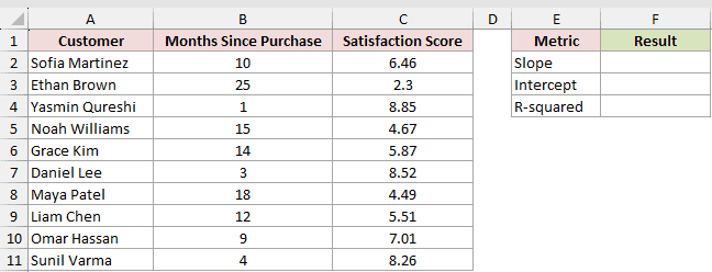
Here is the formula for the slope:
=SLOPE(C2:C11,B2:B11)
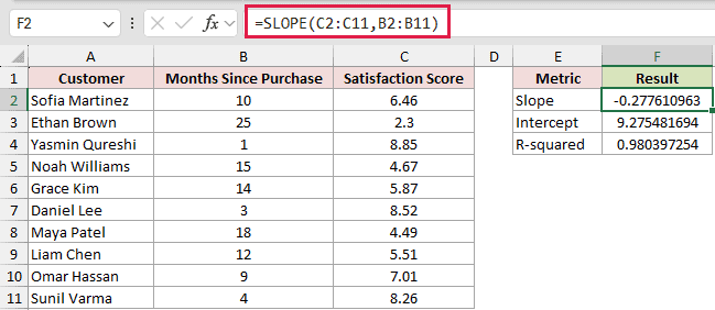
This returns -0.2776, the same slope the trendline gave me.
And here is the formula for the intercept:
=INTERCEPT(C2:C11,B2:B11)
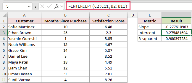
This returns 9.2755. So the regression line is y = -0.2776x + 9.2755, matching the chart exactly.
How do these formulas work?
Both functions take the y-values first and the x-values second. Here the satisfaction scores in C2:C11 are the y-values (the thing I’m predicting), and the months in B2:B11 are the x-values. Excel runs the least-squares fit behind the scenes and returns one coefficient each.
If you also want the R-squared value in a cell, add the RSQ function as a bonus:
=RSQ(C2:C11,B2:B11)
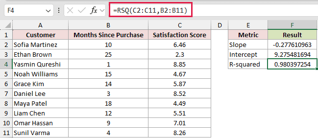
This returns 0.9804, the same fit quality shown on the chart. You can read more about how the coefficient is calculated on my SLOPE function guide.
Note: The argument order is y-values first, then x-values. This is the opposite of how you’d read “x versus y” out loud, and swapping them is the most common mistake with these functions. If your slope looks wrong, check the order.
Method #3: Using the LINEST Function
If you want every regression statistic from a single formula, LINEST is the one. Instead of calling SLOPE, INTERCEPT, and RSQ separately, LINEST returns the slope, the intercept, the R-squared, and several more stats all at once as a spilled array.
I’m working with the same dataset: months since purchase in Column B, satisfaction score in Column C.
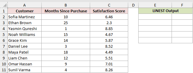
Here is the formula:
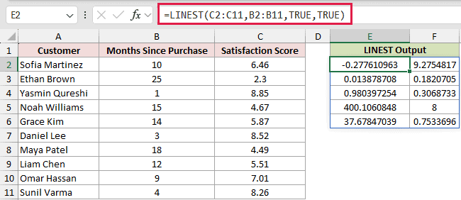
=LINEST(C2:C11,B2:B11,TRUE,TRUE)
In Microsoft 365 or Excel 2021 and later, you type it in one cell and press Enter. The result spills automatically into a block that is 2 columns wide and 5 rows tall.
How does this formula work?
The first argument is the y-values (C2:C11) and the second is the x-values (B2:B11), same order as SLOPE.
The third argument, TRUE, tells Excel to calculate a normal intercept. The fourth argument, TRUE, tells it to return the extra regression statistics instead of just the two coefficients.
The spilled block is easiest to read by position:
- Top-left cell is the slope: -0.2776.
- Top-right cell is the intercept: 9.2755.
- The third row, left cell is the R-squared: 0.9804.
The rest of the block holds standard errors, the F statistic, and the sums of squares, which come in handy for deeper statistical work.
Note: LINEST returns an array. In Microsoft 365 or Excel 2021 and later, it spills on its own. In Excel 2019 or earlier, first select a range that is 2 columns wide and 5 rows tall, type the formula, then press Ctrl + Shift + Enter to enter it as an array formula.
Method #4: Using the Data Analysis ToolPak
If you want the same full statistics report a stats program would give you, the Data Analysis ToolPak is the way.
Its Regression tool produces a formatted table with R-squared, coefficients, p-values, and optional residuals, without writing a single formula. It’s the most thorough of the four methods.
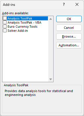
The ToolPak is an add-in that ships with Excel but isn’t switched on by default. In Windows, go to File > Options > Add-ins, choose Excel Add-ins in the Manage box, click Go, tick Analysis ToolPak, and click OK.
On Mac, choose Tools > Excel Add-ins, select Analysis ToolPak, and click OK. Restart Excel if prompted.
I’m using the same customer dataset, with months since purchase in Column B and satisfaction score in Column C.
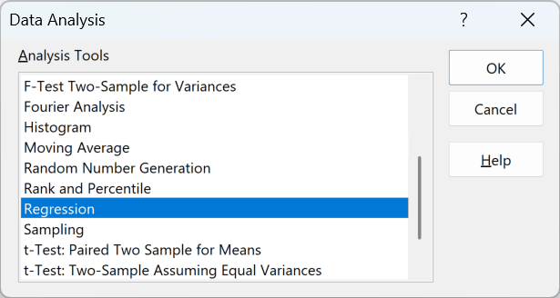
Here are the steps to run the regression:
- On the Data tab, in the Analysis group on the far right, click Data Analysis.
- In the list, select Regression and click OK.
- For Input Y Range, select C1:C11. For Input X Range, select B1:B11.
- Check the Labels box, since both ranges include their header row.
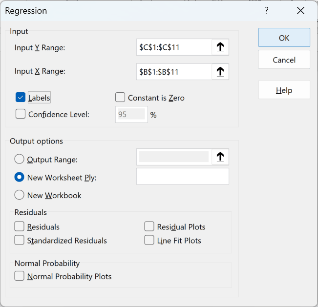
- Pick where you want the output (a new worksheet is fine) and click OK.
Excel writes a full summary table. R Square shows 0.9804. The Coefficients column lists the Intercept as 9.2755 and the Months Since Purchase coefficient (the slope) as -0.2776, matching every other method.
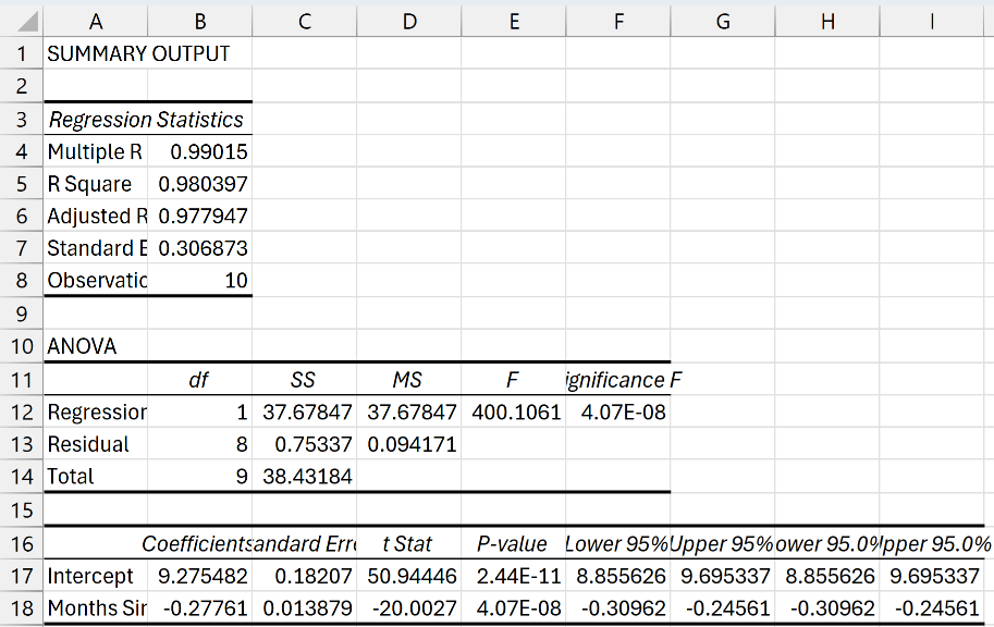
Note: The ToolPak output is a static snapshot. It does not update when you change the source data, unlike the SLOPE, INTERCEPT, and LINEST formulas. If your numbers change, run the Regression tool again.
Additional Notes About Linear Regression in Excel
- Linear regression assumes a straight-line relationship. If your points curve, a linear fit will look weak even when the two columns are clearly related, so plot them first to check the shape.
- A high R-squared means the line fits your sample well. It does not prove that one variable causes the other, so be careful reading cause into it.
- For an ordinary, nondegenerate dataset, the trendline, functions, and ToolPak should agree apart from displayed rounding. In edge cases such as collinear data, SLOPE and INTERCEPT can behave differently from LINEST.
- Keep x and y as paired numeric observations. SLOPE and INTERCEPT ignore text, logical values, and empty cells in references, while error values or ranges with different numbers of data points can return errors.
- The ToolPak’s Regression dialog has Residuals and Line Fit Plots checkboxes. Tick them when you want to see how far each point sits from the line, which is the quickest way to spot a curve a single R-squared hides.
Frequently Asked Questions
Can I run multiple linear regression in Excel?
Yes. LINEST and the Data Analysis ToolPak both handle several predictor columns at once. Give LINEST a multi-column x range, or point the ToolPak’s Input X Range at all your predictor columns. SLOPE and INTERCEPT only work with a single x variable.
How do I predict a new value from my regression?
You can plug an x value into the equation yourself, or let Excel do it with FORECAST.LINEAR or TREND. To predict the score at 20 months, use =FORECAST.LINEAR(20,C2:C11,B2:B11), which returns 3.72.
Keep the x value inside the range you actually measured. My data stops at 25 months, so asking for month 60 gives a number the line has no evidence for.
What does the R-squared value actually tell me?
It’s the share of the variation in your y-values that the line explains, on a scale from 0 to 1. My R-squared of 0.9804 means the fitted line accounts for about 98% of the movement in satisfaction, which is a strong relationship.
Why is the coefficient negative in my output?
A negative slope just means y goes down as x goes up. In my example satisfaction falls as months pass, so the slope is below zero. A positive slope would mean the two rise together.
Conclusion
You now have four ways to run a linear regression in Excel. For a fast visual answer with the equation on screen, add a trendline to a scatter chart.
For numbers you can reuse in other formulas, reach for SLOPE and INTERCEPT, or LINEST when you want every statistic at once.
When you need a full report with p-values and residuals, run the Data Analysis ToolPak. I use the trendline for a quick look and LINEST when I need the details.
Other Excel articles you may also like: