Data bars in Excel let you compare numbers at a glance by drawing a bar inside each cell, with longer bars for larger values.
You’ll find them under conditional formatting, which changes how cells look based on their values.
By default, the largest value fills its cell. That works for sales, but an 85% progress bar can look finished if it’s the highest value in the column.
I’ll show you how to add data bars, set a true 100% progress scale, and adjust how the bars look.
Method #1: Using the Conditional Formatting Menu
I recommend this route for most readers. You can preview the bars before applying them and pick the color you want.
Below I have a dataset with sales reps, their regions, and their sales. I want to add data bars to the Sales column.
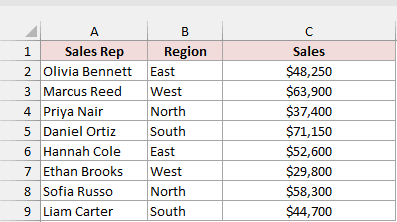
Here are the steps to add data bars to the sales figures:
- Select C2:C9 on the Sales sheet, leaving out the header.
- On the Home tab, click Conditional Formatting in the Styles group. Go to Data Bars and click the Blue Data Bar under Gradient Fill. As you hover over each option, Excel previews it on your selected cells.
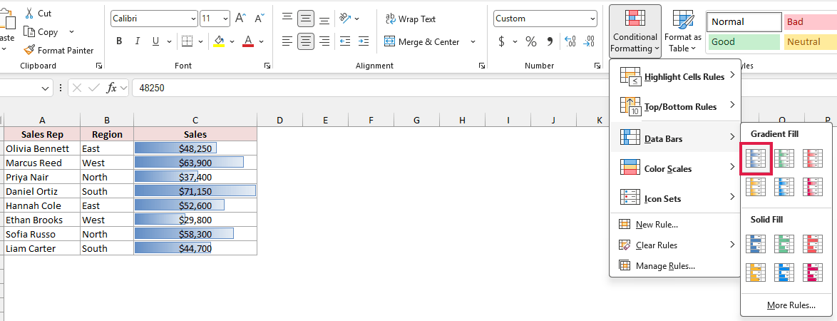
Each sales figure now has a bar behind it. Daniel Ortiz, with $71,150, has the longest bar; Ethan Brooks, with $29,800, has the shortest.
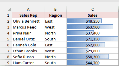
The menu offers Gradient Fill, which fades along the bar, and Solid Fill, which keeps one color throughout the bar. Each group has six colors.
The default bars start at zero, and the largest value fills the cell. The gradient bars also have a thin border in the same color.
Note: The bars sit behind the numbers without changing the values. Formulas that use C2:C9 keep working.
Method #2: Using the Quick Analysis Tool
For the fastest route with your mouse, you can add data bars right beside your selection without opening the ribbon.
Below I have a dataset with sales reps, their regions, and their sales. I want to add data bars to the Sales column.
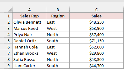
Here are the steps to add the bars using Quick Analysis:
- Select C2:C9 on the Sales sheet, leaving out the header.
- Click the Quick Analysis button at the bottom-right corner of the selection, or press Ctrl + Q. On the Formatting tab, hover over Data Bars to preview the bars, then click it.
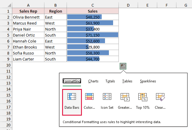
Quick Analysis adds solid blue data bars with a single flat color and no border. Daniel Ortiz’s bar fills the cell, while Ethan Brooks’s is the shortest.
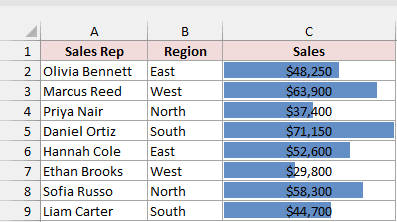
Note: Quick Analysis always applies these solid blue bars. For another color or gradient style, use Method #1 or change settings in the customization section below.
Method #3: Creating a Custom Data Bar Rule
For progress bars, you’ll want the full cell to mean 100% complete. Regular data bars always stretch the largest value to fill the cell.
Below I have a dataset with tasks and their percentages complete on the Progress sheet. I want the bars to show progress toward 100%.
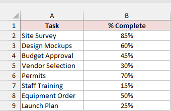
With the bars from Method #1, Site Survey’s 85% fills the cell because it’s the largest value. It looks finished, even though it isn’t.
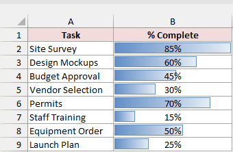
You can fix this by setting the bar’s starting and ending values yourself. These are the Minimum and Maximum in a custom data bar rule.
Excel stores percentages as decimals: 85% is 0.85, and 100% is 1. That’s why you’ll use 1 as the Maximum, rather than 100.
Here are the steps to create progress bars with a fixed 0% to 100% scale:
- Select B2:B9 on the Progress sheet.
- On the Home tab, click Conditional Formatting, go to Data Bars, and click More Rules.
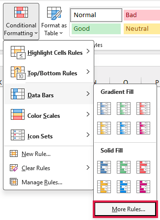
- In the New Formatting Rule dialog box, Data Bar is already selected as the Format Style. Under Minimum, set Type to Number and Value to 0. Under Maximum, set Type to Number and Value to 1.
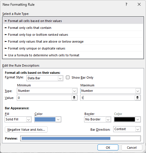
- Click OK to apply the rule.
The bars now measure progress from 0% to 100%. Site Survey’s bar stops at 85% of the cell, and Staff Training’s 15% gets a short bar.
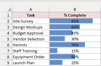
Note: Don’t choose Percent as the Type here. It means a percentage of the range between the lowest and highest values, rather than 0% to 100% complete.
How to Customize Data Bars in Excel
Every data bar setting lives in the rule’s dialog box. For bars you’ve already added, here’s how to open it:
- Select the cells with the data bars. For the Sales example, select C2:C9.
- On the Home tab, click Conditional Formatting, then Manage Rules.
- In the Conditional Formatting Rules Manager, click the Data Bar rule and click Edit Rule.
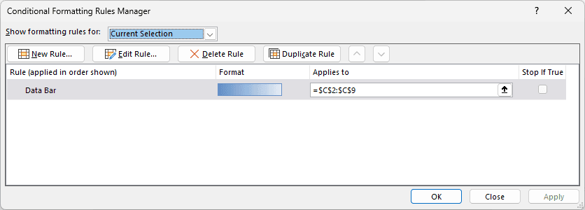
The rule’s Applies to range is =$C$2:$C$9. The Edit Formatting Rule dialog box has the same options as the New Formatting Rule dialog from Method #3.
Show Only the Bars (Hide the Numbers)
For a cleaner, chart-like look, you can hide the numbers and leave just the bars visible.
Here’s how to hide the numbers:
- In the Edit Formatting Rule dialog box, check Show Bar Only and click OK.
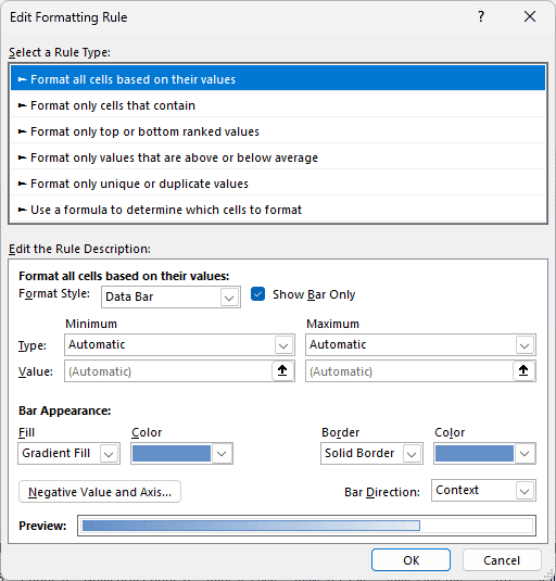
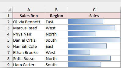
Only the bars show in the cells now. The values are still there; click a cell to see its value in the formula bar.
Change the Bar Color and Fill
You can make the bars easier to distinguish by changing their color and using a solid fill.
Here’s how I changed the sales bars to solid green:
- In the Edit Formatting Rule dialog box, go to Bar Appearance. Set Fill to Solid Fill. Pick green from the Color menu, then set Border to No Border. Uncheck Show Bar Only if you turned it on earlier. Click OK.
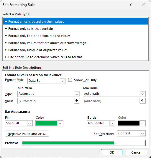
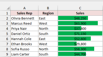
The sales figures now have solid green bars without borders.
The Bar Direction drop-down is in the same area. Choosing Right-to-Left makes the bars grow from the right edge of each cell.
Show Negative Values in Data Bars
Below I have a dataset with profit changes by store on the Profit Change sheet. I’ve added blue gradient bars to B2:B9 using Method #1.
Dallas, Miami, and Chicago have negative changes. Excel gives them red bars that grow left from a dashed black line marking zero, called the axis.
With the default Automatic setting, the axis sits where zero falls between the lowest and highest values. Chicago’s -$6,700 has the longest red bar.
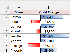
You can change the negative bar fill and border colors. You can also move the axis so every bar starts from the middle of its cell.
Here are the steps to move the axis to the center:
- Select B2:B9 on the Profit Change sheet. Go to Home, Conditional Formatting, then Manage Rules. Select the Data Bar rule and click Edit Rule.
- Click Negative Value and Axis. In the Negative Value and Axis Settings dialog box, choose Cell midpoint under Axis settings. Click OK twice.
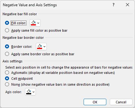
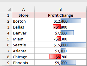
Cell midpoint puts the axis in the middle of every cell. Positive bars grow right and negative bars grow left from the same center line.
Choosing None instead makes negative bars point in the same direction as positive bars.
Here’s the result with Cell midpoint selected:
How to Remove Data Bars in Excel
You can remove the bars without deleting the numbers. The command below clears all conditional formatting rules from the selected cells, so check your selection first.
Here are the steps to remove the bars:
- Select the cells with the data bars you want to remove.
- On the Home tab, click Conditional Formatting, go to Clear Rules, and click Clear Rules from Selected Cells.
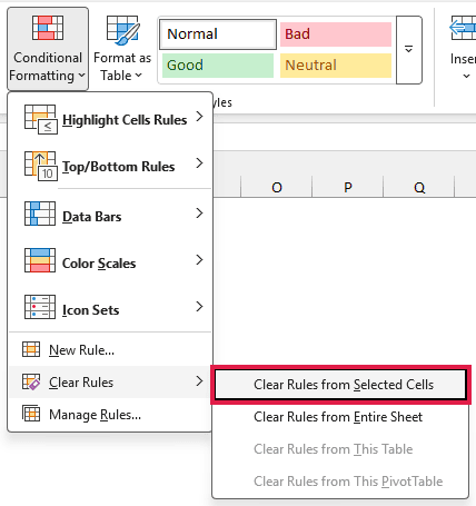
Clear Rules from Entire Sheet removes every conditional formatting rule on the sheet, including rules other than data bars.
Additional Notes About Data Bars in Excel
- Data bars only show for numbers. Text cells, blank cells, and numbers stored as text get no bar.
- The bars update immediately when you change a value, so you don’t need to apply the rule again.
- Bar length is relative to the other cells in the same rule. Apply one rule to the whole column at once. Adding bars one cell at a time creates separate rules, with each bar filling its cell.
- To keep the numbers alongside clean bars, enter
=C2:C9in D2. It spills down the column automatically. Add data bars to D2:D9 and turn on Show Bar Only there. - Gradient bars with borders and negative-value bars need Excel 2010 or later. If you save the workbook in the old
.xlsformat, these settings aren’t kept.
Frequently Asked Questions
Here are a few questions you might run into while working with Excel data bars.
Why do my data bars look almost the same length?
Close values can look almost equal. For example, 960, 980, and 1,000 produce similar bars when the scale starts at zero.
In the rule’s dialog box, set the Minimum Type to Number and its Value to a little below your lowest number, such as 900.
Avoid the Lowest Value type for this fix: it gives the smallest value no bar at all.
Can I add data bars to a PivotTable?
Yes. Select the PivotTable’s value cells without the Grand Total and add data bars the same way.
Click the Formatting Options button beside the cells. Pick “All cells showing ‘Sum of Sales’ values for ‘Sales Rep'”.
This covers new rows after you refresh the PivotTable and leaves out the totals.
Can I use a formula for the minimum or maximum?
Yes. Set Type to Formula in the rule’s dialog box. For example, enter =MAX($C$2:$C$9)*1.2 as the Maximum.
That sets the maximum 20% above the largest sales value, leaving room at the end of the longest bar so its number is easier to read.
Do data bars show up when I print?
Yes. Data bars print like any other cell formatting.
Conclusion
I’ve covered three ways to add data bars, along with hiding numbers, changing the appearance, handling negative values, and removing the bars.
I’d use Method #1 for everyday comparisons. For percentages complete, use a custom rule with Number limits of 0 and 1 so a full bar means 100%.
Other Excel articles you may also like: