A Gantt chart in Excel shows every task in a project as a bar on a timeline.
You can see what starts when, what overlaps, and when the project wraps up.
The catch is that Excel has no Gantt chart type in its chart list.
You build one yourself, either from a stacked bar chart or from a grid of dates that colors itself.
In this article, I’ll show you how to turn a stacked bar chart into a Gantt chart and how to color a date grid with Conditional Formatting.
I’ll also cover weekend shading, a today line, progress bars, and a free template.
Method #1: Using a Stacked Bar Chart
This is the classic way to make a Gantt chart in Excel. You stack two bar series, hide the first one, and the second one floats at the right dates.
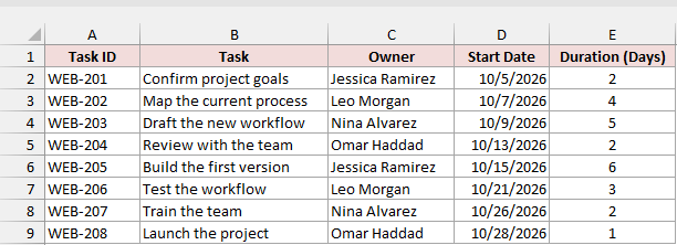
Below I have a project plan on the Project Plan sheet. Each task has an ID, an owner, a start date, and a duration in calendar days.
First, add a Finish Date column so you can see when each task ends. Enter this formula in F2:
=D2:D9+E2:E9-1
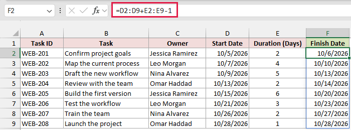
The formula adds each duration to its start date and subtracts 1, because the start day is day one.
So a 2-day task that starts on October 5 finishes on October 6.
It spills down the column automatically in Excel 2021, Excel 2024, and Microsoft 365. In older versions, use =D2+E2-1 in F2 and copy it down to F9.
Here are the steps to make a Gantt chart from the start dates and durations:
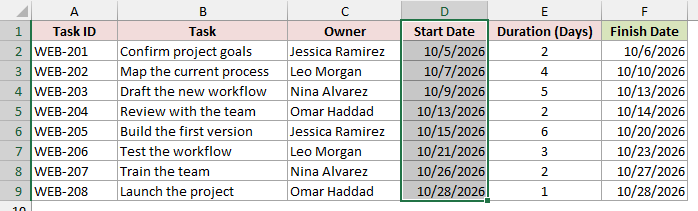
- Select the Start Date column, including its header (D1:D9). Select only this column for now.
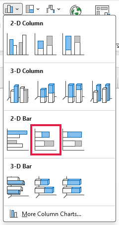
- Go to the Insert tab, click the Insert Column or Bar Chart icon, and pick Stacked Bar under 2-D Bar.
Excel adds a bar chart with a single series called Start Date.
The bars start way back in September and the tasks show up as 1 to 8. We’ll fix both.
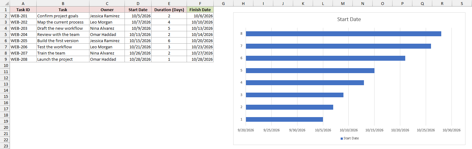
Note: Don’t select the Start Date and Duration columns together. Excel treats a column of dates as axis labels, so you’d end up with one Duration series and no start dates at all.
- Right-click the chart and choose Select Data.
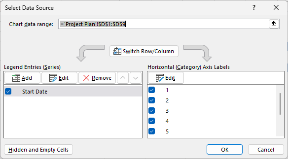
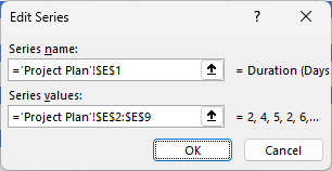
- Under Legend Entries (Series), click Add. In the Edit Series dialog, select E1 for Series name, clear the Series values box, select E2:E9, and click OK.
- Under Horizontal (Category) Axis Labels, click Edit. Select the task names in B2:B9 and click OK. Then click OK again to close Select Data.
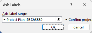
The chart now shows each task by name. Every bar has a blue Start Date part and an orange Duration part stacked on the end of it.
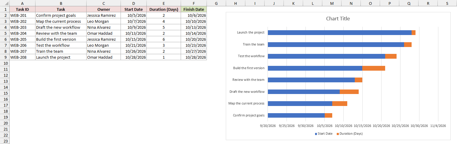
- Click any blue Start Date bar and press Ctrl + 1 to open the Format Data Series pane. Under Fill & Line, open Fill and choose No fill.
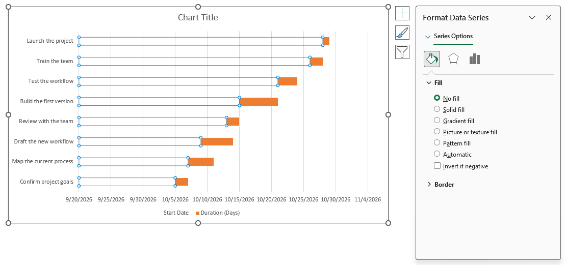
The blue bars disappear, but they’re still there doing their job. They push each orange bar out to the date where that task starts.
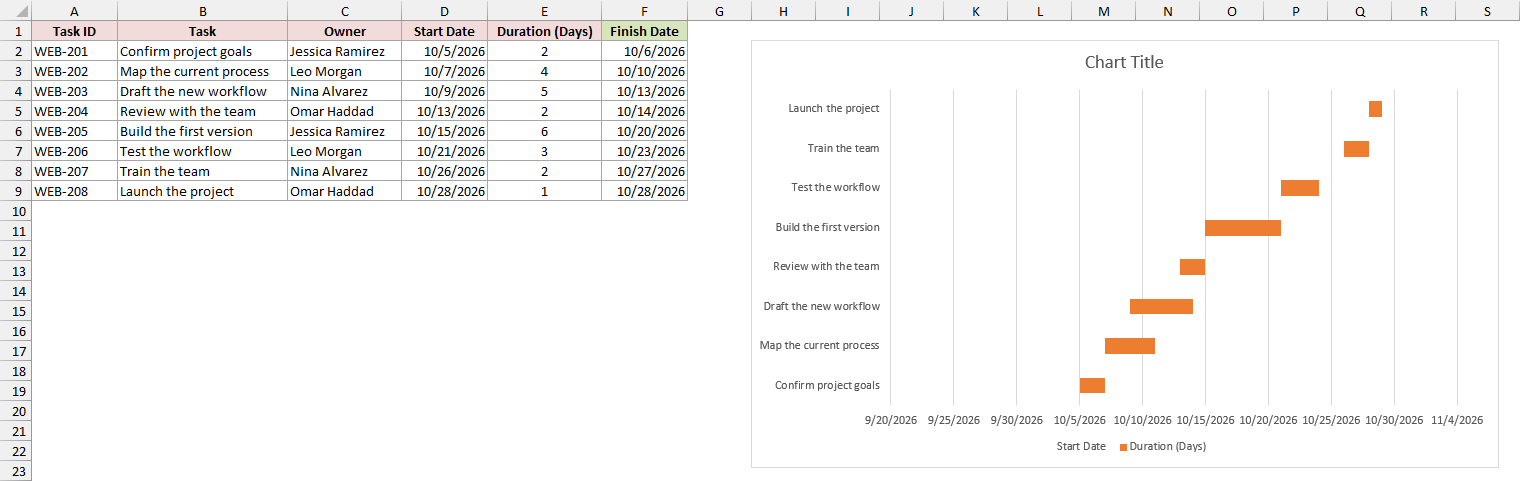
- Right-click the task names on the left and choose Format Axis. Under Axis Options, in the Axis position section, check Categories in reverse order.
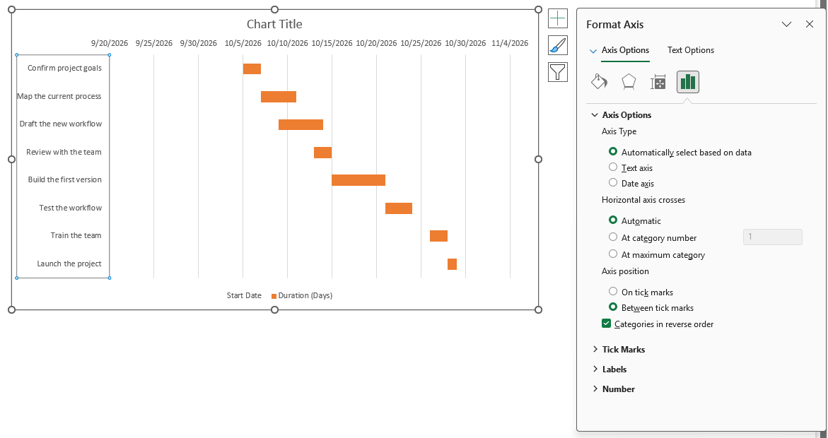
Now the first task sits at the top, like a real project plan. The dates also move to the top of the chart.
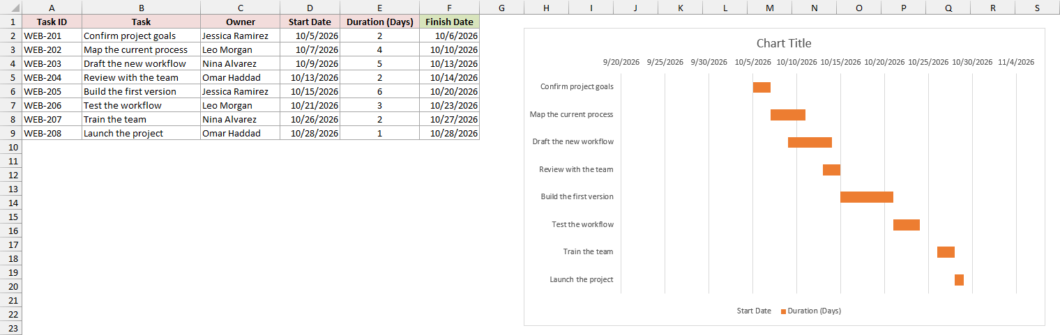
The chart still starts in late September, which leaves a big empty gap on the left. To fix that, you tell the date axis where to start and stop.
Chart axis settings don’t accept dates or formulas, only numbers.
Excel stores every date as a serial number, so you need the serials for the first start date and the last finish date.
In the sample file, a small Axis Bound table below the plan works them out. Enter this formula in B12 to get the minimum:
=MIN(D2:D9)
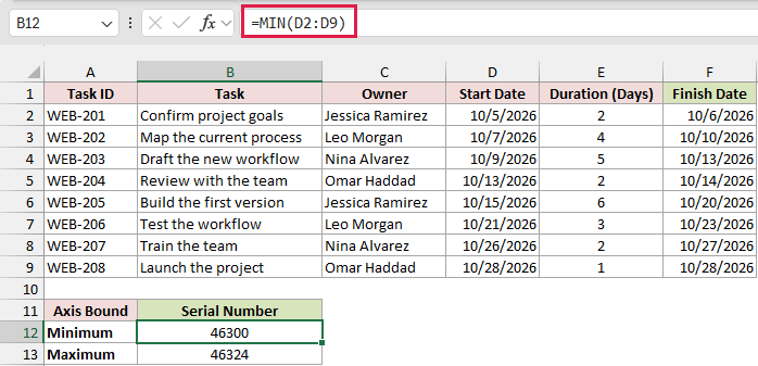
It returns 46300, which is October 5, 2026. Make sure B12 is formatted as a number, not a date, or you’ll just see the date again.
Then enter this formula in B13 to get the maximum:
=MAX(F2:F9)+1
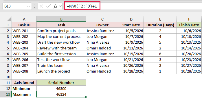
It returns 46324, which is October 29, 2026. The +1 matters because the last task’s bar covers the whole of its finish day, October 28.
- Right-click the dates at the top of the chart and choose Format Axis. Under Bounds, type 46300 in Minimum and 46324 in Maximum.
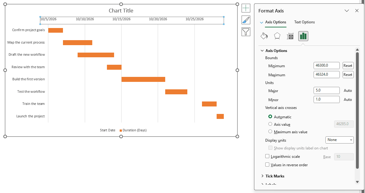
The bars now fill the chart from the first day of the project to the last one.
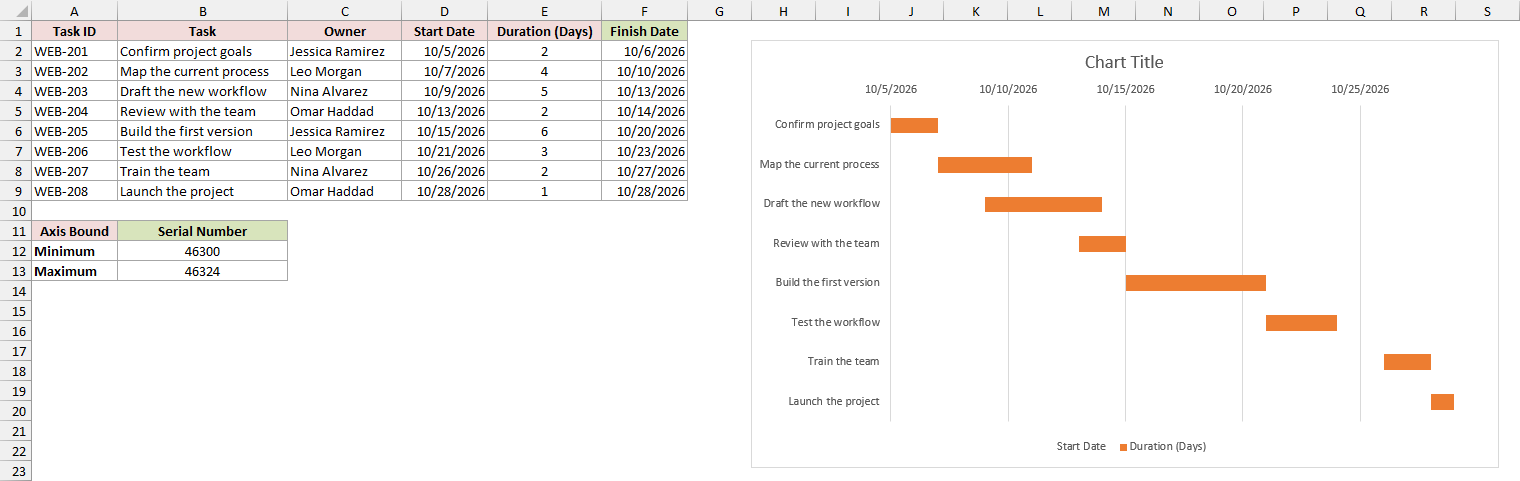
That’s a working Gantt chart. A few quick touches make it easier to read:
- Select the orange bars, press Ctrl + 1, and set Gap Width to 50% under Series Options to make the bars thicker.
- In the Format Axis pane for the dates, set the Major unit to 7 to get one label per week. Under Number, type
mmm din Format Code and click Add. - Click the legend and press Delete. You don’t need it with only one visible series.
- Click the chart title and type something like Project Schedule.
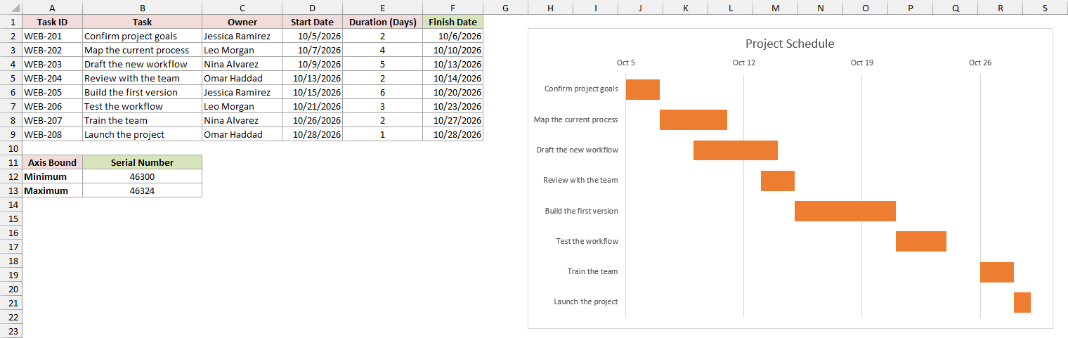
Because the chart reads straight from the plan, changing a start date or duration moves that task’s bar.
The axis bounds are the one exception, so update them if the project dates move.
Method #2: Applying Conditional Formatting to a Timeline
If you’d rather see your schedule in the cells themselves, you can make a Gantt chart out of a date grid.
Conditional Formatting colors each cell that falls inside a task’s dates.
This version is also easy to extend. I’ll add weekend shading and a today line, which a bar chart can’t do easily.
Below I have the same project plan on the Project Plan sheet, with the task names, start dates, durations, and finish dates.
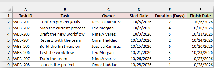
Start on a new sheet called Timeline. Instead of copying the task data, link to it, so the timeline updates whenever the plan changes.
Enter this in A2 to pull in the task names:
='Project Plan'!B2:B9
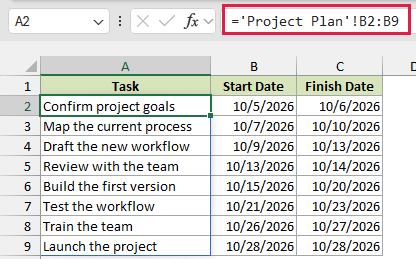
Then enter this in B2 to pull in the start dates:
='Project Plan'!D2:D9
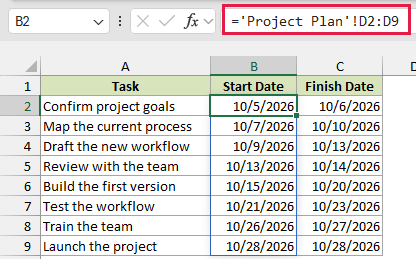
And this in C2 to pull in the finish dates:
='Project Plan'!F2:F9
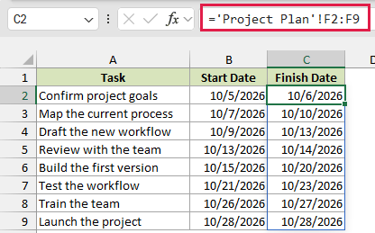
Each formula spills down to row 9. Type Task, Start Date, and Finish Date as the headers in A1:C1.
Next, you need one column per day. Leave column D empty as a spacer, type 10/5/2026 in E1, and enter this formula in F1:
=E1+1

Copy F1 across to AB1 to get every day up to October 28.
I formatted the date row as m/d and made the columns narrow so the whole project fits on one screen.
Since every date follows E1, you can type a new project start in E1 and the whole row shifts with it.
Next, color the grid. I’ll shade the weekends first, then add the task bars on top. Here are the steps:
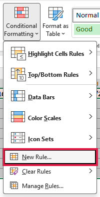
- Select the empty grid, E2:AB9. Then go to Home, click Conditional Formatting, and choose New Rule.
- Choose Use a formula to determine which cells to format and enter the formula below. Click Format, pick a light gray on the Fill tab, and click OK twice.
=WEEKDAY(E$1,2)>5
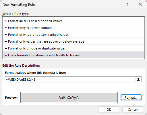
With 2 as its second argument, WEEKDAY numbers Monday as 1 and Sunday as 7. So anything above 5 is a Saturday or a Sunday, and those columns turn gray.

- With E2:AB9 still selected, create another New Rule with the formula below. This time pick a fill color for the task bars, such as light orange.
=AND(E$1>=$B2,E$1<=$C2)
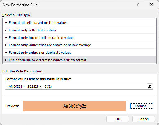
The rule checks each date in row 1 against the task’s start and finish dates.
When the date falls between them, the cell gets colored, which draws a bar for each task.
The dollar signs keep the references pointing the right way. E$1 always looks at the date row, while $B2 and $C2 always look at that row’s own task dates.

Excel puts each new rule on top of the older ones.
That’s why I added the weekend rule first: the task bars now stay orange on weekends, since the project counts every calendar day.
- Type Status Date in A11 and 10/16/2026 in B11. Then select E2:AB9 again and create one more New Rule with the formula below. Click Format, and on the Border tab, pick a red color and add a left and a right border.
=E$1=$B$11
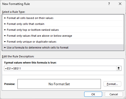
The date column that matches the Status Date gets red lines on both sides, so you can see at a glance which tasks should be done by then.

I typed a fixed date in B11 so the line shows up in this example.
If you want a true today line that moves on its own, replace the date in B11 with =TODAY().
Method #3: Using a Stacked Bar Chart (With Progress)
A plain Gantt chart tells you when things should happen.
If you also want to see how far along each task is, you can split every bar into the part that’s done and the part that’s left.
Below I have the project plan on the Project Plan sheet again. This time there’s a % Complete column in G, which you’d update as the work moves along.
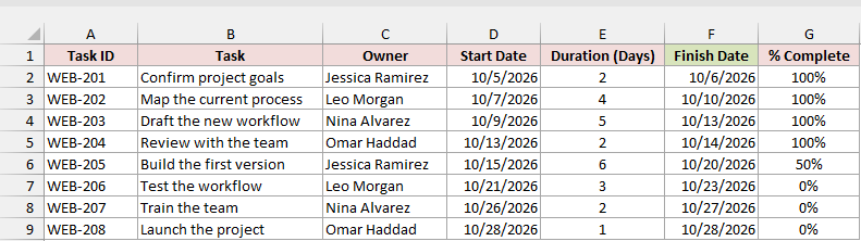
First, turn the percentage into days. Enter this formula in H2 to get the days completed:
=ROUND(E2:E9*G2:G9,0)
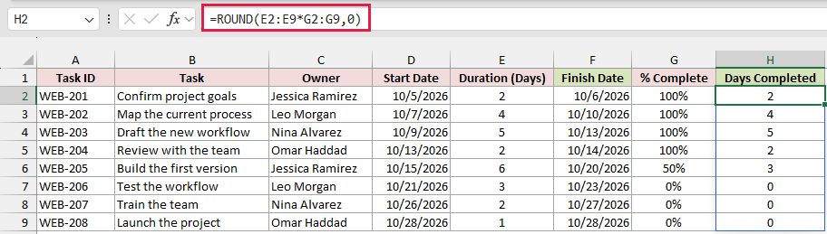
It multiplies each duration by its percentage and rounds to whole days. Build the first version is 6 days long and 50% done, so it returns 3.
Then enter this formula in I2 to get the days remaining:
=E2:E9-H2:H9
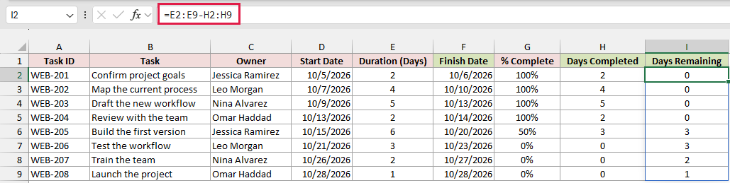
Both formulas spill in Excel 2021, Excel 2024, and Microsoft 365. In older versions, use =ROUND(E2*G2,0) and =E2-H2 and copy them down.
Here are the steps to build the progress chart:
- Select only D1:D9, go to Insert, click Insert Column or Bar Chart, and pick Stacked Bar under 2-D Bar.
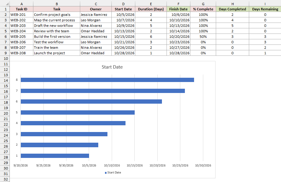
- Right-click the chart and choose Select Data. Click Add and use H1 and H2:H9 for Days Completed. Click Add again and use I1 and I2:I9 for Days Remaining. Then click Edit under Horizontal (Category) Axis Labels, select B2:B9, and click OK twice.
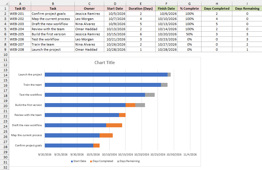
- Click a blue Start Date bar, press Ctrl + 1, and choose No fill under Fill & Line. Then format the task axis with Categories in reverse order, and set the date axis bounds to 46300 and 46324.
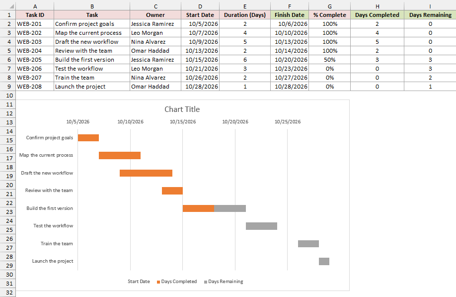
- Give Days Completed a dark fill and Days Remaining a light fill of the same color. Click the Start Date entry in the legend and press Delete, then type a title such as Project Progress.
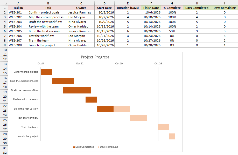
The first four tasks are fully dark, since they’re 100% done.
Build the first version is half dark and half light, and the last three tasks are all light because they haven’t started.
As you update the % Complete column, the dark part of each bar grows on its own.
Method #4: Using a Free Gantt Chart Template
If you don’t want to build anything, Excel has free Gantt chart templates you can fill in. They’re a quick start, but you work inside someone else’s layout.
Here are the steps to open one:
- Go to File, click New, and type Gantt in the search box.
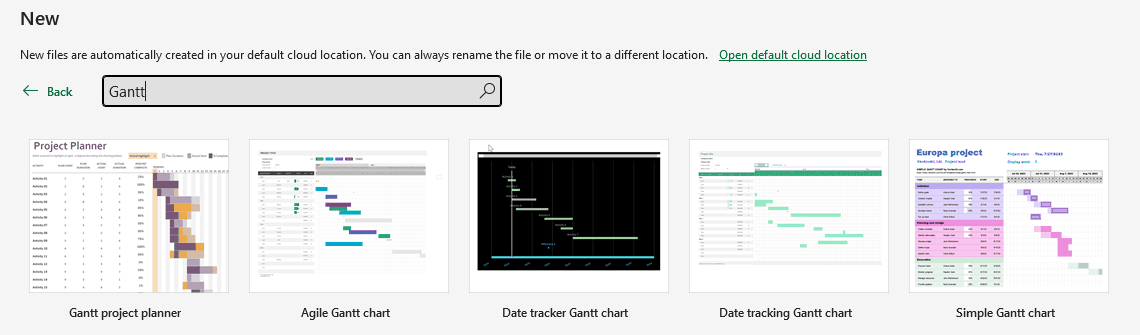
- Click a template such as Simple Gantt chart or Gantt project planner, then click Create.
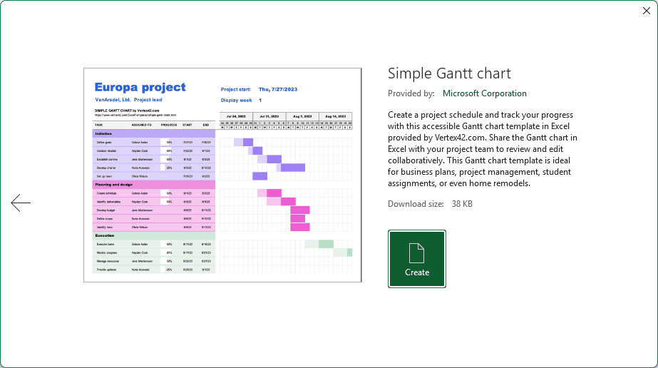
- Type your own tasks and dates over the sample rows.
Each template labels its columns a little differently, and some track progress or working days in their own way. Check what each column expects before you type over it.
The templates you see depend on your Excel version and whether you’re signed in, so your list may not match mine exactly.
Additional Notes About Making a Gantt Chart in Excel
- Every method here counts weekends as working days. If your tasks skip weekends, see the WORKDAY question in the FAQ below.
- If your list has a start date and an end date instead of a duration, get the duration with
=F2-D2+1. The +1 counts both the first and last day. - The chart’s axis bounds don’t follow your data. When the project dates change, recalculate the MIN and MAX serials and type the new values into Format Axis.
- To see a date’s serial number without a formula, select the date cell and change its format to General.
Frequently Asked Questions
Here are answers to a few common questions about making a Gantt chart in Excel.
Does Excel have a Gantt chart template?
Yes. Go to File > New and search for Gantt. You’ll see a few free templates, such as Simple Gantt chart and Gantt project planner. Method #4 walks through it.
How do I make a task start when the previous one ends?
Link the start date to the previous finish date. For example, enter =F2+1 in D3.
If the first task slips, every linked task after it moves too, and so do the chart and the timeline.
How do I skip weekends in a Gantt chart?
Calculate the finish date with the WORKDAY function instead, using =WORKDAY(D2,E2-1).
Map the current process starts on Wednesday, October 7, and takes 4 days, so it finishes on Monday, October 12 instead of Saturday, October 10.
Why does my Gantt chart show numbers instead of dates on the axis?
The axis is showing the date serial numbers. Open Format Axis for the dates, go to Number, and pick a date format, or type a code such as mmm d.
How do I add a milestone to a Gantt chart?
Add the milestone as its own row, with the milestone date as both the start and the finish.
In the timeline, that colors a single cell. In the chart, give it a duration of 1 so it shows up as a short block.
Conclusion
In this article, I showed you how to make a Gantt chart in Excel with a stacked bar chart, a Conditional Formatting timeline, a progress chart, and a free template.
For most projects, I’d start with the stacked bar chart.
I hope you found this article helpful.