A gauge chart in Excel shows one number against a scale, so you can see how close your sales or another performance measure is to its target.
Like a car’s speedometer, it makes the number’s position easy to read at a glance.
Excel has no built-in gauge chart type in any version, including Microsoft 365, so you need to build one from a doughnut chart.
I’ll show you how to make a half-circle progress gauge and a classic speedometer chart with colored zones and a moving needle.
Method #1: Using a Half Doughnut Chart
I recommend this option for most readers because it takes the fewest steps and displays the percentage right on the gauge.
You get a half-circle that fills up as your value grows, without a needle.
A doughnut chart starts as a full circle. To show only half, you add an extra slice equal to all the other slices put together.
That extra slice fills half the circle. You rotate it to the bottom, then make it invisible.
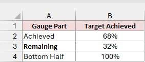
Below I have a dataset on the Progress Gauge sheet showing sales target achievement of 68%. I’ll use it to build the progress gauge.
The table in A1:B4 has the headers Gauge Part and Target Achieved. Its three rows are:
- Achieved: B2 contains 68%, the percentage you’re tracking.
- Remaining: B3 calculates the percentage still needed to reach the target, which is 32% here.
- Bottom Half: B4 contains 100%, equal to Achieved plus Remaining, so this slice fills the bottom half of the circle.
Here is the formula in B3:
=1-B2
Here are the steps to turn this table into a half-circle gauge:
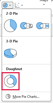
- Select A1:B4. On the Insert tab, click Insert Pie or Doughnut Chart and pick Doughnut under Doughnut.
Excel adds a full ring with three slices and a legend. The slices represent Achieved, Remaining, and Bottom Half.
Your chart title already says Target Achieved because Excel takes it from the column header.
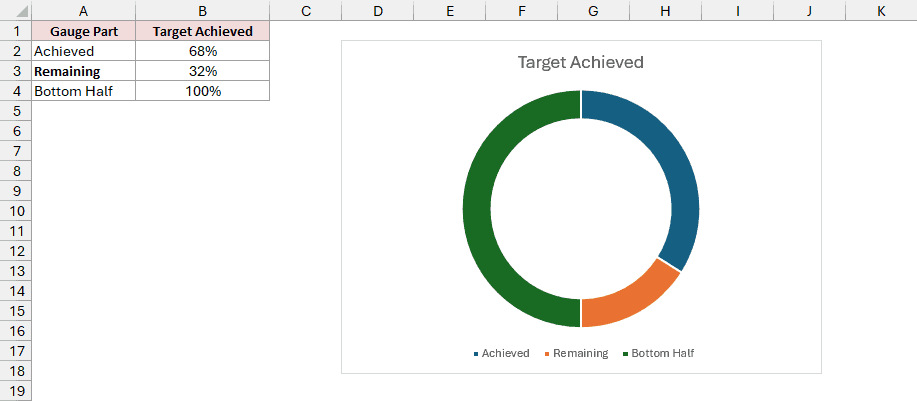
The extra slice needs to occupy the bottom half so your visible gauge runs across the top.
- Right-click the ring and click Format Data Series. In the pane, under Series Options, set Angle of first slice to 270° and Doughnut Hole Size to 50%.
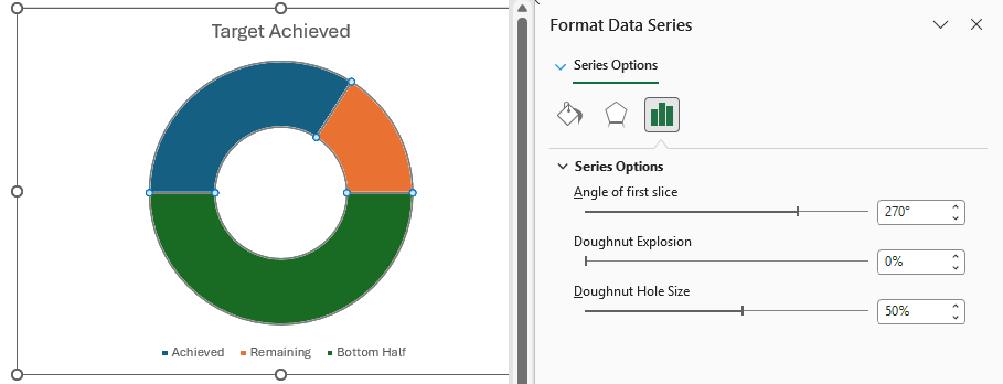
The 270° setting starts the first slice at the left, or 9 o’clock. Achieved and Remaining fill the top half, while Bottom Half takes the bottom.
The hole size only changes how thick the ring is.
- Click the Bottom Half slice once to select the whole ring, then click it again to select only that slice. The pane now says Format Data Point. Go to Fill & Line, open Fill, and select No fill.
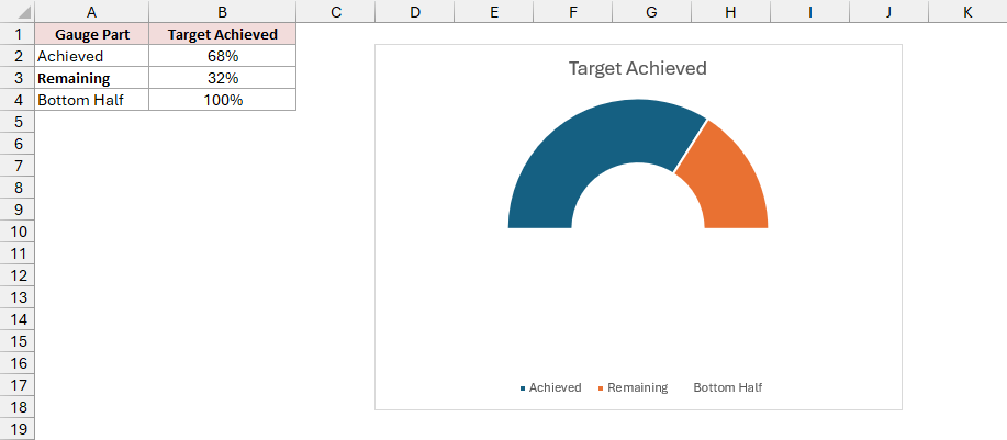
You now have a half-circle gauge, with the legend still showing.
- Finish the look:
- Select the Remaining slice by clicking it twice. On the Format tab, click Shape Fill and pick a light gray.
- Click the legend and press Delete.
- Click the Achieved slice twice, right-click it, and choose Add Data Label > Add Data Label. Excel shows 68% on the slice. With the label selected, use the Home tab to make it bold, white, and size 14.
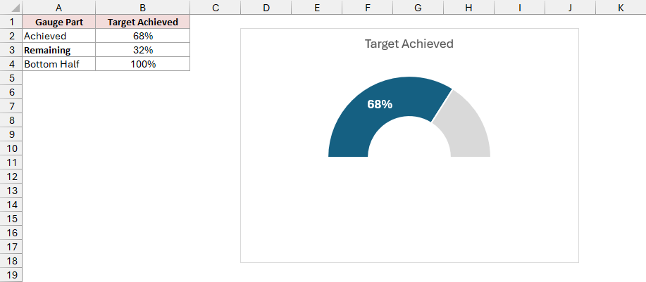
The finished gauge shows a bold white 68% on the dark blue Achieved slice, with light gray for Remaining and nothing at the bottom.
Type a new percentage in B2, such as 85%, and the gauge updates. The Remaining formula recalculates the unfilled portion automatically.
Note: Keep B2 between 0% and 100%. Above 100%, Remaining turns negative and the ring no longer displays correctly.
Method #2: Combining a Doughnut and a Pie Chart
For a classic speedometer chart, I’ll add a needle to a colored half-circle. Pick this option when you want to see which performance zone your value falls in.
The colored half-circle is the dial. You build it from a doughnut chart, then place a pie chart on top to create the needle.
To make the dial, add one slice equal to all the colored slices combined. Rotate this extra slice to the bottom and make it invisible.
For the needle, you hide everything in the overlaid pie except one very thin slice.
Both charts must total 200. The dial has 100 across the visible top and another 100 hidden below, so the pie needs the same total to line up.
Below I have a dataset on the Speedometer sheet with two tables. I’ll use them to show a customer satisfaction score of 74 against colored zones.
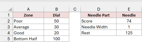
The zone table in A1:B5 has the headers Zone and Dial. Each zone’s number is its width on the 0-to-100 scale:
- Poor: 50, covering 0 to 50.
- Average: 30, covering 50 to 80.
- Good: 20, covering 80 to 100.
- Bottom Half: 100, equal to the three visible zones combined.
The needle table in D1:E4 has the headers Needle Part and Needle:
- Score: E2 contains 74, the value you want the needle to point to.
- Needle Width: E3 contains 1, keeping the visible slice thin.
- Rest: E4 contains the formula below, which returns 125.
=200-E2-E3
Here are the steps to build the colored dial and add its needle:
- Select A1:B5. On the Insert tab, click Insert Pie or Doughnut Chart and pick Doughnut.
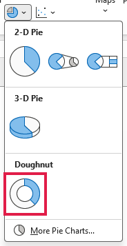
Excel adds a full ring with four slices, one for each row in the zone table.
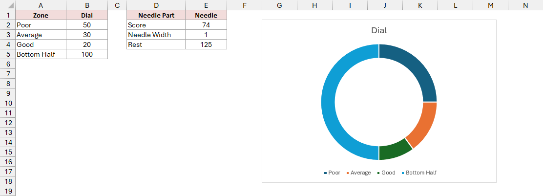
The zone colors will show whether your score falls in the Poor, Average, or Good range.
- Turn the ring into a dial:
- Right-click the ring and click Format Data Series. Under Series Options, set Angle of first slice to 270° and Doughnut Hole Size to 50%.
- Click the Bottom Half slice twice to select only that slice. In Fill & Line, open Fill and select No fill.
- Select each colored slice individually by clicking it twice. Use Format > Shape Fill to make Poor red, Average yellow, and Good green.
- Click the chart title and type Customer Satisfaction Score.
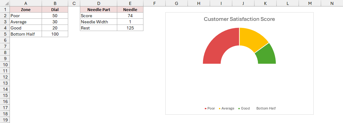
Your colored dial is ready, with its legend still showing. Excel calls each set of chart values a series.
- Right-click the chart and click Select Data. Under Legend Entries (Series), click Add. In the Edit Series box, select E1 for Series name, delete
={1}from Series values, then select E2:E4. Click OK, then OK again.
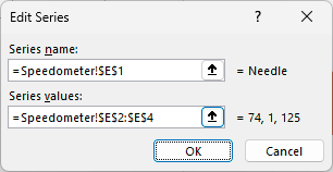
In the Edit Series box, the references are =Speedometer!$E$1 for the name and =Speedometer!$E$2:$E$4 for the values.
Excel adds the needle data as a second ring around the dial. The outer ring is the Needle series. Don’t worry about its appearance yet.
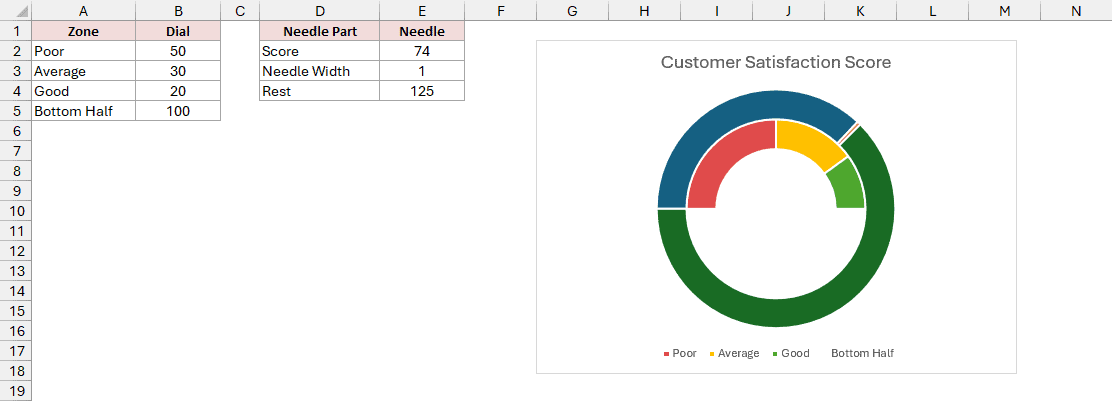
A pie chart can sit over the dial, with its thin slice acting as the needle.
- Right-click the outer ring and click Change Series Chart Type. In the dialog, click Combo in the left list if it isn’t already selected. Set the Needle chart type to Pie and check its Secondary Axis box. Leave Dial as Doughnut, then click OK.
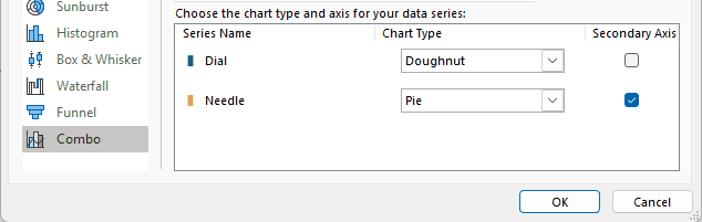
The pie now covers the dial. Both charts need the same starting point for the needle to line up with the zones.
- Right-click the pie and click Format Data Series. Under Series Options, set its Angle of first slice to 270° as well.
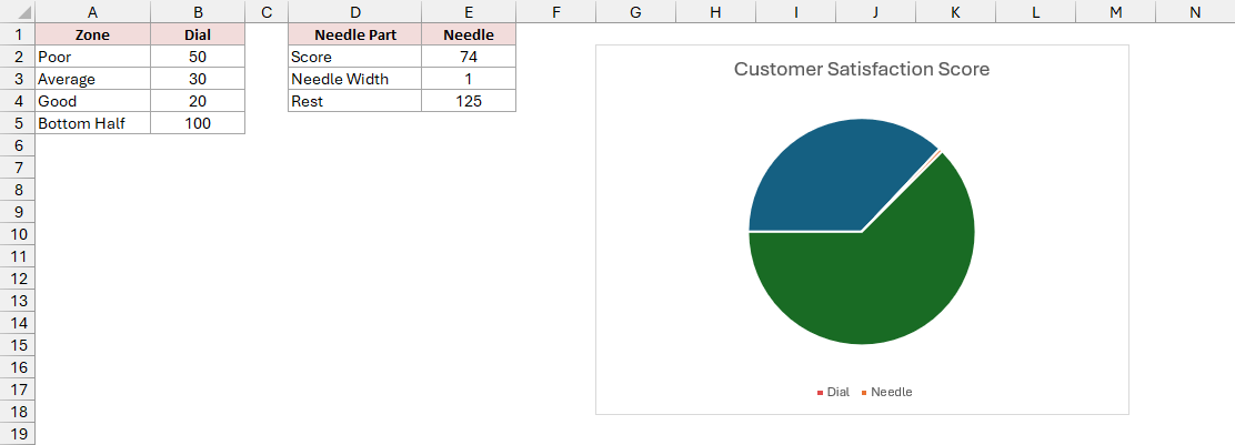
The Score slice now runs from the left edge over the top to about 74. The thin slice between Score and Rest will become your needle.
- Make the needle the only visible part of the pie:
- Click the Score slice twice. In Fill & Line, open Fill and select No fill. Do the same for the Rest slice.
- Click the thin needle slice twice. Set its Fill to Solid fill in black. Under Border, pick Solid line in black so the thin slice is easy to see.
- Click the legend and press Delete.
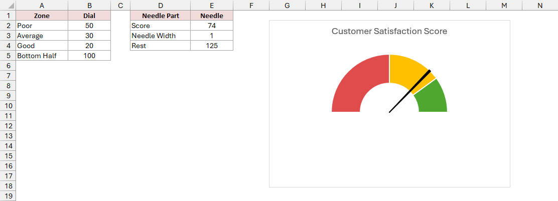
Your finished speedometer has a black needle pointing at 74, inside the yellow Average zone.
Change the score in E2 and the needle moves. Rest recalculates, so the pie always totals 200.
Note: If the needle points to the wrong spot, check that both series use 270° and that the needle values add up to 200, matching the dial.
Additional Notes About Gauge Charts in Excel
Keep these points in mind when you use a gauge in your worksheet:
- A gauge shows one number at a time. To compare several values or follow a trend, you’ll find a bar or line chart easier to read.
- For a different scale, match the hidden half to the visible half. On a 0-to-5,000 dial, make the zones total 5,000 and set Bottom Half to 5,000. Use
=10000-E2-E3for Rest and a needle width of about 25, or half a percent of the maximum. - A score below 0 or above 100 swings the needle into the hidden bottom half. Type the raw score in a spare cell such as G2 and put
=MIN(MAX(G2,0),100)in E2 so the needle and Rest both use the capped value. - Thin white lines between slices are their borders. Select an affected slice and set Border to No line if a gap appears where you don’t want one.
Frequently Asked Questions
Here are answers to a few other questions you might have about your gauge chart.
How do I show the value in the middle of the speedometer?
Select the chart. On the Insert tab, click Text Box and draw it inside the chart under the needle.
With the text box selected, type the following reference in the formula bar and press Enter:
=Speedometer!$E$2
The box shows the score and updates whenever you change E2.
Can I add more zones to the dial?
Yes. Add a row for each zone above Bottom Half, keep Bottom Half equal to the total of the zones, and update the chart range.
Can I make a gauge chart in older Excel?
Yes. Doughnut and pie charts exist in every desktop version. These steps work in Excel 2013 and later; older versions use Format dialog boxes instead of the pane.
Conclusion
I’ve shown you how to build a half doughnut progress gauge and a speedometer by combining a doughnut dial with a pie needle.
Start with Method #1 for a quick progress gauge. Use Method #2 when you want colored zones and a needle pointing at your score.
Other Excel articles you may also like: