A break-even chart in Excel shows you how many units you need to sell before revenue covers total costs.
On the chart, the revenue and total cost lines cross at your break-even point.
Below that point, you lose money; above it, you make a profit.
I’ll show you how to build the revenue and cost formulas, create a scatter chart, and mark the break-even point with a red dot and label.
Set Up the Data for a Break-Even Chart
You need a column of unit volumes, plus revenue and cost amounts for each volume. I’ll calculate those amounts from your fixed costs and per-unit inputs.
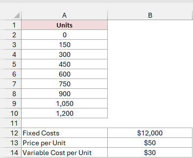
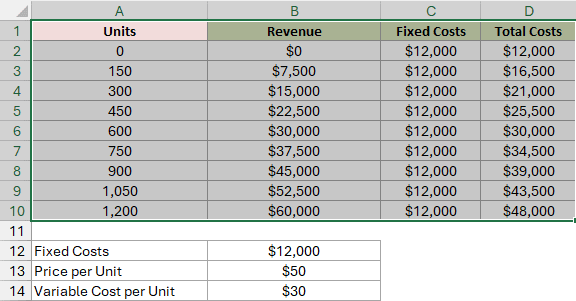
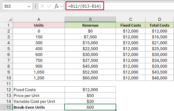
Below I have a dataset with units from 0 to 1,200 in steps of 150, plus three inputs in A12:B14.
The inputs are fixed costs of $12,000, a price per unit of $50, and a variable cost per unit of $30.
First, type Revenue in B1. Then enter this formula in B2 to calculate revenue for every unit count in A2:A10:
=A2:A10*$B$13
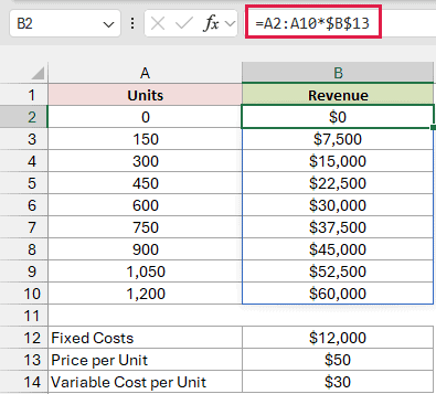
The formula multiplies each unit count by the $50 price in B13. It spills the results into B2:B10 automatically, so you don’t need to copy it down.
The dollar signs keep the reference to B13 fixed.
Next, type Fixed Costs in C1. Then enter this formula in C2 and copy it down to C10:
=$B$12
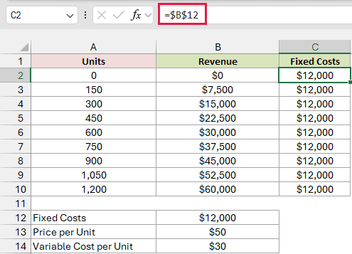
A single-cell reference doesn’t spill, so you copy it down to C10. The same $12,000 in every row gives you a flat fixed-cost line.
Type Total Costs in D1, then enter this formula in D2:
=$B$12+A2:A10*$B$14
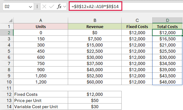
The formula adds $12,000 in fixed costs to the $30 variable cost for each unit sold. It spills the results into D2:D10 automatically.
At 600 units, Revenue and Total Costs both equal $30,000. That’s already your break-even point; now I’ll make it visible on the chart.
Note: The B2 and D2 formulas spill only in Microsoft 365 and Excel 2021 or later. In Excel 2019 and earlier, enter =A2*$B$13 in B2 and =$B$12+A2*$B$14 in D2, then copy both down to row 10.
Create the Break-Even Chart
With your unit volumes and calculated amounts in A1:D10, here’s how to plot revenue and costs against units sold:
- Select A1:D10, including the headers.
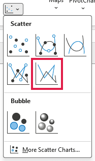
- On the Insert tab, in the Charts group, click Insert Scatter (X, Y) or Bubble Chart and choose Scatter with Straight Lines.
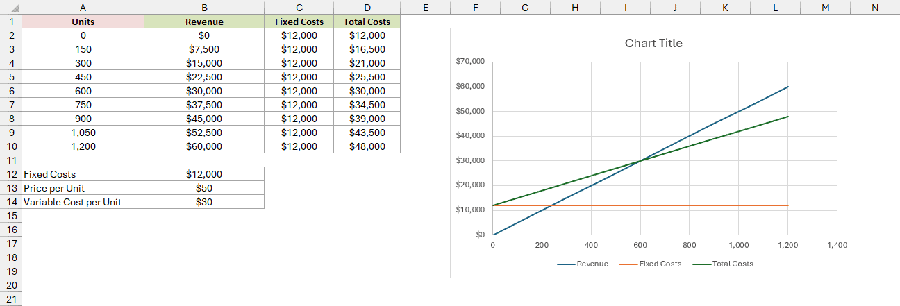
Excel uses Units for the horizontal axis and adds three lines, with a legend at the bottom. The title still reads Chart Title.
The blue Revenue line starts at $0, while the green Total Costs line starts at $12,000. They cross at 600 units and $30,000.
The orange Fixed Costs line stays flat at $12,000.
Next, give the chart and its axes names so you can tell what each scale represents:
- Click the Chart Title text and type Break-Even Chart.
- Click the chart, then click the Chart Elements button (the plus sign at its top right) and check Axis Titles. Click each Axis Title placeholder. Type Units Sold for the horizontal axis and Amount ($) for the vertical axis.
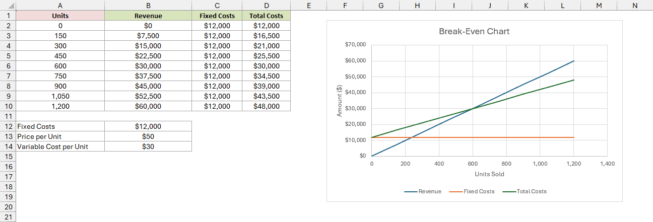
Note: If you pick a line chart instead, Excel spaces the unit numbers evenly like text labels, or plots Units as a fourth line. A scatter chart gives you a true number axis for reading the break-even point.
Mark the Break-Even Point on the Chart
You can see roughly where the lines cross, but a marked, labeled point tells you the exact number of units needed to break even.
Calculate the Break-Even Point
I’ll use the inputs in B12:B14 to calculate the point’s position.
Type Break-Even Units in A15, then enter this formula in B15:
=B12/(B13-B14)
How does this formula work?
Each unit sells for $50 and costs $30 to make. That leaves $20 from each sale to cover your fixed costs.
The formula divides $12,000 by that $20, returning 600 units. At that volume, you’ve covered all your costs without making a profit yet.
Type Break-Even Revenue in A16, then enter this formula in B16:
=B15*B13
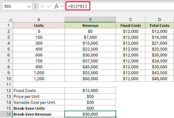
This returns $30,000, your sales amount at the break-even point. It matches Total Costs at 600 units.
Add the Break-Even Point to the Chart
You’ll add a new series containing one point, using B15 as its horizontal (X) value and B16 as its vertical (Y) value.
Here are the steps to add it to your scatter chart:
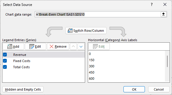
- Right-click the chart and choose Select Data. The Select Data Source dialog opens, with Revenue, Fixed Costs, and Total Costs under Legend Entries (Series).
- Click Add to open Edit Series. Enter Break-Even Point as the Series name. For Series X values, select B15. Clear the default
={1}from Series Y values, then select B16.
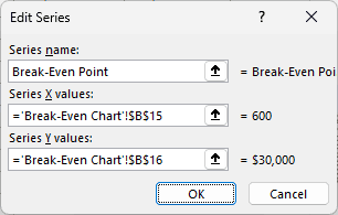
In the example file, the X values box should show ='Break-Even Chart'!$B$15, and the Y values box should show ='Break-Even Chart'!$B$16.
Finish adding the series:
- Click OK in the Edit Series dialog, then OK in the Select Data Source dialog.
You won’t see a new point yet. This chart type draws lines without markers, and a single point has no line to draw.
You’ll see Break-Even Point in the legend, though. To make the point visible, select its series and give it a marker:
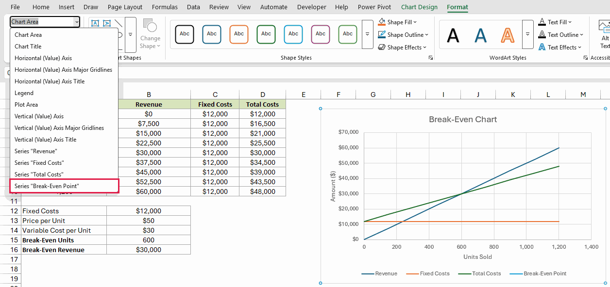
- Click the chart and go to the Format tab. In the Current Selection group at the far left, open the Chart Elements drop-down and pick Series “Break-Even Point”.
- Click Format Selection, then in the Format Data Series pane click Fill & Line (the paint bucket) and then Marker.
Set these options:
- Marker Options: Built-in, Type circle, Size 10
- Fill: Solid fill, red
- Border: Solid line, the same red
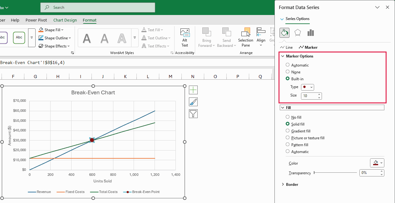
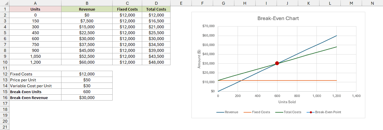
You now have a red dot exactly where the Revenue and Total Costs lines cross, at 600 units and $30,000.
Add a Label to the Break-Even Point
I’ll build the label from the break-even units in B15.
Type Chart Label in A17, then enter this formula in B17:
="Break-even: "&TEXT(B15,"#,##0")&" units"
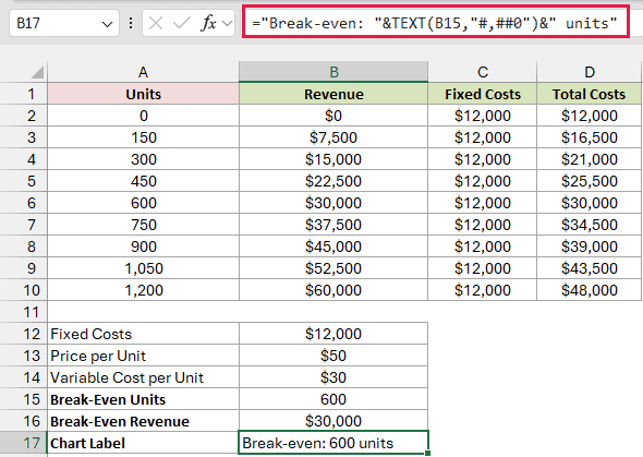
The formula returns Break-even: 600 units. TEXT formats the number with a thousands separator when needed, and the label updates when your inputs change.
Here’s how to use B17 as the label:
- Pick Series “Break-Even Point” from the Format tab’s Chart Elements drop-down again, then click the Chart Elements plus button next to the chart. Point to Data Labels, click its arrow, and choose More Options.
- In the Format Data Labels pane, under Label Options > Label Contains, check Value From Cells. Select B17 in the Data Label Range box and click OK. Uncheck Y Value so the label doesn’t also show the Y value. Under Label Position, choose Left.
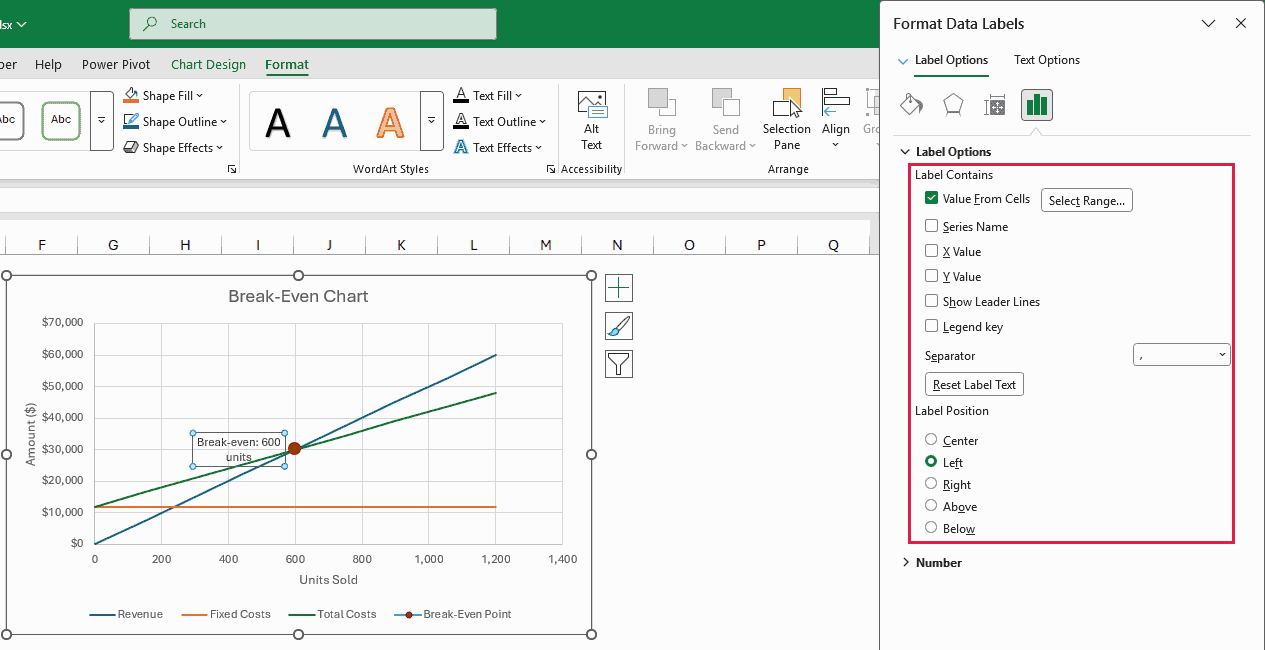
Your finished chart shows Break-even: 600 units to the left of the red dot.
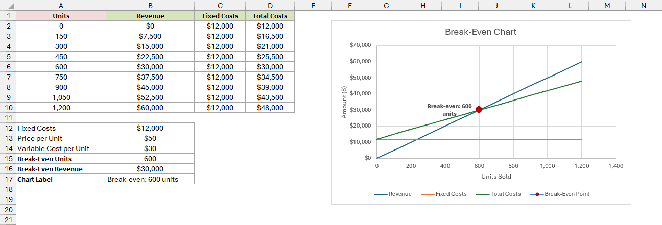
Change any of the three inputs, and your table and chart update, including the dot and its label, to show the new break-even point.
Additional Notes About Break-Even Charts in Excel
- Try a different selling price. Change B13 to $60, and the break-even point drops to 400 units at $24,000. Each unit now leaves $30 to cover fixed costs.
- Keep the Units column running past the break-even point (up to 1,200 here). Otherwise, the red dot sits beyond the ends of the lines. Add more Units values, change A2:A10 in the B2 and D2 formulas to cover them, copy C2 down, and extend each series in Select Data.
- Your price must exceed the variable cost per unit. Equal amounts return
#DIV/0!in B15; a lower price returns a negative number. Neither gives you a break-even point because sales can’t cover fixed costs.
Frequently Asked Questions
Here are a few more details about calculating break-even amounts and creating the chart on a Mac.
How do I calculate the break-even point in sales dollars?
B16 already gives you this. To skip the units step, use:
=B12/(1-B14/B13)
This returns $30,000. Each sales dollar leaves $0.40 after variable costs, so you divide $12,000 by 0.40 to find the sales needed.
How do I round up the break-even point to whole units?
Use ROUNDUP in B15 when the calculation returns a fraction:
=ROUNDUP(B12/(B13-B14),0)
For example, a $14 variable cost gives you 12,000 / 36 = 333.33 units. B15 shows 333 because of its number format, but you actually need 334.
ROUNDUP returns 334, the whole-unit sales target you need because you can’t sell part of a unit.
Can I create a break-even chart in Excel on a Mac?
Yes. Go to Insert > X Y (Scatter) > Scatter with Straight Lines.
For axis titles and the data label, use Chart Design > Add Chart Element instead of the plus button.
Conclusion
I’ve shown you how to calculate revenue and costs, create a scatter chart, and mark the break-even point with a separate series, red marker, and cell-driven label.
Now you can change your costs or selling price and see how many units you’ll need to sell to cover them.