How to Create a Histogram in Excel
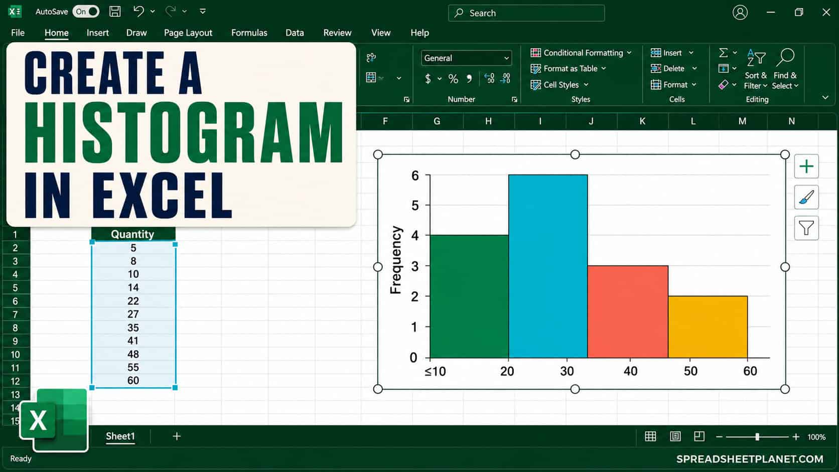
If you want to see how your numbers are spread out, a histogram makes the pattern easy to spot. It groups values into intervals, called bins, and shows how many …

In this section, you will find easy-to-follow tutorials about creating charts in Excel. It also covers simple tips and how-tos about Excel charting.
If you want to see how your numbers are spread out, a histogram makes the pattern easy to spot. It groups values into intervals, called bins, and shows how many …

In Excel, you can create dynamic chart titles that automatically update based on changes in specific cells. The process removes the need to manually adjust the titles whenever your data …

A Sankey diagram, also known as a Sankey chart, visualizes the movement or flow of resources, energy, or data between different points, showing how quantities flow from one set of …

When you insert a chart into a worksheet, Excel places it roughly in the center of the Excel window, close to the source data. However, to enhance readability—especially since many …

A scatter plot or an XY graph is a type of graph used to display and analyze the relationship between two different variables. The horizontal (x-axis) and vertical (y-axis) axes …

Whether creating charts in Excel, it’s important to know how to resize your charts to fit your needs. A chart that’s too small can be hard to read, while one …

Sparklines allow you to place small charts within the cells in a worksheet in Excel. You can have your data in a row and then create a sparkling that shows …

When we create Excel charts, we have to make them more engaging to users. Bubble charts are such attractive chart types to show complex data. When we use different bubble …

Overlaying graphs in Excel can be useful when you want to show different data series on a single graph, making comparisons and correlations more evident. For example, if you have …

When making charts in Microsoft Excel, we need to add titles to the horizontal and vertical axis so the reader can know what the axis represents. Excel is an excellent …

Charts are an excellent way of visualizing data. Whether you want to show a trend or a comparison between multiple values, charts are one of the best ways to represent …

A border makes a chart in Excel stand out and attract the readers’ attention. If you have multiple charts on the same sheet, adding a border also makes them look …