When we create Excel charts, we have to make them more engaging to users. Bubble charts are such attractive chart types to show complex data.
When we use different bubble sizes, and different bubble colors to show patterns in a scatter diagram, we call that chart a bubble chart.
Creating a bubble chart in an Excel sheet is not as complex as you think. Using Excel, we can create a beautiful bubble chart as below.
In this article, I am going to show you how to create a simple bubble chart (all bubbles with the same color) as well as creating an advanced bubble chart (different bubble colors for different segments).
At the end of this article, I also discuss some of the drawbacks associated with using bubble charts.
Creating a Simple Bubble Chart
In a scatter diagram, we have X values and Y values for data points.
When there is another set of values (Z values) also to each data point, the bubble chart is the ideal chart to show that data.
Below I have data for 5 companies in our group.
Column A represents the company name, column B shows the revenue in millions, column C shows the growth rate of each company, column D shows the market share percentage of each company, and the last column of the table shows the industry of the company.

Now I need to create a simple bubble chart for the above data. I can do it by following the below steps.
- Go to the “Insert” tab.

- Click the “Insert Scatter (X, Y) or Bubble Chart” icon (Which is in the Charts group).
- Go to the Bubble chart section and select “3-D Bubble” from the expanded list.

- Select the Blank chart and go to the “Chart Design” tab.

- Click the “Select Data” icon from the “Data” group.
- Keep the cursor on the Chart data range box and select the data values for x, y, and z. X values are for the X-axis of the chart, y values are for the Y-axis of the chart and z values are for the bubble size. In this case, I am selecting cells B2 to D6 as the chart data range. I am selecting only data values. Column headers are not selected as a part of the data range.

- Click the Edit button of the Legend Entries (Series) section to open the “Edit Series” dialog box.

- Select the column header of bubble size as the series name. In this example, I am selecting cell D1 as the series name. Then, click the “OK” button of the “Edit Series” dialog box and the “Select Data Source” dialog box.

Now I can see the basic bubble chart for my data.

I can modify the appearance of my chart by adding a chart title, axis titles, and legends.
To do that, I click the chart and expand the “Chart Elements”.
When I do the above modifications, my chart looks like below.

Also read: Create Bar of Pie Chart in Excel?
Adding Data Labels to the Bubble Chart
In the above chart, I have to add data labels. Otherwise, I can’t identify which company is representing each bubble.
To add labels, I have to follow the below steps.
- Select the chart and expand the chart elements.
- Expand the options of “Data Labels”.

- Click “More Options…”.

- Select label options. We can select values from cells also. So, I am selecting company names. First I check the “Value From Cells” option and select the cells that contain company names (Cells A2 to A6) in the “Data Label Range” dialog box. Finally, click the “OK” button.

I can add other label options also. So, I am selecting the bubble size also.

- Expand the Separator options and Select the separator for label options.

- Finally, select the label position.

If we want, we can manually drag the labels to the best-fit position.
Apply Chart Styles to Bubble Chart
Excel has given us some in-built chart styles that we can apply quickly to our chart styles.
When we apply chart styles, it gives a more professional look to our charts. To apply a chart style to the bubble chart, I have to follow the below steps.
- Select the chart and go to the “Chart Design” tab.

- Go to the “Chart Styles” group and expand the “Change Colors” drop-down and Select a color palette.

- Select a suitable chart style from the “Chart Styles” group.

When I apply a chart style, it looks like below.

Highlight a Specific Bubble in the Bubble Chart
Now, I want to highlight company D in this bubble chart because our focus is on company D. To highlight a specific bubble, I can change the color of that bubble. To change the color of a bubble, I can follow the below steps.
- Click on the bubble that we want to highlight and select that bubble. In this case, I am selecting the bubble of Company D.

- Go to the “Format” tab.

- Go to the “Shape Styles” group and change the style of the selected bubble. In this case, I am only changing the color of the bubble. So, I expand the Shape Fill options and select the Green color.
After I modify the above bubble chart, it looks like this.

Also read: Add a Trendline in Excel Charts
Creating an Advanced Bubble Chart
Using different bubble colors to show different segments of data is very common in bubble charts.
It is not difficult to get different bubble colors for different segments.
Below I have data for 5 companies in our group. Column A represents the company name, column B shows the revenue in millions, column C shows the growth rate of each company, column D shows the market share percentage of each company, and the last column of the table shows the company’s industry.
Now I need to create a bubble chart for the above data. Further, I want to use different bubble colors for different industries.
As I need to use different bubble colors based on industry, I have to follow the below steps.
- Sort the Data table segment-wise. In this case, I want the bubble colors based on industry. So, I am sorting the source data based on the industry column (Column E). The purpose of sorting is to get data points of the same segments together.

- Go to the “Insert” tab.
- Click the “Insert Scatter (X, Y) or Bubble Chart” icon (Which is in the Charts group).
- Go to the Bubble chart section and select “3-D Bubble” from the expanded list.
- Select the Blank chart and go to the “Chart Design” tab.
- Click the “Select Data” icon from the “Data” group.
Then we can see the “Select Data Source” dialog box.
- Click the “Add” button of the “Legend Entries (Series) section.

- Select the first segment name for the Series name. In this case, I am selecting cell E2 to get the first series name as “Health”.

- Then, I have to select X values, Y values, and bubble size values of the first segment data points. So, I am selecting X values, Y values, and bubble size values of companies in the Health Industry (Up to row number 4). Then, click the “OK” button.

- Again click the “Add” button of the “Legend Entries (Series) section.

- Select the second segment name for the Series name. In this case, I am cell E5 to get the first series name as “Agri”.

- Then, I have to select X values, Y values, and bubble size values of the second segment data points. So, I am selecting X values, Y values, and bubble size values of companies in the Agri Industry (Row numbers 5 to 6). Then, click the “OK” button.

- Click the “OK” button of the “Select Data Source” dialog box.

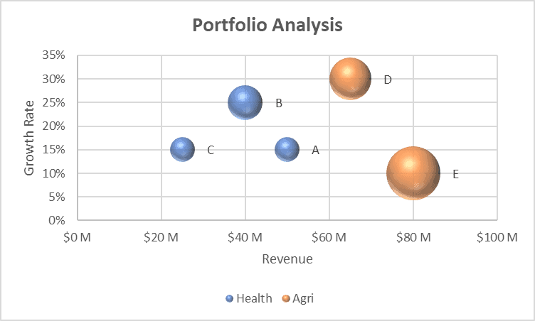
Then, we will get a bubble chart like below.

Even Though, I initially selected a 3-D bubble chart, after creating the chart it is not 3-D. I can go to the “Chart Design” tab and use the “Change Chart Type” icon to convert the chart to 3-D Bubble chart.

But, I need to go to the “Chart Design” tab >> “Select Data” icon in the Data group >> “Edit” button of the Legend Entries (Series) section and update the X values for each series again.
Now, I have my 3-D bubble chart.

I can modify the appearance of my chart by adding a chart title, axis titles, data labels, and legends. To do that, I click the chart and expand the “Chart Elements”.

After I modify the above bubble chart, it looks like this.

Now you have learned how to create a bubble chart in Excel. Use the bubble charts on your reports to give a more professional look to your reports.
Also read: How to Create a Waterfall Chart in Excel?
Drawbacks of Bubble Charts
The bubble charts look great, but there are some drawbacks about bubble charts that you need to know about:
Perceptual difficulty: Our eyes have difficulty accurately comparing the areas (or volumes, in the case of 3D bubbles) of circles. This can make it difficult to interpret the difference between bubbles accurately.
Overlapping bubbles: In a crowded bubble chart, bubbles can overlap, obscuring data. While some transparency can help mitigate this issue, it can also make the chart more complicated to interpret.
Can Become Cluttered: Bubble charts are less effective for large datasets. They can quickly become cluttered and unreadable when displaying too many bubbles.
Color perception: If color is used to represent a fourth data variable, there can be issues with interpretation as not everyone perceives colors in the same way. This can also make the chart inaccessible to color-blind users.
No zero value representation: Bubble charts cannot show zero or negative values for the third variable, which is represented by the size of the bubble. O if you’re trying to plot net income using bubble charts, and if the net income is negative for some companies, you shouldn’t be using bubble charts.
Misinterpretation: A common misconception with bubble charts is that the data point is at the center of the bubble when it is actually at the base. This could lead to inaccurate reading of the data.
Requires more effort to create and understand: Compared to simpler data visualizations like bar or line graphs, bubble charts require more effort to create and can be more difficult for viewers to understand.
Despite these drawbacks, bubble charts can still be useful in certain circumstances where the data has a clear and compelling story that the chart can help to tell.
Other Excel articles you may also like: