A stacked bar chart in Excel gives each category one horizontal bar, split into colored segments for its parts.
You can compare the overall size and the mix at a glance.
Excel can also make every bar the same length to compare shares, but adding totals and matching your data’s order take extra steps.
I’ll show you stacked and 100% stacked bars, how to convert an existing chart, and how to add labels and fix the bar order.
Method #1: Using the Stacked Bar Chart Option
I recommend this option for most readers. You get one bar per store, with its length showing total units sold and its segments showing the products.
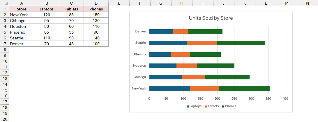
Below I have a dataset of units sold by store in A1:D7, with Store, Laptops, Tablets, and Phones as headers. I want to compare each store’s total and its product mix.
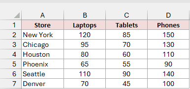
Here are the steps to make the stacked bar chart:
- Select A1:D7, including the headers.
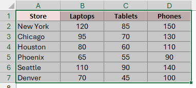
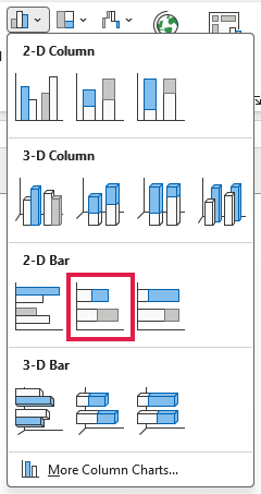
- On the Insert tab, in the Charts group, click Insert Column or Bar Chart. Under 2-D Bar, click Stacked Bar.
Excel adds the chart. Each store has one bar split into Laptops, Tablets, and Phones. The legend at the bottom tells you which color represents each product.
Click the default Chart Title text and type your title. I’ve used Units Sold by Store.
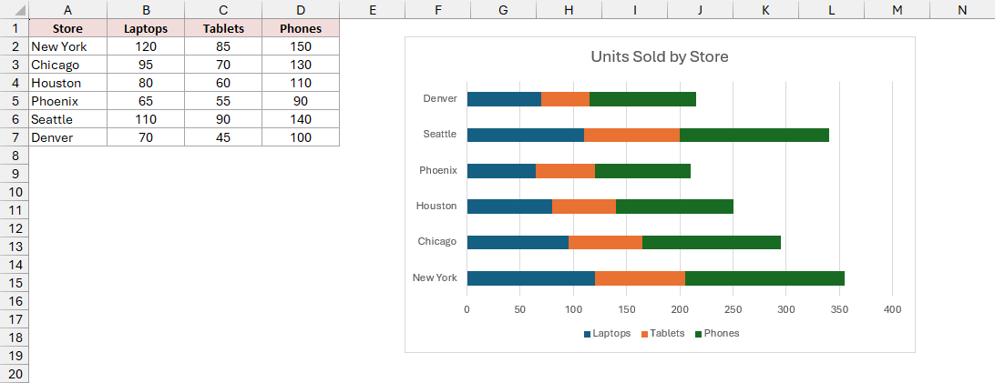
Note: Excel plots the first data row at the bottom, so New York (row 2) is the bottom bar and Denver is the top. You can flip this using the steps under Show the Bars in the Same Order as Your Data.
Method #2: Using the 100% Stacked Bar Chart Option
A 100% stacked bar chart makes every bar the same length, so you compare each product’s share instead of total units.
Below I have a dataset of units sold by store in A1:D7, with Store, Laptops, Tablets, and Phones as headers. I want to compare each product’s share.
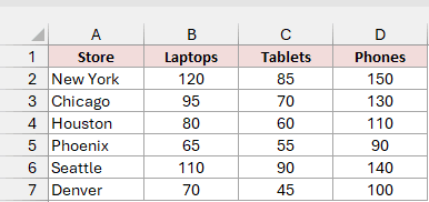
Here are the steps to make the 100% stacked bar chart:
- Select A1:D7, including the headers.
- On the Insert tab, click Insert Column or Bar Chart. Under 2-D Bar, click 100% Stacked Bar.
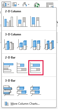
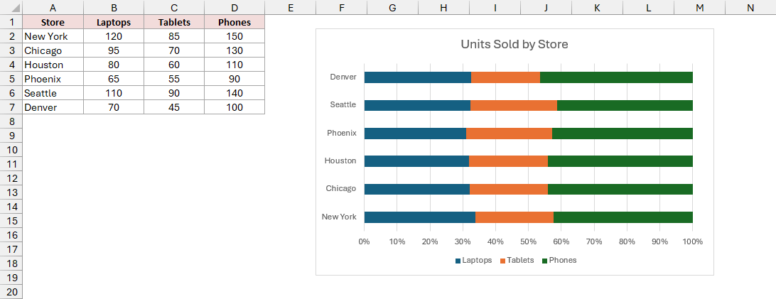
Every bar now runs to 100%, and the horizontal axis shows percentages from 0% to 100%.
Phoenix sells 65 laptops out of 210 units, so its blue segment ends at about 31%.
Note: Data labels on a 100% stacked bar show raw numbers, such as 65, 55, and 90, rather than percentages. To show percentages, point labels at a range of percentage cells using Value From Cells, as shown in the total labels section below.
Method #3: Changing an Existing Chart to a Stacked Bar
You can also stack a chart you’ve already made. If your chart has bars sitting side by side, you don’t need to start over.
Below I have a clustered bar chart made from the same store data in A1:D7, with Store, Laptops, Tablets, and Phones as headers. I’ll stack its bars.
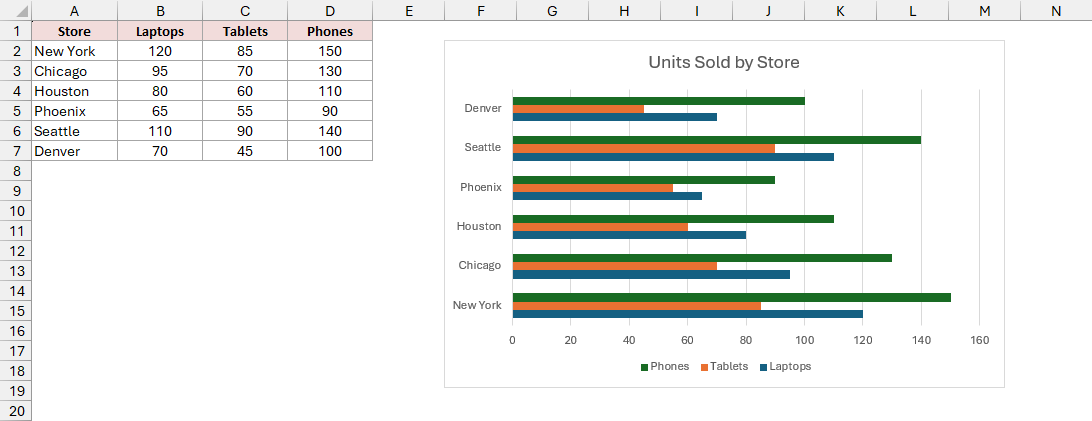
Here are the steps to change the existing chart:
- Right-click an empty area of the chart, rather than a bar, and click Change Chart Type.
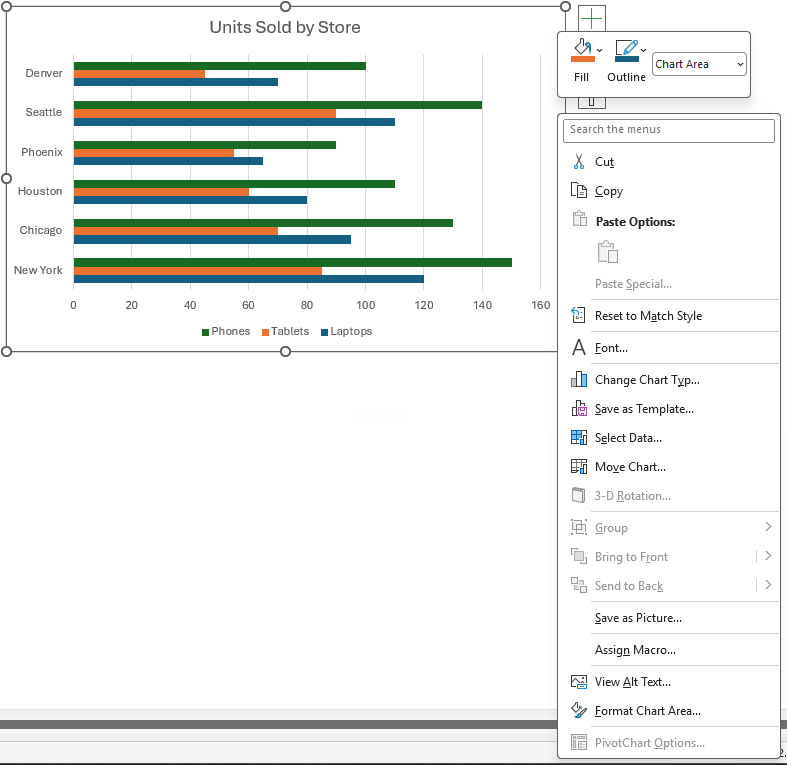
- In the Change Chart Type dialog box, Bar is already selected on the left because this is a bar chart. Click the Stacked Bar icon at the top (the second icon), then click OK.
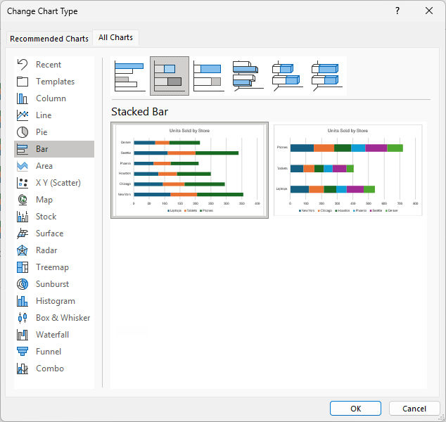
You now have the same chart with its bars stacked. Your chart title and formatting stay in place.
To get a 100% stacked bar instead, click the third icon in that dialog.
How to Customize Your Stacked Bar Chart
A few small changes make the chart much easier to read.
Add Data Labels to Each Segment
You can print each segment’s number directly on its bar. These numbers are called data labels, and they save you from checking the sheet for each value.
Here are the steps to add the labels:
- Click the chart.
- Click the Chart Elements button (the plus icon at the top right of the chart) and check Data Labels.
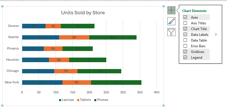
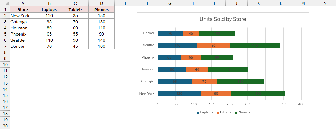
Each segment now shows its value in the center. On the New York bar, you’ll see 120 for laptops, 85 for tablets, and 150 for phones.
Add Total Labels at the End of Each Bar
Excel has no built-in option to show each bar’s total on a stacked chart. I use an extra column of zeros to give those totals a place.
The zeros add nothing to the bars, but their labels sit at the end. This extra plotted column is a helper series, which I’ll call Spacer.
You can then point its labels at cells containing your totals.
Here are the steps to add total labels:
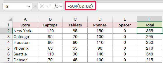
- Add a Spacer column in E and enter 0 in E2:E7. Add a Total column in F. In F2, enter the formula below, then copy it down to F7.
=SUM(B2:D2)
The formula adds the three product values for each store. F2 returns 355 for New York.
- Select A1:E7, including Spacer but excluding Total. On the Insert tab, click Insert Column or Bar Chart, then Stacked Bar under 2-D Bar. Click the chart’s Chart Elements button and check Data Labels.
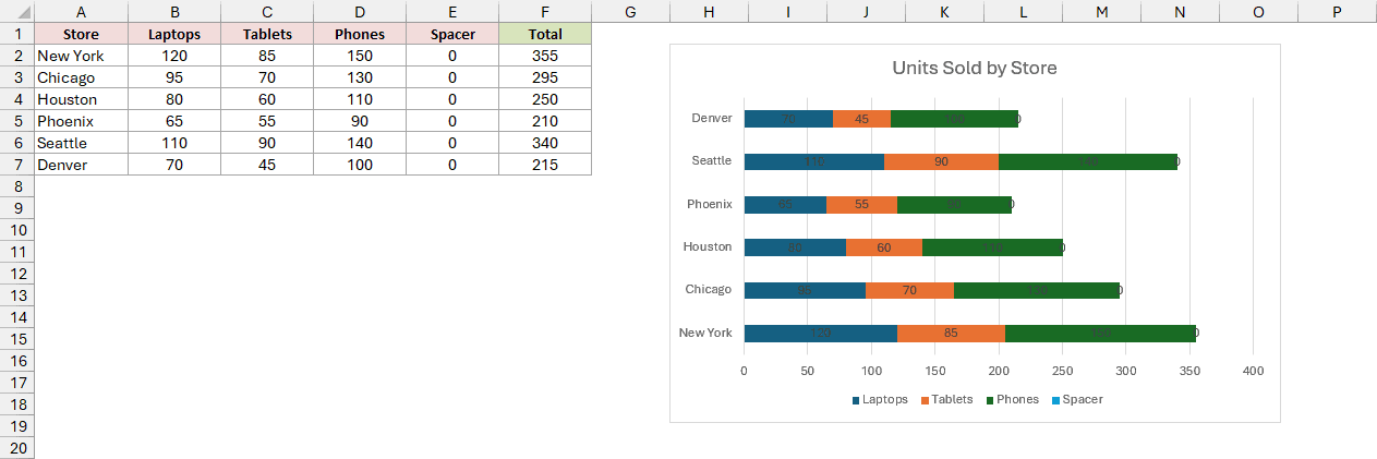
You’ll see a 0 at the end of every bar, and Spacer appears in the legend.
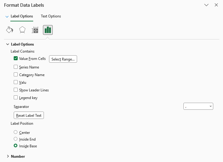
- Click any 0 label to select all the zero labels, then press Ctrl + 1 to open the Format Data Labels pane. Under Label Options, check Value From Cells. Select F2:F7 in the Data Label Range box and click OK.
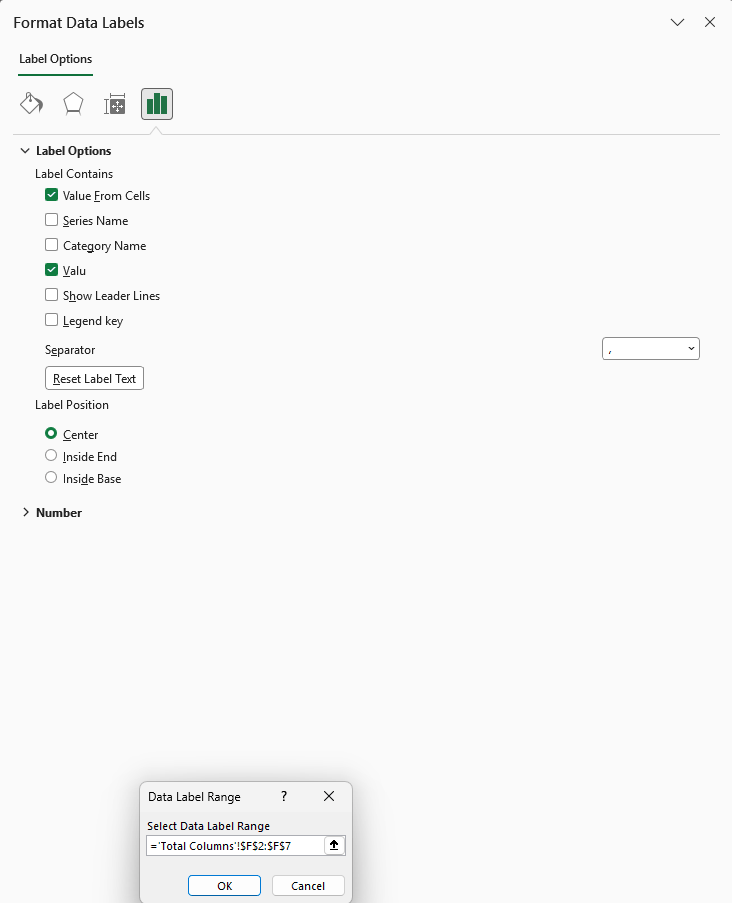
- Still in the pane, uncheck Value to remove the 0. Set Label Position to Inside Base, which puts each total just past the end of its bar.
- Click the legend, then click the Spacer entry so only that entry is selected. Press Delete.
Each bar now ends with its total: New York 355, Chicago 295, Houston 250, Phoenix 210, Seattle 340, and Denver 215.
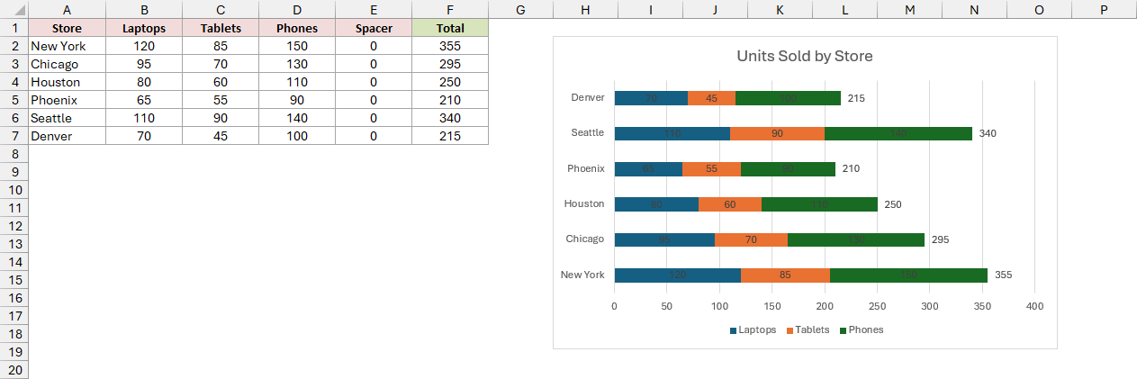
Note: Value From Cells needs Excel 2013 or later. The labels are linked to F2:F7, so they update when your data changes.
Show the Bars in the Same Order as Your Data
Right now, New York, the first store in your data, is at the bottom. You can make the bars read from top to bottom like your sheet.
Here are the steps to reverse the stacked bar chart’s order:
- Right-click the store names on the left of the chart (the vertical axis) and click Format Axis.
- Under Axis Options, check Categories in reverse order. Under Horizontal axis crosses, choose At maximum category.
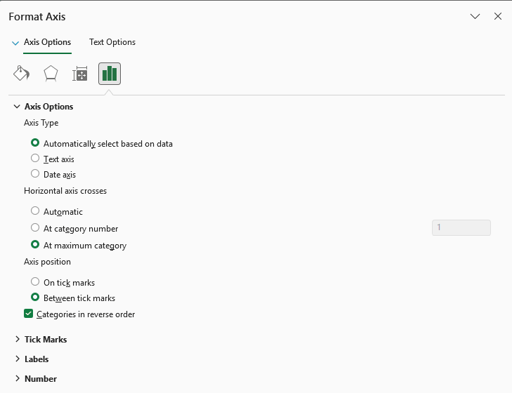
Without the second setting, the number axis jumps to the top when you reverse the order.
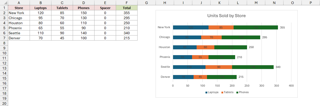
New York is now the top bar and Denver the bottom, matching your sheet. The legend and numbers stay at the bottom.
Additional Notes About Stacked Bar Charts in Excel
Keep these points in mind when you’re setting up your chart:
- Keep the number of segments small, ideally three to five. Middle segments are harder to compare because they don’t start from the same line.
- On the Chart Design tab, Switch Row/Column swaps what makes the bars and segments. Here, you’d get one bar per product, split by store.
- To make the bars thicker, lower Gap Width in Format Data Series. A smaller gap leaves more room for each bar.
- Before charting, turn your data into an Excel Table with Ctrl + T. The chart will then pick up new rows automatically.
Frequently Asked Questions
Here are a few other questions you may have about stacked bar charts in Excel.
How do I change the colors of a stacked bar chart in Excel?
Click a segment once to select the whole series, then use Shape Fill on the Format tab. You can give each product its own color.
Can I make a stacked bar chart from a PivotTable?
Yes. Click inside the PivotTable, then go to Insert > PivotChart. Pick Bar > Stacked Bar.
What is the difference between a stacked bar chart and a stacked column chart?
A stacked bar chart runs horizontally, while a stacked column chart runs vertically. You’ll find both in the same Insert Column or Bar Chart menu.
I find horizontal bars easier to read when the category names are long.
Conclusion
I’ve covered stacked and 100% stacked bars, converting an existing chart, and adding segment labels, totals, and the correct store order.
Start with Method #1 for comparing totals and their parts. Choose 100% stacked bars when you want to compare shares instead.
Other Excel articles you may also like:
- How to Create a Stacked Waterfall Chart in Excel
- How to Create a Gantt Chart in Excel
- How to Create a Waterfall Chart in Excel?
- How to Make a Pie Chart in Excel (With Percentages)
- How to Create Bar of Pie Chart in Excel?
- How to Create a Histogram in Excel
- How to Make Box Plot (Box and Whisker Chart) in Excel?
- How to Overlay Graphs in Excel