If you want to see how your numbers are spread out, a histogram makes the pattern easy to spot.
It groups values into intervals, called bins, and shows how many values fall into each one.
Excel has a dedicated Histogram chart command. The Data Analysis ToolPak and FREQUENCY function are also useful when you want an output table or formula-driven counts.
In this article, I’ll walk you through all three methods.
Method #1: Using the Insert Histogram Chart
The quickest way to build a histogram is the dedicated Histogram chart type.
You pick your numbers, and Excel bins them and draws the bars for you.
This is the one I reach for first for most datasets.
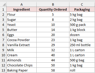
Below I have a bakery’s ingredient order log. Column A lists the ingredient, column B has the quantity ordered (a count of units), and column C notes the packaging.
I want a histogram of the quantities in column B, so I can see how the order sizes cluster.
Here are the steps to create the histogram:
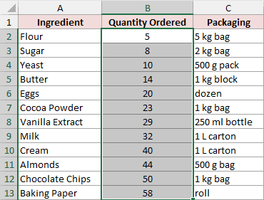
- Select only the quantity values in column B (B2:B13). Leave the ingredient names out so Excel bins the numbers, not the labels.
- On the Insert tab, click the Insert Statistic Chart icon, then choose Histogram from the drop-down.
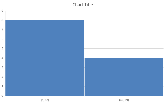
Excel drops in a histogram right away, but it picks the bins for you. To match clean ranges of 10, I’ll adjust the axis.
- Right-click the horizontal axis and choose Format Axis. Under Axis Options, set Bin width to 10 and set the Underflow bin to 10.
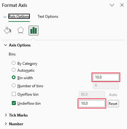
Setting the Underflow bin to 10 makes the first bin include every value less than or equal to 10.
With a Bin width of 10, each later bin continues from that cut-off in steps of 10.
The intervals are 10 or less, then greater than 10 and up to 20, greater than 20 and up to 30, and so on.
Because this example contains whole-number quantities, the later intervals can also be labeled 11-20, 21-30, and so on.
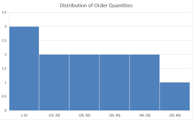
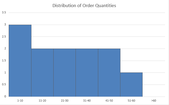
That gives me bars of 3, 2, 2, 2, 2, and 1 across the six ranges, which adds up to all 12 ingredients.
Note: The dedicated Histogram chart is available in Excel 2016 and later on Windows, supported current versions of Excel for Mac, and Excel for the web. There is no separate Bin start setting. Use the Underflow bin for values at or below a chosen cut-off, then use Bin width or Number of bins to control the remaining intervals.
Method #2: Using the Data Analysis ToolPak
If you’d rather get a frequency table alongside the chart, the Data Analysis ToolPak is a good pick.
It lets you set your own bin cut-off points and gives you both the counts and an optional chart.
The ToolPak is a free add-in that ships with Excel but is switched off by default.
I’m using the same bakery order log.
This time I’ve also typed my bin cut-off points into column E: 10, 20, 30, 40, 50, and 60.
Each number is the top of a range.
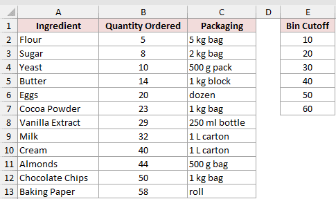
First, turn the add-in on if you haven’t already:
- Go to File, then Options, then Add-ins. At the bottom, set Manage to Excel Add-ins and click Go. Check Analysis ToolPak and click OK.
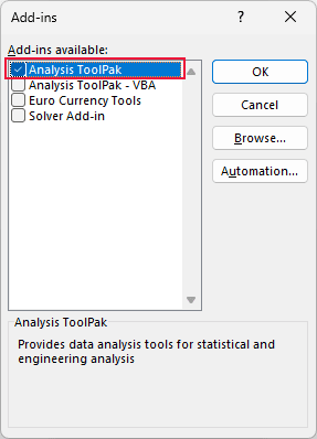
On Mac, choose Tools > Excel Add-ins, select Analysis ToolPak, and click OK. Restart Excel if prompted.
Now build the histogram:
- On the Data tab, click Data Analysis. Pick Histogram from the list and click OK.
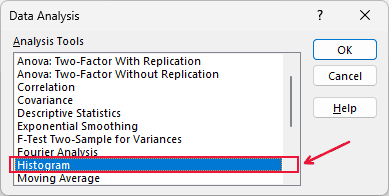
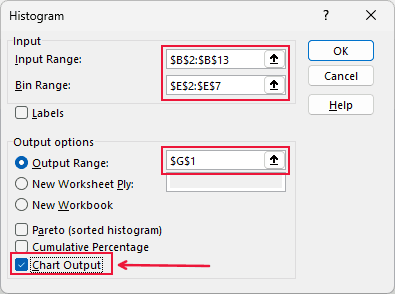
- Set the Input Range to your quantity values (B2:B13) and the Bin Range to your cut-off points (E2:E7). Pick an output cell, tick Chart Output, and click OK.
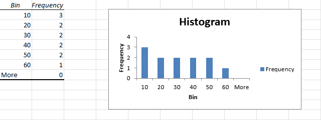
Excel writes out a small table with each bin and its frequency, plus a chart.
The counts read 3, 2, 2, 2, 2, 1, and a “More” row of 0 for anything above 60.
That’s the same distribution the built-in chart gave me.
Note: The ToolPak output is a static snapshot. If your data changes, the table and chart won’t refresh on their own, so run the Histogram tool again. The add-in is available in supported desktop versions of Excel for Windows and Mac, but not in Excel for the web.
Method #3: Using the FREQUENCY Function
If the ToolPak isn’t available to you, or you want counts that update as your data changes, the FREQUENCY function is the way to go.
It counts how many values fall into each bin, and then you plot those counts as a column chart to get the histogram look.
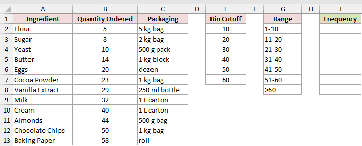
I’ve got the same order log, with quantities in B2:B13.
In column E I’ve listed the bin cut-off points (10 through 60).
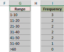
In column G I’ve written labels for this positive whole-number dataset: 1-10, 11-20, through to a “>60” catch-all.
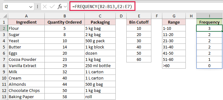
Here is the formula I put in cell I2:
=FREQUENCY(B2:B13,E2:E7)
How does this formula work?
FREQUENCY takes two things: the data you want to count (B2:B13) and your bin cut-off points (E2:E7). It returns how many values fall into each bin.
The first result counts values less than or equal to the first cut-off, 10.
Each later result counts values greater than the previous cut-off and less than or equal to the current one.
The final result counts values above the highest cut-off.
In current Microsoft 365 and supported dynamic-array versions, including Excel 2021 and Excel 2024, enter the formula once in I2 and press Enter. It spills through I8 automatically.
Six cut-offs produce seven results because FREQUENCY returns one more value than the bins array. The extra result counts values above 60, which is 0 here.
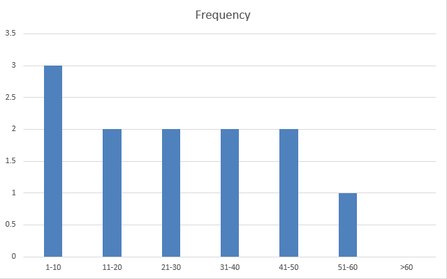
My counts come out as 3, 2, 2, 2, 2, 1, 0, which sums to all 12 ingredients.
Now turn those counts into a chart:
- Select the range labels in column G along with the frequency counts in column I.
- On the Insert tab, click Insert Column or Bar Chart, then choose Clustered Column.
- Right-click any bar, choose Format Data Series, and set the Gap Width to 0. Add a thin border so the bars stay separated. That gives it the touching-bars look of a real histogram.
I used the text labels from column G on purpose.
If you chart the numeric bin column instead, Excel treats those numbers as a second set of bars, which throws the histogram off.
Note: In legacy, non-dynamic-array versions such as Excel 2019 and Excel 2016, select the whole output range first (I2:I8, one cell more than the six-bin range), type the formula, and press Ctrl+Shift+Enter. Current Microsoft 365 and supported dynamic-array versions need only Enter.
Additional Notes About Creating a Histogram in Excel
- The first interval includes every value less than or equal to the first cut-off. After that, each interval is greater than the previous cut-off and less than or equal to the current one, so 20 falls in the interval greater than 10 and up to 20. With whole-number data, you can label that interval 11-20.
- Put bin cut-off points in ascending order so each FREQUENCY or ToolPak interval has the intended lower and upper bounds.
- Pick a bin width that fits your data. Too few bins hide the pattern, and too many leave gappy, spiky bars that are hard to read.
- The built-in Histogram chart draws touching bars automatically. The ToolPak and FREQUENCY charts come out as regular column charts, so you set the gap width to 0 yourself to get that look.
Frequently Asked Questions
What’s the difference between a histogram and a bar chart in Excel?
A bar chart compares separate categories, like sales per region.
A histogram shows the distribution of one set of numbers by grouping them into ranges, and its bars usually touch to show the ranges are continuous.
Why does my histogram bin range keep resetting?
If the horizontal axis remains on Automatic, Excel can recalculate the bins as the data changes.
Lock them down by typing a Bin width and an Underflow bin value in Format Axis instead of leaving them on Auto.
Can I make a histogram without the Data Analysis ToolPak?
Yes. Use the built-in Histogram chart (Excel 2016 and later) or the FREQUENCY function feeding a column chart. Both give you a full histogram with no add-in required.
Conclusion
I covered three ways to create a histogram in Excel: the built-in chart, the Data Analysis ToolPak, and the FREQUENCY function.
For most datasets, I start with the built-in Histogram chart.
I hope you found this article helpful!
Other Excel articles you may also like: