A pie chart in Excel shows how a total splits into parts, like how much of your weekly sales each product brings in.
Making the basic chart takes a couple of clicks. Getting it to show percentages, and reading well, takes a few more.
There’s also a catch. A pie chart needs one number per slice, so raw data with repeated categories has to be summed up first.
In this article, I’ll show you three ways to make a pie chart, using the Insert tab, Quick Analysis, and a PivotChart for raw data.
I’ll also show you how to add percentage labels, sort the slices, pull one out, and change the colors.
Method #1: Using the Insert Tab
This is the standard way to make a pie chart, and it works in every version of Excel. I recommend it for most people.
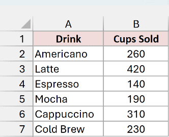
Below I have a dataset on the Drink Sales sheet. It shows how many cups of each drink a coffee shop sold in a week.
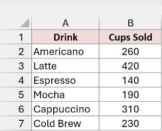
Here are the steps to make a pie chart from this data:
- Select the data, including the headers (A1:B7).
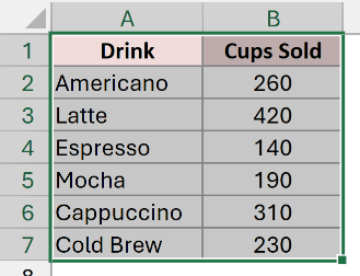
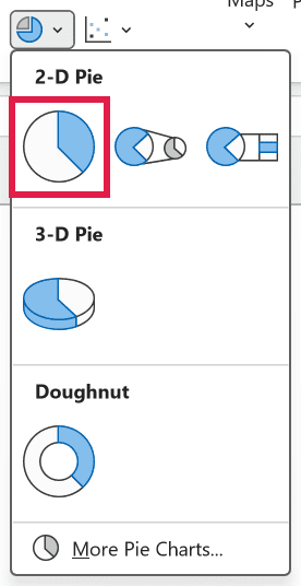
- Go to the Insert tab, click the Insert Pie or Doughnut Chart icon in the Charts group, and pick Pie under 2-D Pie.
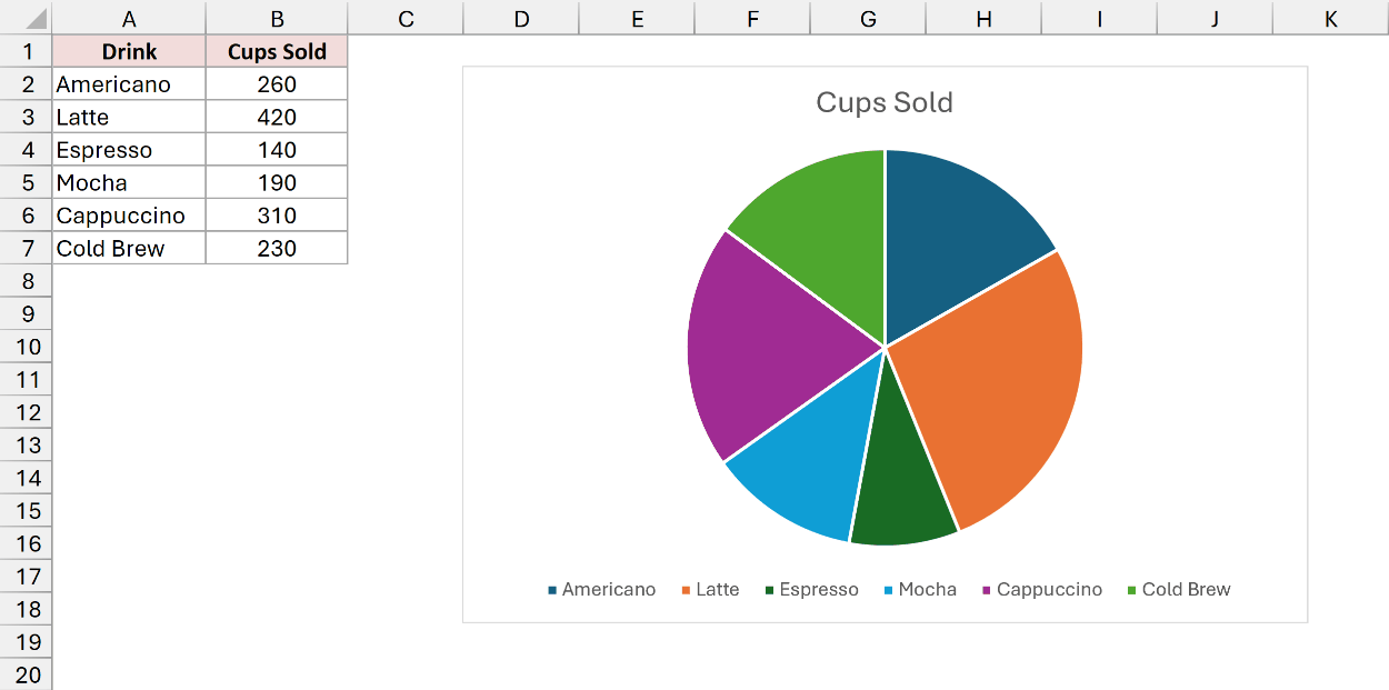
Excel adds a pie chart with one slice per drink. It uses the Cups Sold header as the chart title and puts a legend at the bottom.
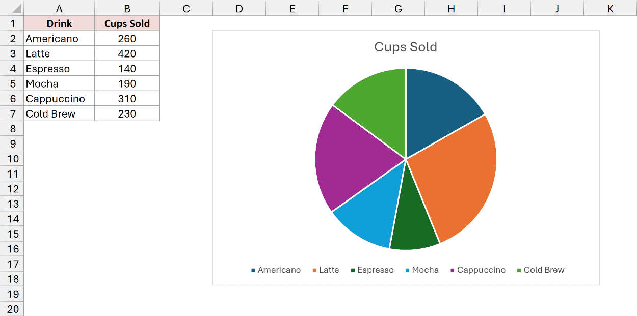
Note: Select only the labels and the numbers. If your data has a Total row, leave it out, or it turns into a slice that takes up half the pie.
Method #2: Using the Quick Analysis Tool
If you want the fastest route, Quick Analysis gets you there without opening the ribbon. It’s available in Excel 2013 and later on Windows, but not in Excel for Mac.
I’ll use the same Drink Sales data, with the cups sold for each drink in column B.
Here are the steps to make a pie chart with Quick Analysis:
- Select A1:B7. Click the Quick Analysis button that appears at the bottom-right of the selection, or press Ctrl + Q.
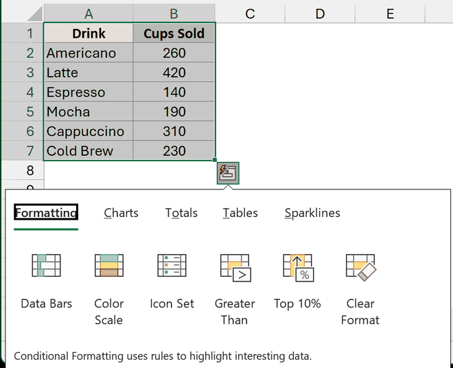
- Go to the Charts tab in the Quick Analysis menu and click Pie.
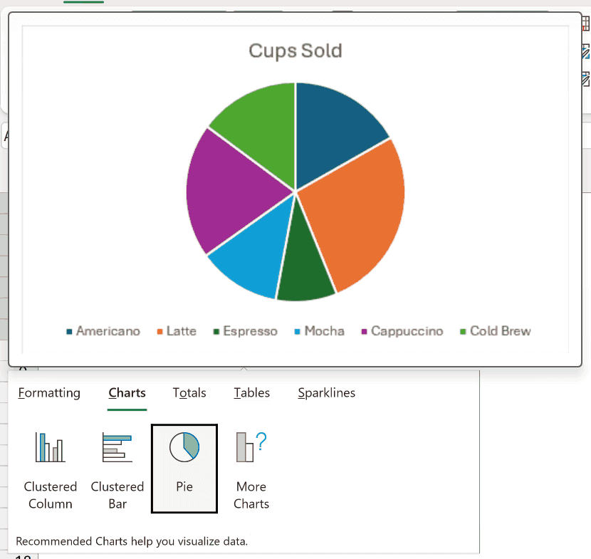
You get the same pie chart as Method #1. Hover over an option first if you want a preview before you click.
Method #3: Using a PivotChart (For Raw Data)
The first two methods need one row per slice.
When your data is a raw list where the same category shows up many times, a PivotChart adds it up for you.
Below I have an order log on the Order Log sheet. Each row is one order, with the drink and the number of cups in it.
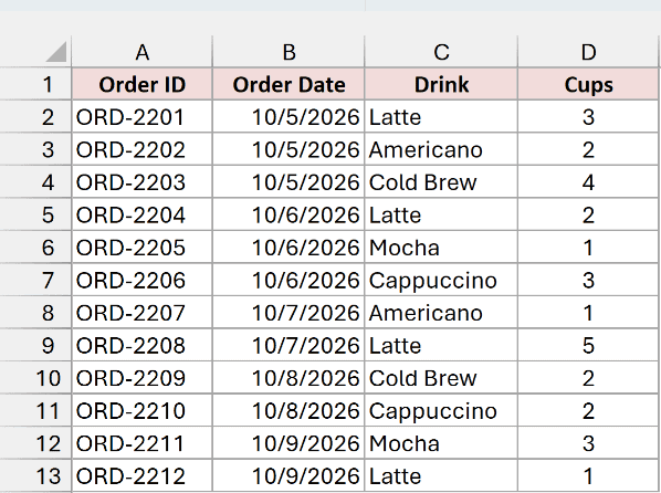
Latte shows up four times here. A regular pie chart would give it four separate slices, which is not what we want.
Here are the steps to make a pie chart from this data with a PivotChart:
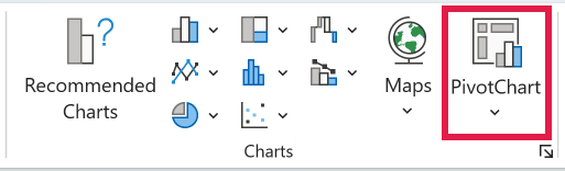
- Select any cell in the data. Go to the Insert tab and click PivotChart in the Charts group.
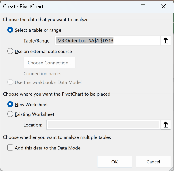
- In the Create PivotChart dialog box, check that the range is A1:D13, keep New Worksheet selected, and click OK.
- In the PivotChart Fields pane, drag Drink to the Axis (Categories) area and Cups to the Values area.
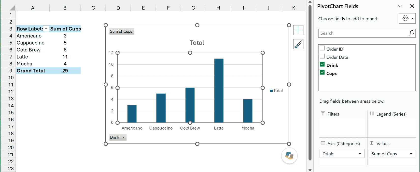
Excel builds a PivotTable with the total cups for each drink, plus a column chart next to it. Latte now shows up once, with 11 cups.
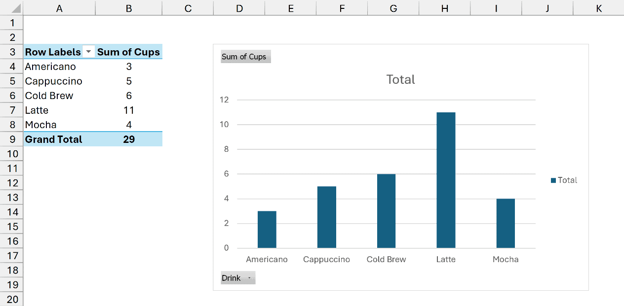
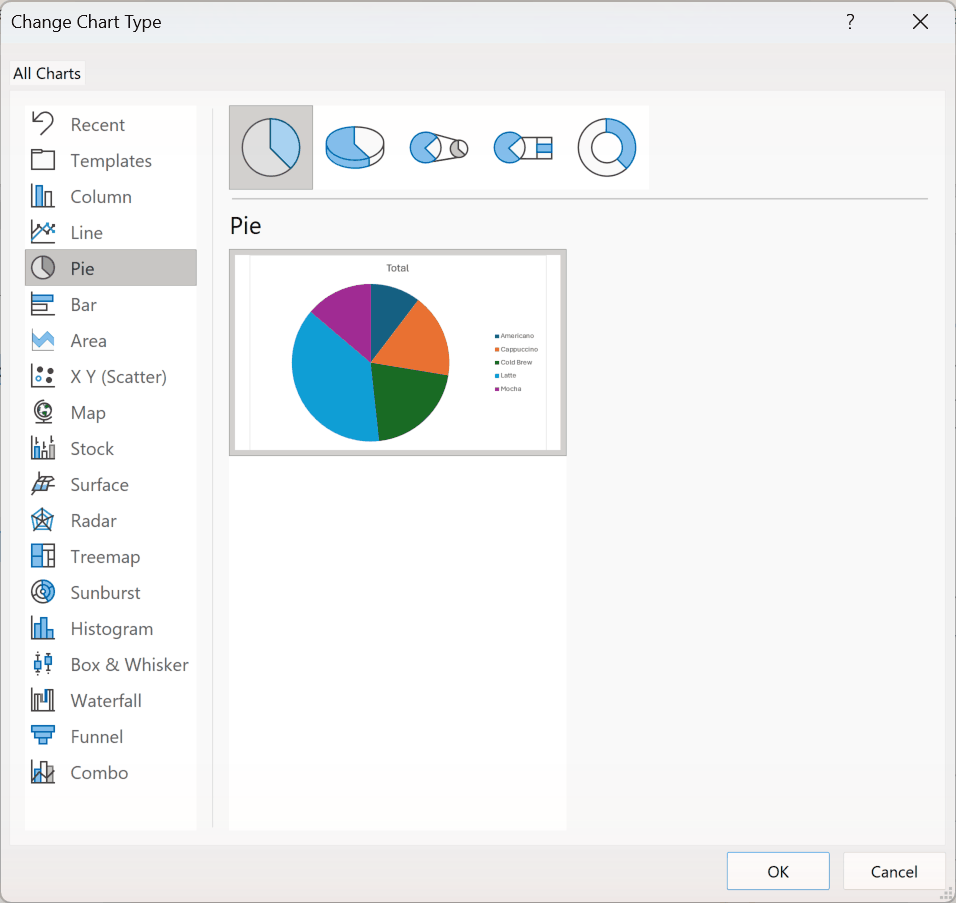
- Right-click the chart and choose Change Chart Type. Select Pie on the left, then click OK.
- Excel titles the chart “Total”. Click the title and type a better one, like Cups Sold by Drink.
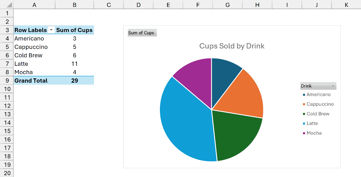
The pie chart stays linked to the PivotTable. If you add orders to the log, right-click the PivotTable and choose Refresh, and the chart updates.
Note: This also works when you only have text, like a list of survey answers. Drag the text field to both Axis (Categories) and Values, and Excel counts each answer instead of adding numbers.
How to Show Percentages on a Pie Chart
A plain pie chart makes you guess how big each slice is. Percentage labels fix that, and Excel works them out for you from the numbers.
I’ll use the pie chart made from the Drink Sales data in Method #1.
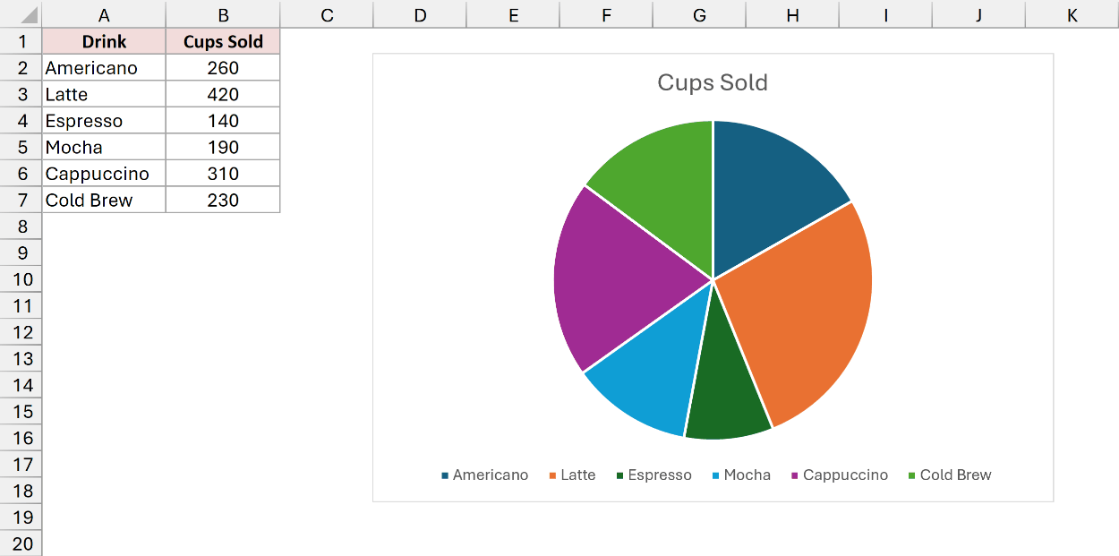
Here are the steps to add percentages to the pie chart:
- Click the chart, then click the Chart Elements button (the plus sign) at its top-right corner.
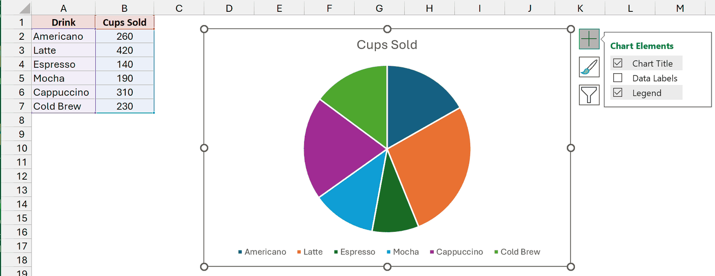
- Hover over Data Labels, click the arrow next to it, and choose More Options.
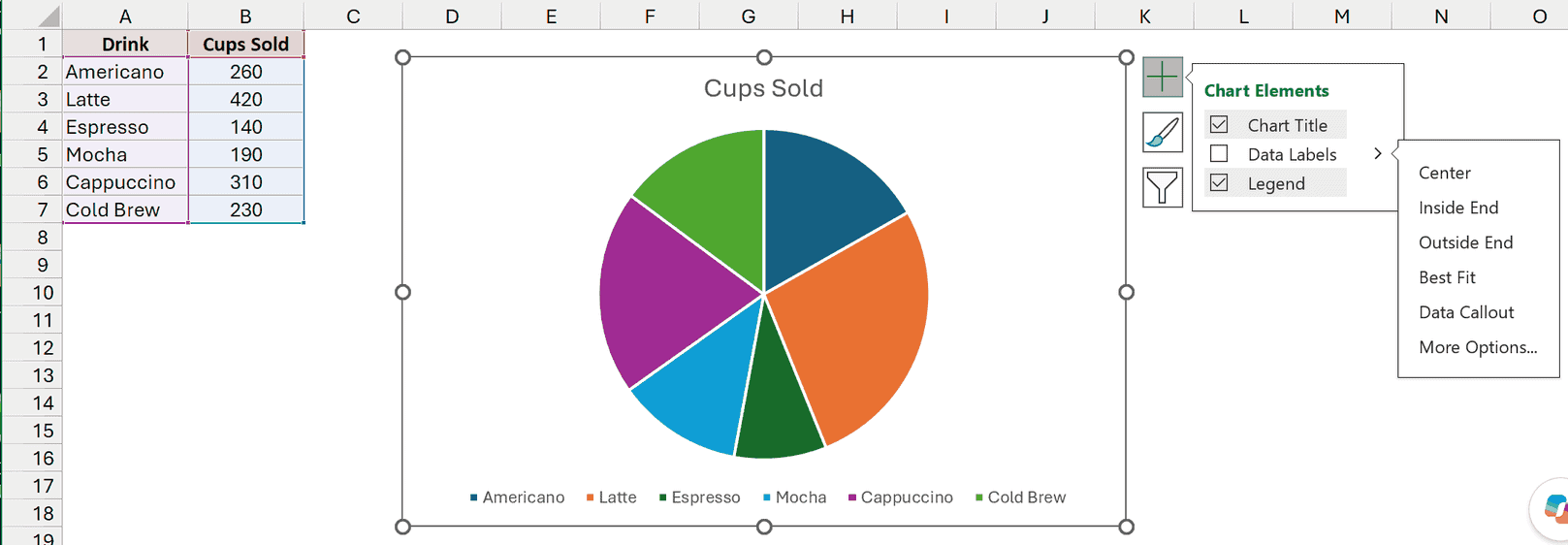
- In the Format Data Labels pane, under Label Options, check Percentage and uncheck Value. Under Label Position, pick Outside End.
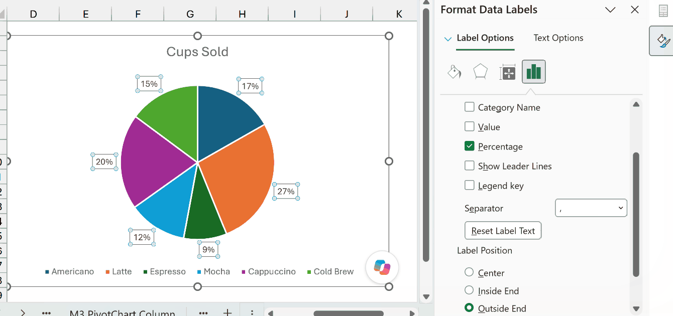
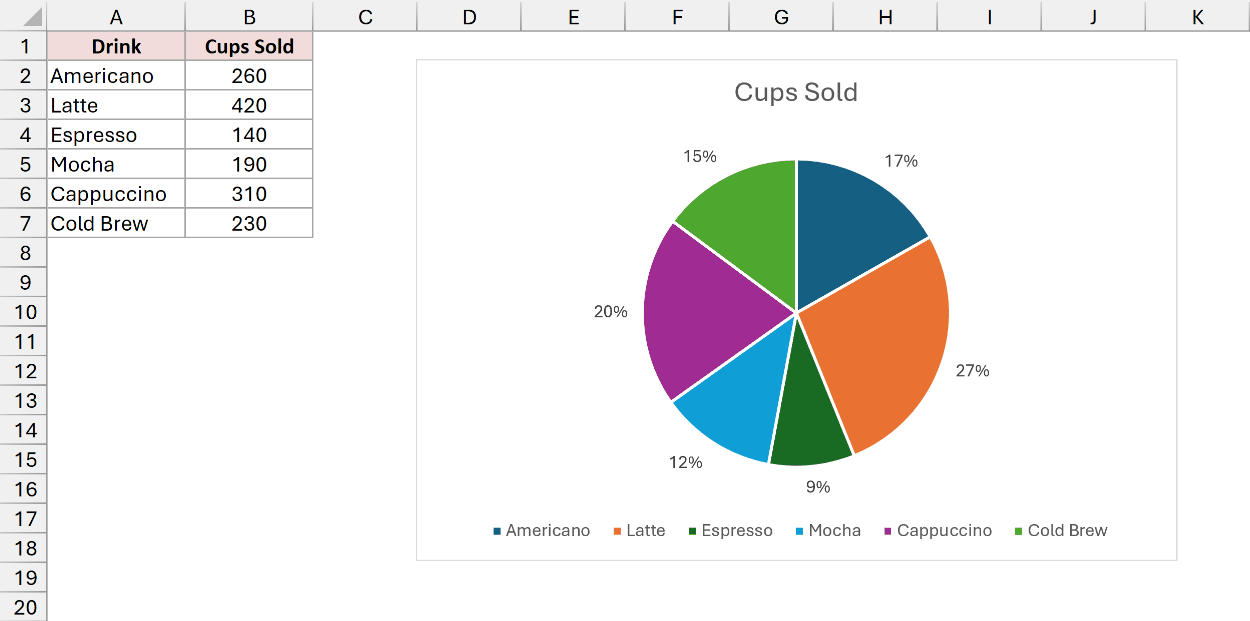
Each slice now shows its share of the total. Latte is 27% because its 420 cups are 27% of the 1,550 cups sold.
I put the labels at Outside End because dark text is hard to read on the darker slices.
- To put the drink names on the slices too, check Category Name in the same pane. Then click the legend and press Delete, since the labels now do its job.
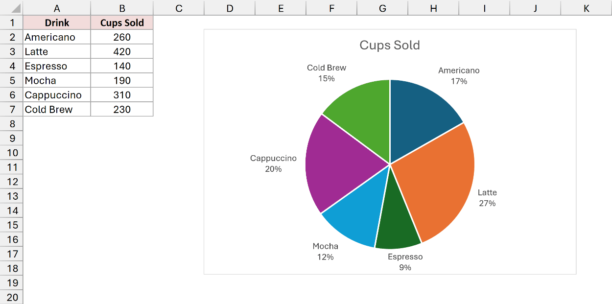
Now readers can see the drink and its share right on each slice, without looking back and forth at a legend.
How to Customize a Pie Chart in Excel
With the labels in place, a few small changes make the chart easier to read. Here are the ones I use most.
Sort the Slices by Size
A pie chart draws its slices in the same order as your data, starting at 12 o’clock and going clockwise. Sorted slices are much easier to compare.
Here’s the Drink Sales data again, with the pie chart that now has the drink names and percentages.
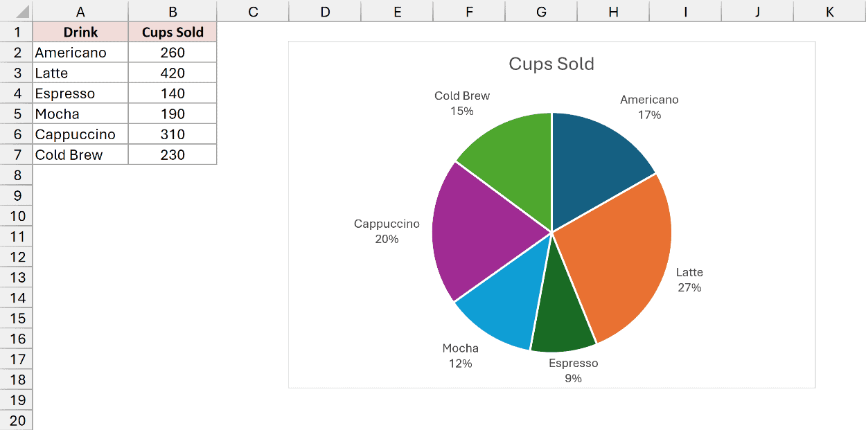
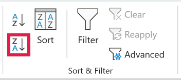
Click any number in the Cups Sold column (like B2). Then go to the Data tab and click Sort Largest to Smallest in the Sort & Filter group.
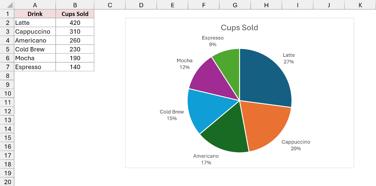
The rows reorder, and the chart follows right away. Latte now starts at the top, and the slices get smaller as you go around.
Pull Out a Slice
Pulling one slice away from the pie is a simple way to point at it. I’ll pull out Latte, the best seller.
Here are the steps:
- Click the pie once to select all the slices, then click the Latte slice again to select only that one.
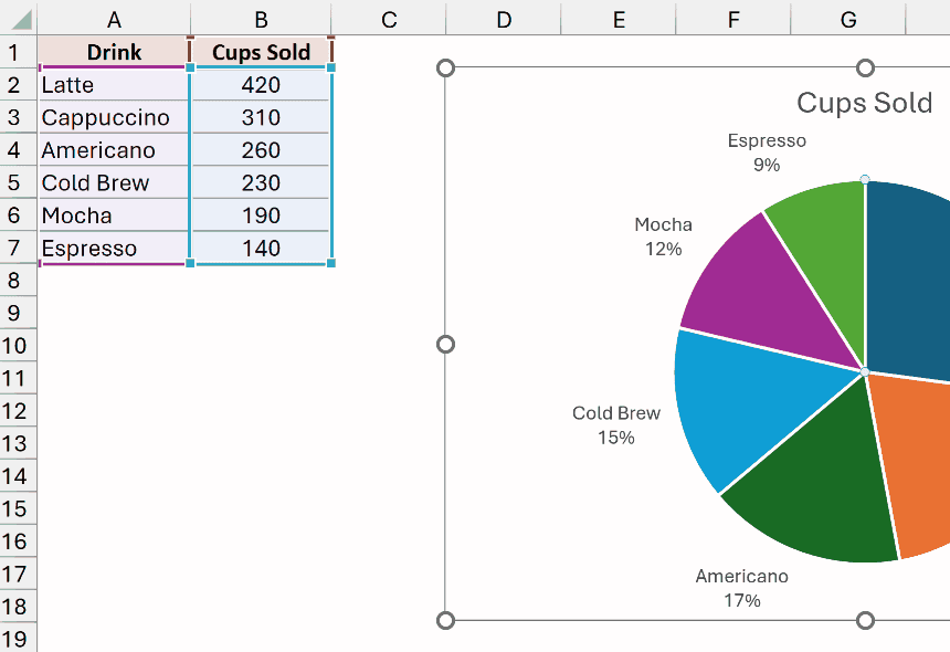
- Right-click the slice and choose Format Data Point. Under Series Options, set Point Explosion to 12%.
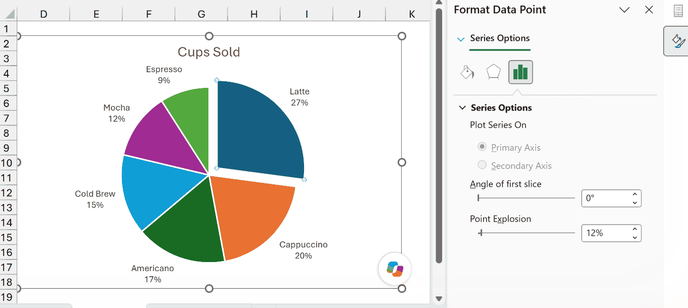
The Latte slice moves out from the center and the rest of the pie stays together.
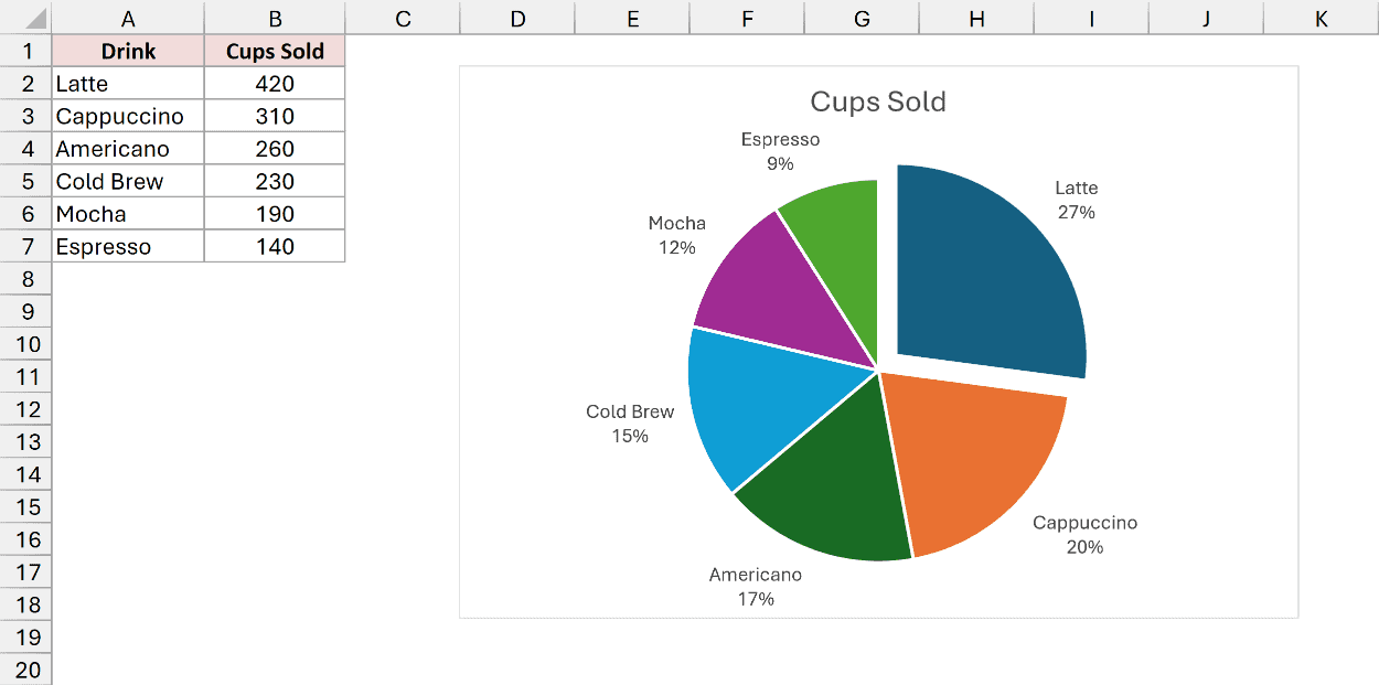
You can also drag the selected slice outward with the mouse. The pane is better when you want an exact amount.
Change the Slice Colors
Excel’s default colors are bright and all different. If you want something calmer, you can swap the whole color set in one go.
Click the chart, go to the Chart Design tab (just Design in Excel 2019 and earlier), click Change Colors, and pick Monochromatic Palette 1 (the first one under Monochromatic).
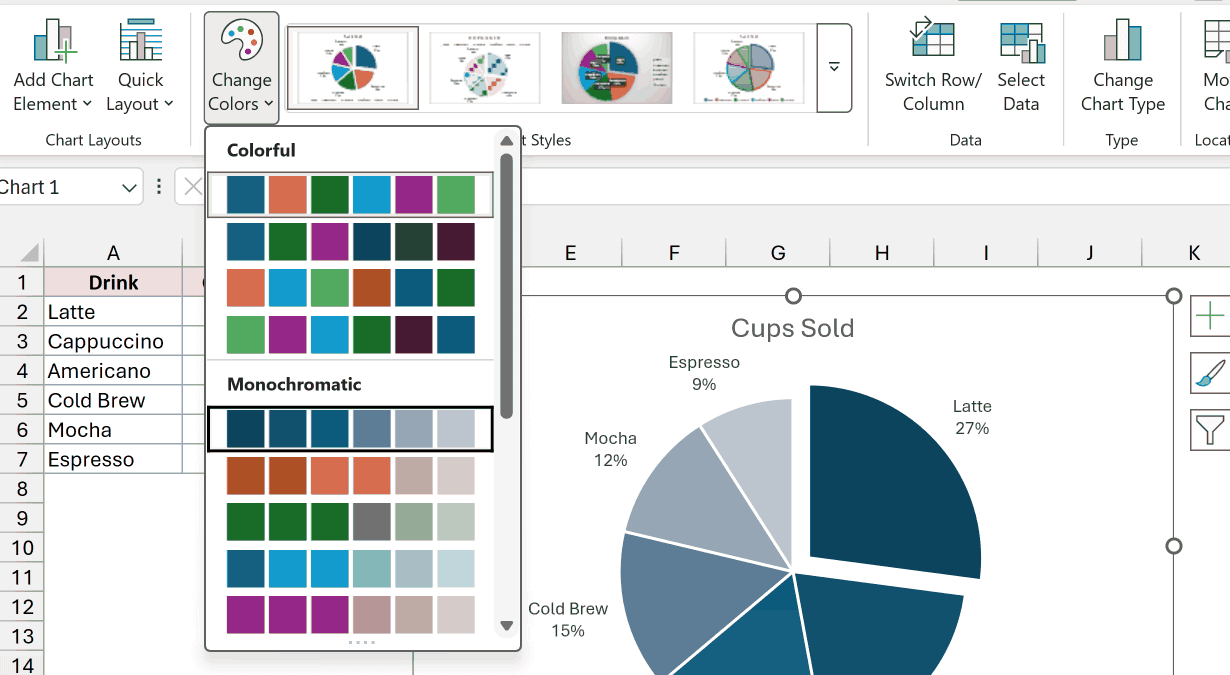
Every slice now uses shades of one color. Since the slices are sorted, the shades also run from darkest to lightest by size.
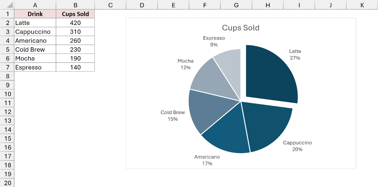
To recolor just one slice, select it the way you did above. Then go to the Format tab, click Shape Fill, and pick a color.
Additional Notes About Making a Pie Chart in Excel
- Keep it to about six slices. Beyond that, the small slices become hard to tell apart. For lots of small values, a Bar of Pie chart groups them into a separate bar.
- Use one series only. A pie chart shows one set of numbers. If you select two number columns, Excel only draws the first one.
- Doughnut and 3-D pies are in the same menu. A doughnut works the same way with a hole in the middle. 3-D pies make the front slices look bigger than they are, so stick with 2-D when accuracy matters.
- Rotate the chart if labels crowd together. Right-click the pie, choose Format Data Series, and change Angle of first slice.
- For categories inside categories, try a Sunburst chart. It shows two or more levels as rings, which a pie chart can’t do.
Frequently Asked Questions
Here are answers to a few questions people often ask about pie charts in Excel.
How do I show both the values and the percentages on a pie chart?
Open the Format Data Labels pane and check both Value and Percentage. Excel puts them on the same label, separated by a comma.
Does a pie chart update when I change the data?
Yes, change a number and the slice resizes right away.
New rows added below the data aren’t included, though. Turn the data into a Table (Ctrl + T) before you make the chart, and new rows get picked up automatically.
Can a pie chart show negative numbers?
Not correctly. Excel draws a negative number as if it were positive, then labels it with a negative percentage.
So the chart doesn’t add up. Use a bar chart for data with negatives.
Why does one of my slices show 0% with nothing next to it?
That category has a value of zero, so it gets a label but no slice.
Filter it out of the data, or delete its label, if you don’t want it on the chart.
Conclusion
In this article, I showed you three ways to make a pie chart in Excel, using the Insert tab, Quick Analysis, and a PivotChart for raw data.
I also covered how to add percentage labels, sort the slices, pull one out, and change the colors.
I hope you found this article helpful.
Other Excel articles you may also like: