Waterfall Charts are a popular mode of visualization, especially when it comes to analyzing and understanding change.
They are known by different names like McKinsey Charts, Cascade Charts, and even Mario Charts (owing to their resemblance with the game’s landscape).
In this tutorial, we will discuss the waterfall chart and show you how to create one in Excel.
We will also show you how to style and customize the chart according to your requirements.
What is a Waterfall Chart?
A Waterfall Chart is a tool used to visualize how a quantity or variable changes over time.
The chart basically depicts how a starting value for a variable rises and falls till it reaches the end value.
It shows positive and negative changes using different colored bars, allowing you to easily recognize a rise and fall in the value. These bars are also known as bridges.
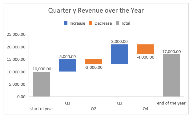
Here’s an example of a waterfall chart showing how the revenue of a fictitious company changed over a year, from the first to the last quarter:

The starting and ending revenue is shown starting from the horizontal axis (or x-axis), while the columns in between are shown to be floating.
A blue column shows a rise in the revenue during the given quarter, while an orange column shows a fall in the revenue during the quarter.
Also read: How to Create Bubble Chart in Excel
How to Make a Waterfall Chart in Excel?
In earlier Excel versions, waterfall charts were not available as part of the chart template collection.
So, you had to improvise upon a stacked column chart if you needed to create a waterfall chart.
However, from Excel 2016 onwards, waterfall charts have also been added to the visualization tools, so you can create one with a few clicks, just as you would create any other chart in Excel.
Let us see how.
Consider the following data:

The above data shows a company’s quarterly revenue over a year.
Note that we specified the text (or the x-axis values) in the first column and the revenue (or the y-axis values) in the second column.
We also included the starting amount in the first row, and the ending amount in the last row.
You will need to calculate the ending amount before creating the chart if you want to see it displayed in the chart.
For this, simply sum up the revenue amounts in the second column, as follows:
=SUM(B2:B6)
Here’s how the dataset looks after entering the formula for the ending amount:

Now that the data is ready, let us use it to create a Waterfall Chart. Here are the steps:
- Select your data (cells A1:B7).
- Click on the Insert tab.
- Under the ‘Charts’ group, select the Waterfall Chart dropdown.
- Click on the Waterfall Chart from the menu that appears.

Your Waterfall Chart should now appear in your worksheet.

Specifying the Total / Subtotal Columns
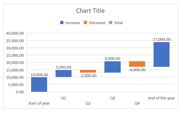
You will notice that by default, your waterfall chart displays the ending revenue as a floating column too, instead of showing it as a subtotal.

But this is the full amount remaining, and not just another change in revenue.
This is one of the limitations of the Excel waterfall chart. We hope Microsoft fixes this issue at some point. But for now, here’s how you can work around the problem:
- Double click on the last column.
- Now single click it. You should see all other columns of the chart ghosted out, except for your last one, as shown below:

- Right-click on this column and select ‘Set as Total’ from the context menu that appears.

Your last column should now turn into a subtotal column (change color to gray) and extend all the way to the x-axis, as shown below:

You can change the color of the first column too (starting revenue) in the same way, so that it is easier to differentiate between changes and full amounts.

You can add more subtotal columns in your chart in the same way.
For example, say you also want to display the total revenue in the middle of the year (at the end of the second quarter).
Your data could then be adjusted as follows:

The corresponding column in your waterfall chart could then be converted to a Total column in the same way you converted your ending revenue column:

Customizing and Styling the Waterfall Chart in Excel
You can also style your waterfall chart the same way you would style any other chart in Excel. There are a number of preset chart styling options available under the Chart Design tab (under ‘Chart Tools’).

However, if you want to style specific aspects of the chart, here are a few pointers.
Changing Chart Titles
Your chart title should be descriptive enough for people to understand what it’s about at a glance. To change the chart title, simply double-click on it and type over in the text box with the title you want.

Changing Chart Colors
Another drawback of the Excel waterfall chart is that you cannot change all negative blocks or all positive blocks in one go unless you use the preset color palette.
But if you want to specify your own colors, you will have to manually select each column and change the colors, by navigating to Format->Shape Fill.

If you want to use the preset color palette, select any one of the columns and navigate to Chart Design -> Change Colors. Then select the color palette that you prefer.

Hiding the Connector Lines
Connectors are the lines that you will find connecting the individual columns of the waterfall chart. Excel displays these as a single gray line by default.

However, you can also choose to hide the connector lines if you want. To hide the connector lines, follow the steps below:
- Double click on the chart.
- You should see the Chart sidebar to the right of your Excel window.

- Click on the Chart Options dropdown and select Series “Amount”.

- Click on the Series Options tab, as shown below:

- Uncheck the box next to “Show connector lines”.

This will hide all the connector lines from your Waterfall Chart.

Changing the Gap Size between Columns
You can also adjust the width of the gap between columns of your waterfall chart by sliding the slider next to Gap width under the Series Options tab.

Slide it right for a bigger width and left for a narrower gap.
Adding / Removing Column Labels
The data labels provide additional information about the individual columns of your waterfall chart.
You can choose to change the position, format the labels or even remove them from your chart using the Label options.
To access the Label options, you can either double click on one of the labels of the chart or select the Series “Amount” Data Labels from the Chart Options dropdown of the chart sidebar.

Once you have the Label Options in the sidebar, select the Label Options tab, as shown below:

From here, you can adjust your labels as you see fit.
To remove the labels, simply select the Label Options category under the same tab, and under ‘Label Contains’, uncheck the box next to ‘Values’.

You can also change the label position from here.

To change the font (size, style, color, etc.) of the label, click on the Text Options tab, as shown below:

There are many other customization options available, like those for setting up your axes, gridlines, legends, etc.
These are similar to settings for any other Excel chart, so we will not go over those in this tutorial.
Also read: How to Ungroup Sparklines in Excel
What are Waterfall Charts Used For?
Waterfall charts are mainly used to visualize how a quantity changes over time.
They are useful in demonstrating how one arrived at a given net value by breaking down the effect of different positive and negative influences.
As such these charts are quite helpful in a variety of applications, like:
- Analyzing company profits
- Following inventory or sales over time
- Visualizing change in employee headcount
- Demonstrating product value variations over time
- Visualizing personal cash flow
- Tracking student scores over a year
There are a whole lot of other applications that one can think of.
Although these charts were initially created to track monetary performance over time, they are increasingly being applied to a myriad of other areas and industries.
This tutorial was about Waterfall charts. We showed you what these charts are capable of and how to create, style, and customize them in Excel.
We hope it was helpful for you.
Other Excel tutorials you may also like:
- How to Create Org Chart in Excel?
- How to Switch Axis in Excel (Switch X and Y Axis)
- How to Make Box Plot (Box and Whisker Chart) in Excel?
- How to Create Bar of Pie Chart in Excel? Step-by-Step
- How to Delete Chart in Excel? (Manual & VBA)
- How to Create Win/Loss Sparklines Chart in Excel?
- How to Make Scatter Plot in Excel
- How to Create Sankey Diagram in Excel
