A chart legend in Excel tells you what each color represents, so you can read the chart without guessing.
The legend has no text of its own. Its labels come from your data, so you can’t rename them by typing inside the legend.
I’ll show you how to add and move a legend, then rename its entries, including the slice labels in a pie chart.
How to Add a Legend to a Chart in Excel
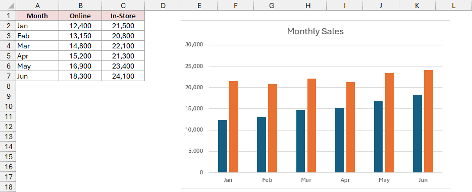
Below I have a dataset of a bakery’s monthly sales, split into online orders and in-store sales, with a column chart beside it.
The data is in A1:C7, and the chart is titled Monthly Sales. There’s no legend, so you can’t tell which color is online and which is in-store.
Here are the steps to add a legend to the chart:
- Click anywhere inside the chart. Three small buttons appear beside its top-right corner. Click the top button, the plus sign. This is the Chart Elements button.
- Check the Legend box.
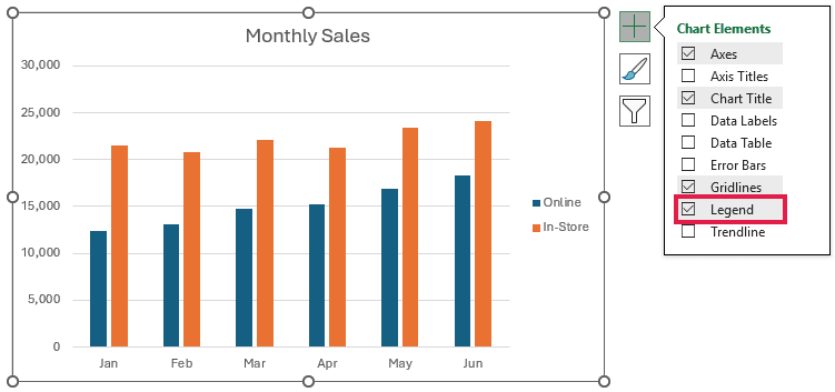
Excel adds the legend right away. It shows Online and In-Store, the two column headers from B1 and C1.
The dark blue bars represent Online, and the orange bars represent In-Store.
You can move the legend from the same list:
- Hover over Legend and click the small arrow that appears on its right. Pick a position. I’ll pick Top.
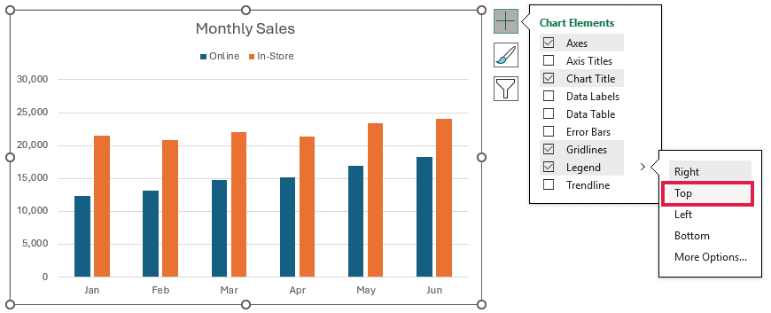
The legend now sits above the bars, under the chart title.
How to Rename Legend Entries in Excel
Each set of bars, here Online and In-Store, is called a data series. The legend displays the name of each series.
Excel takes these names from the header cells. To rename a legend entry, you change the name it uses.
I’ll show you three ways:
- Edit the header cell. This is the quickest way.
- Use the Select Data Source dialog box to keep the header unchanged.
- Change the slice labels for a pie chart.
Method #1: Editing the Header Cell
I recommend editing the header cell when you’re happy to change its wording. It’s the fastest way, and the legend stays linked to that cell.
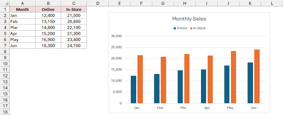
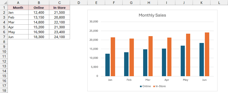
Below I have a dataset of a bakery’s monthly online and in-store sales, with a column chart showing Online and In-Store in its bottom legend.
I want the In-Store entry to read In-Store Sales.
Here’s how to change the legend name:
- Select cell C1, type In-Store Sales, and press Enter.
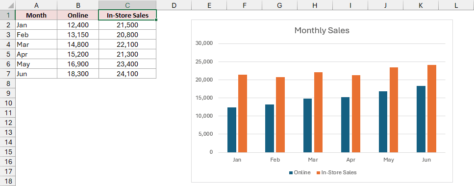
The legend is linked to C1, so its entry updates the moment you press Enter.
The catch is that the header in your data changes too. If you need that header to stay as it is, use Method #2.
Method #2: Using the Select Data Source Dialog Box
Here’s a way that leaves the header alone. You set the legend name inside the chart instead.
You might prefer this when other formulas or reports rely on the existing header.
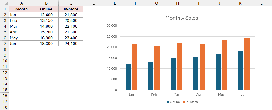
For this example, I’m using a bakery’s monthly online and in-store sales. The column chart has Online and In-Store in its bottom legend.
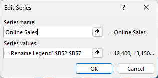
I want Online Sales in the legend while B1 still says Online.
Here are the steps to edit the legend entry without changing B1:
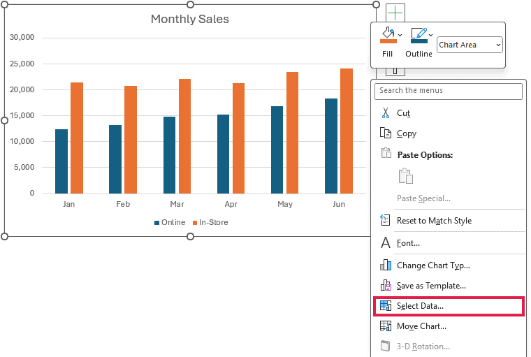
- Right-click an empty spot inside the chart, away from the bars, and click Select Data.
- In the Select Data Source dialog box, select Online under Legend Entries (Series) on the left, then click Edit.
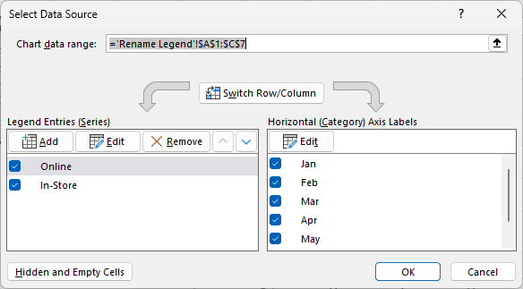
- In the Edit Series dialog box, clear the Series name box, which holds a reference to B1. Type Online Sales and click OK.
- Click OK to close the Select Data Source dialog box.
The legend now reads Online Sales and In-Store, and B1 still says Online.
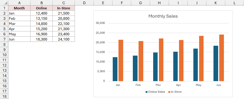
Note: Typing a name breaks that entry’s link to B1, so later changes to B1 won’t update the legend. To link it to a different cell instead, clear the Series name box and then click that cell.
Method #3: Changing the Axis Labels (For Pie Charts)
For a pie chart, you need to change the labels attached to its slices. These are the categories, such as individual products.
A pie chart has one data series, but its legend lists the slice labels. Changing the Series name in Method #2 won’t rename those entries.
Below I have a dataset of a bakery’s product codes, product names, and units sold in A1:C6.
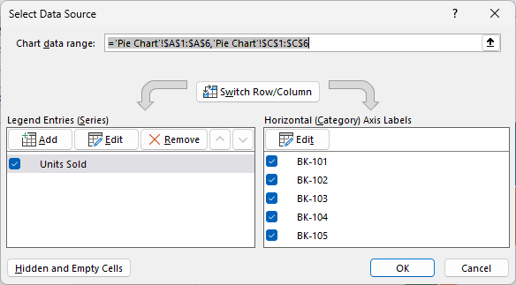
The Units Sold by Product pie chart uses the Product Code and Units Sold columns, A1:A6 and C1:C6. Its bottom legend shows BK-101 to BK-105.
I want the legend to show product names without changing the data.
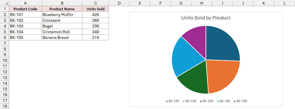
Excel stores these slice labels as the chart’s category labels, and calls them axis labels even though a pie chart has no axis.
Here are the steps to use the product names as the slice labels:
- Right-click an empty spot inside the chart and click Select Data. In the dialog box, click Edit on the right, under Horizontal (Category) Axis Labels.
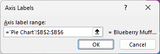
- In the Axis Labels dialog box, select B2:B6, the product names, so the Axis label range box shows that range. Click OK.
- Click OK to close the Select Data Source dialog box.
The legend now lists Blueberry Muffin, Croissant, Bagel, Cinnamon Roll, and Banana Bread.
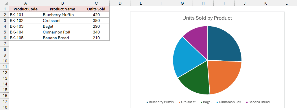
If you’re happy to change the data itself, typing over a slice’s label cell also renames its legend entry, just as in Method #1.
Additional Notes About Chart Legends in Excel
- Double-click the legend to open the Format Legend pane. The Show the legend without overlapping the chart checkbox is selected by default. Clear this checkbox to let the legend sit over the plot area.
- To remove just one entry, click the legend, click that entry, and press Delete. The bars stay in the chart.
- To reorder entries, use the Move Up and Move Down arrows in the Select Data Source dialog box. This also changes the order of the bars.
- To change the legend’s font size or color, click the legend first, then use the font controls on the Home tab.
Frequently Asked Questions
Here are a few other questions you might have about your chart’s legend.
Can I add a title to a chart legend in Excel?
Excel has no built-in legend title. You can add a separate label above it with Insert > Text Box.
Why does my legend say Series1 and Series2?
The header cells weren’t included in the chart’s data, so Excel had no names to use.
Numeric headers, such as 2024 and 2025, can also cause this if Excel treats them as data instead of series names.
Use Method #2 to name each series. In the Series name box, you can type a name or click its header cell.
How do I remove a legend from a chart?
Click the chart, open the Chart Elements plus button, and uncheck Legend.
Conclusion
I’ve shown you how to add and move a chart legend, plus three ways to rename its entries.
For most charts, editing the header cell is the quickest fix.
I hope you found this article helpful.
Other Excel articles you may also like: