Pie charts in Excel provide a great way to visualize categorical data as part of a whole.
By one look at a pie chart, one can tell how much a category contributes to the entire group.
A bar of pie chart lets us go one step further and helps us visualize pie charts that are a little more complex.
In this tutorial, we will look at what a Bar of the pie chart is, how it helps visualize data and how to create one in Excel.
What is a Bar of Pie Chart?
A pie chart is the best option when you want to visualize portions of a small number of categories (around 2-5).
However, as the number of categories increases, the pie chart starts becoming too complex to read.
A ‘Bar of pie chart’ can be quite useful in such cases, as it lets you move the smaller slices of the pie to a separate stacked bar chart.
This simplifies the pie, while the viewer can still see what the smaller sizes comprise of.
For example, in the chart shown below, the larger slices are visible in the main pie, while the smaller ones are grouped together into a single pie and then projected onto a bar chart, where you can still see the individual portions.

Benefits of Using a Bar of Pie Chart in Excel
By separating the smaller slices from the main pie, the Bar of pie chart lets you handle more categories in a pie chart, thereby simplifying a complex pie.
You can also use this as a tool to highlight the important portions of your pie chart.
The Bar of Pie chart is quite flexible, in that you can adjust the number of slices that you want to move from the main pie to the bar.
Besides this, the Bar of pie chart in Excel calculates and displays percentages of each category automatically as data labels, so you don’t need to worry about calculating the portion sizes yourself.
How to Create a Bar of Pie Chart
Let’s say you have the following list of employees along with their total sales.

To visualize how much each employee has contributed to the total company sales, we can use a pie chart.

However, as you can see from the above image, the pie chart would not look very intuitive and it would be difficult to perceive who the largest contributors were.
As such, a Bar of pie chart would be a more appropriate visualization tool in this case. Let us see how we can use a ‘Bar of pie‘ chart to visualize our data:
- Select the range of cells containing the data (cells A1:B7 in our case)
- From the Insert tab, select the drop down arrow next to ‘Insert Pie or Doughnut Chart’. You should find this in the ‘Charts’ group.

- From the dropdown menu that appears, select the Bar of Pie option (under the 2-D Pie category).

- This will display a Bar of Pie chart that represents your selected data.

Note: By default, the chart displays three data points in the stacked bar, unless you specify the number.
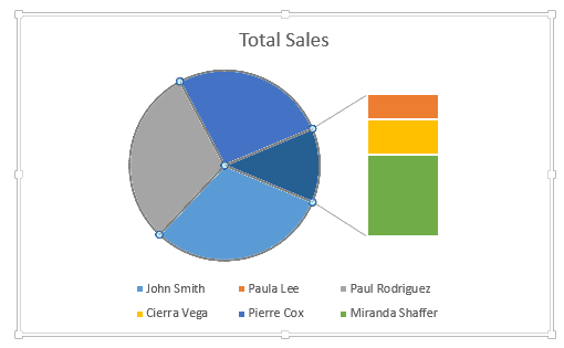
You will notice that the chart does not look neat and organized.
For example, the chart shows Paula Lee’s portion within the pie, although her portion is quite small.
Moreover, it takes John Smith’s portion out which is quite sufficiently large.
Intuitively, it would make more sense to have the smaller portions displayed in the stacked bar, leaving the larger portions in the pie.
Besides this, the chart does not have labels to show the percentage contribution of each employee.
Therefore, we need to customize the chart further to suit our requirements.
Also read: How to Overlay Graphs in Excel
How to Customize a Bar of Pie Chart
Excel lets us add our own customizations to the Bar of Pie chart.
For example, it lets us specify how we want the portions to get split between the pie and the stacked bar.
It also lets us specify whether we want to display data labels, what data labels we want to be displayed as well as what formatting and styling we want to apply to the labels.
Besides this, it lets us edit the chart legend, the title formatting, and much more.
Let us try to customize our chart to bring it more in line with our requirements.
Rearranging the Splitting of Portions
The first thing we want to do is split the portions by percentage.
In other words, we want the larger portions to remain in the pie and move the smaller portions to the stacked bar.
For this follow the steps outlined below:
- Right-click on any slice of the pie chart.
- Select ‘Format Data Series’ from the context menu that appears.

- This will open the ‘Format Data Series’ sidebar to the right of the Excel window.
- Make sure the ‘Series Options’ tab is selected, as shown below:

- You will see a list of Series options below the ‘Series Options’ category.
- Click on the ‘Split by Series’ dropdown. You will see 4 options to split your portions:

- Position – This option lets you specify the number of positions that you want to move to the stacked chart.
- Value – This option lets you specify the maximum values that will be displayed in the pie chart. Values less than this will be moved to the stacked bar.
- Percentage value – This option lets you specify the minimum percentage for portions to be moved to the stacked chart. In other words, if a slice has a smaller percentage in the pie than what is specified, then the slice needs to be moved to the stacked bar.
- Custom – This option lets you hand-pick the slices that you want to move between the stacked bar and the pie chart.
Since we want to split the portions so that the smaller portions move to the stacked bar, we can select the ‘Percentage Value’ option, and then enter the value 10% as input for the ‘Values less than’ field.

This will make sure that the smaller three portions (those that contribute 10% or less to the whole) are moved to the stacked bar chart, while the larger three portions are displayed in the pie chart:
How to Split Series by ‘Custom’ Settings
If you would rather hand-pick and select which portions you want to display in the pie and which ones you want to move to the stacked bar, you could select the ‘Custom’ option instead, in step 6.
Once you select that option you can move your slices between the two charts. Double click on any slice (either in the pie or in the stacked bar) that you want to move.
You will see a new option appear under the Series Options.
This option, which says ‘Point Belongs to’ lets you select where you want the currently selected slice to go.

Let’s say you double-clicked on Paula Lee’s portion.
You want to move it to the bar chart, so click on the dropdown next to ‘Point belongs to’ and select ‘Second plot’.

Similarly, to move a portion from the stacked bar to the pie, simply select the ‘First plot’ option.

Do this for every point that you want to move between the two plots.
Note: Here, the ‘First plot’ refers to the pie chart, while the ‘Second plot’ refers to the stacked bar chart.

Additional Bar of Pie Settings
Under the Series Options of step 6, you will also find some additional settings specific to ‘Bar of pie’ charts.
These are:
- Pie explosion – This setting lets you detach the slices of the pie. You can move the slider up or down to increase or decrease the spaces between each slice.
- Gap Width – This setting lets you set the distance between the pie and the stacked bar chart.
- Second Plot Size – This setting lets you specify the size of the stacked bar relative to the pie.

Adding Data Labels
To be able to see the actual percentage of each portion/ category, adding data labels would be quite helpful.
To add and format data labels to portions in your Bar of pie chart, follow the steps below:
- Click anywhere on the blank area of the chart.
- You will see three icons appear to the right side of the chart, as shown below:
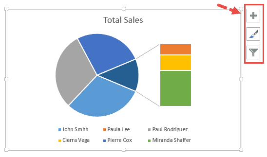
- Click on the plus icon (‘+’) , which represents the Chart Elements settings.
- Check the box next to ‘Data Labels’.

- This will display the values corresponding to each category in the chart. But we want to see percentages, not values. So hover over the Data Labels option.
- You should see an arrow appear next to it. Click on this arrow.

- This will show a list of options for customizing your data labels. Click on ‘More Options’.

- You should now see label options in your Excel sidebar.
- Under the Label Contains category, you will find a list of checkboxes to let you add whatever labels you want to add to your pie portions.
- We only want to see the percentages. So make sure the ‘Percentage’ option is checked and the ‘Series Name’ and ‘Value’ options are unchecked.
- Under the Label Position category, you can also customize the position of your data labels.
Formatting the Text
You can also format the text in your chart, for example, the chart title, the data labels, and the Legend.
This requires you to only select the text and then format it as you need to from the Font tools under the Home tab.
Also read: How to Create Bubble Chart in Excel
How to Convert a Pie Chart to a Bar of Pie Chart
If you’ve already created a Pie chart and now want to convert it to a Bar of pie chart instead, here are the steps you can follow:
- Click anywhere on the chart
- You will see a new menu item displayed in the main menu that says ‘Chart Tools’.
- Under Chart Tools, select the ‘Design’ tab.

- Click on the ‘Change Chart Type’ button (which is in the ‘Type’ group).

- This will display the ‘Change Chart Type’ dialog box.
- Make sure that the ‘All Charts’ tab is selected and the ‘Pie’ category is also selected.

- At the top of the ‘All Charts’ tab, you will see icons for different pie chart types.
- Select the ‘Bar of pie’ icon.

- Click OK.
Your chart should now get changed to a Bar of Pie chart.
You can continue to customize the chart as we explained in the previous sections of this tutorial.
In this tutorial, we showed you how to create a ‘Bar of pie’ chart and how to customize it according to your requirements.
We also showed you how you can convert a regular Pie chart to a Bar of pie chart if you need to.
We hope this was useful.
Other Excel tutorials you may also like:
- How to Move a Chart to a New Sheet in Excel
- How to Add Gridlines in a Chart in Excel?
- How to Interchange X axis and Y axis in Excel
- How to Make a PIE Chart in Excel
- How to Make Box Plot (Box and Whisker Chart) in Excel?
- How to Create Org Chart in Excel?
- How to Create a Waterfall Chart in Excel?
- How to Add a Trendline in Excel Charts?