Sometimes, when you create a chart in Excel, you may want to switch the axis in the chart (i.e., interchange the X and the Y-axis)
It’s really easy, and in this short tutorial, I will show you how you can switch axes in Excel charts with a few clicks.
So let’s get started!
Understanding Chart Axis in Excel Charts
If you create a chart (for example, a column or bar chart), you will get the X and the Y-axis.
The X-axis is the horizontal axis in the chart, and the Y-axis is the vertical axis. The intersection of the X and Y axes is called the origin, and it’s where the values start in the chart.
The relationship between the X and Y axes helps in identifying trends, patterns, and correlations in the data.
- The X-axis typically represents the categories or the independent variable. It is the horizontal line running across the bottom of the chart. For example, it may have years or city names of product names.
- The Y-axis represents the values or the dependent variable. It is the vertical line running up the side of the chart.
Let’s now see how to create a scatter chart, which will further make it clear what an axis is in an Excel chart.
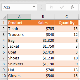
For creating a chart, I will be using the below data set, which contains products in column A, Sales value in column B, and Quantity value in column C.
To create a chart, you need to follow the below steps:
- Select a range of values that you want to plot on the scatter chart (in this example, B1:C10)
- Go to the Insert tab in the ribbon.
- In the Charts group, click on the Scatter chart icon.
- From the drop-down, select the Scatter chart option (the first one)
As a result, you get the scatter chart as shown below (where I have highlighted the axis using the arrow).
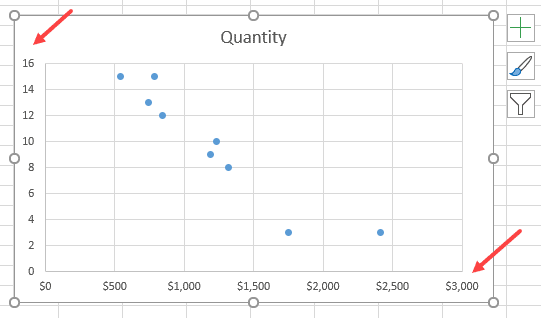
This chart has the X-axis (horizontal) with values from the Sales column and the Y-axis (vertical) with values from the Quantity column.
When you create a chart in Excel, it automatically decides the range that needs to be shown on the axis.
Now that’s all good!
But what if I want a chart where Sales are on the Y-axis and Quantity on the X-axis? So, I want to flip the axes.
Thankfully, Excel allows you to easily switch the X and Y axes with a few clicks.
Let’s see how to switch the axes in Excel charts!
Also read: How to Add Axis Titles in Excel?
Switch the X and Y Axis in Excel Charts
Microsoft Excel allows you to switch the horizontal and vertical axis values in a chart without making any changes to the original data.
This is useful when you have already created and formatted the chart, and the only change you want to make is to swap the axes.
Let’s take the example of the same chart we created in the previous section (where the quantities are shown on the Y-axis and sales values are shown on the X-axis):
Now, if you want to display Sales values on the Y-axis and Quantity values on the X-axis, you need to switch the axis in the chart.
Below are the steps to switch axes in Excel:
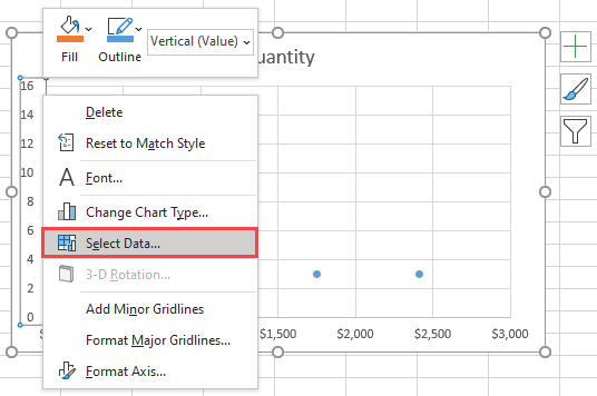
- You need to right-click on one of the axes and choose Select Data. This way, you can also change the data source for the chart.
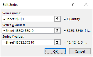
- In the ‘Select Data Source’ dialog box, you can see vertical values (Series), which is X axis (Quantity). Also, on the right side, there are horizontal values (Category), which is the Y axis (Sales). You have to click on the Edit on the left side in order to switch axes.
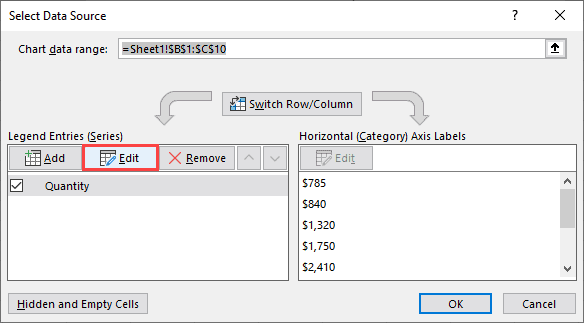
- In the pop-up window, you can see that Series X values refer to the range “=Sheet1!$B$2:$B$10”, and the Series Y values refer to the range “=Sheet1!$C$2:$C$10”.
- In order to switch values, you have to swap these two ranges, so that the range for series X becomes a range for series Y and vice versa. So, in Series X values, enter “=Sheet1!$C$2:$C$10”, and in Series Y values, enter “=Sheet1!$B$2:$B$10”.
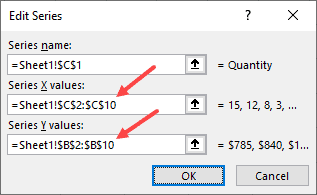
- After you confirm changes, you will be redirected back to the Select Data Source window and click OK.
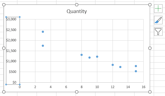
Finally, your chart has a switched axis. As you can see, Sales values are now on the Y-axis, and Quantity values are on the X-axis.
Also read: How to Add Secondary Axis in Excel Charts?
Rearrange the Data to Swap the Chart Axes
The above method works great when you have already created the chart and you want to swap the axis.
But if you haven’t created the chart already, one way could be to rearrange the data so that Excel picks up the data and plots it on the X and Y axis as per your needs.
Excel, by default, sets the first column of the data source on the X-axis and the second column on the Y-axis.
In this case, you can just move Quantity in column B and Sales in column C.
Switching the axis option in a chart gives you more flexibility for adjusting the chart axis. Also, this way, you don’t need to change any data in your sheet.
So, these are two simple and easy ways to switch X-axis and Y-axis in Excel charts.
While I have shown an example of a scatter chart in this tutorial, you can use the same steps to interchange axes in case of any chart in Excel.
Different types of charts utilize these axes differently. For example, in a line chart, both axes are crucial for understanding the trend, whereas in a pie chart, there’s no X or Y-axis as it represents parts of a whole.
Some Tips When Formatting Chart Axis
When you’re playing around with charts in Excel and decide to flip the axes, it’s super important to keep the chart easy to read.
Make sure those data labels are placed just right so everyone can understand them at a glance.
You’ll want to pick a font size and color that are easy on the eyes and work nicely together.
Oh, and adding a chart title and a legend can be a big help in making your data clear to others.
Also, think about what kind of data you’ve got and the best way to show it off – whether that’s with a bar, line, or scatter chart. Remember, the whole point of your chart is to make your information clear and engaging!
I hope you found this Excel tutorial useful!
Other Excel tutorials you may also like:
- How to Move a Chart to a New Sheet in Excel
- How to Insert an Excel file into MS Word (3 Easy Ways)
- How to Create Bar of Pie Chart in Excel?
- How to Insert Chart Title in Excel?
- How to Add Border to a Chart in Excel?
- How to Create a Waterfall Chart in Excel?
- How to Make Box Plot (Box and Whisker Chart) in Excel?