A pivot table summarizes a big dataset into a small table of totals, counts, or averages. A pivot chart takes that same summary and draws it as a chart.
Both work off the same summary, so the real difference isn’t the data.
It’s how you want to read it. You either want exact numbers, or a picture you can scan in a second.
In this article, I’ll walk you through what each one does, how they stay linked when you filter, the key differences, and when to pick one over the other.
The Example Dataset
Below I have a sales dataset with 24 orders. Each row has the order date, region, product, units sold, and revenue.
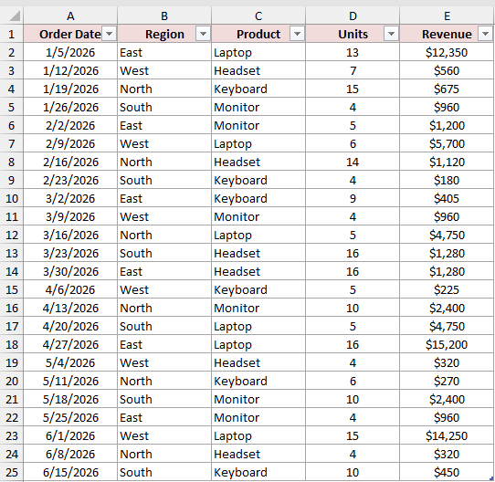
I’ll use this same data for both the pivot table and the pivot chart, so you can see exactly how they relate.
What Is a Pivot Table in Excel?
A pivot table groups your data and summarizes it. You pick a field for the rows (like Region), a field to summarize (like Revenue), and Excel does the math.
Below is a pivot table built from the sales data. It shows total revenue for each region, with Product sitting in the filter area at the top.
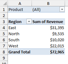
In one glance, you can see East brought in $31,395 and the grand total is $72,965. These are exact numbers you can copy, reference, or check against the source data.
Here’s what a pivot table is great at:
- Showing exact totals, counts, averages, and percentages
- Handling many fields at once (rows, columns, and filters together)
- Drilling into the detail behind a number (double-click a value to see the rows behind it)
What Is a Pivot Chart in Excel?
A pivot chart is a chart that’s connected to a pivot table. It plots whatever the pivot table is currently showing.
Here is the pivot chart for the same pivot table. It shows revenue by region as a column chart.
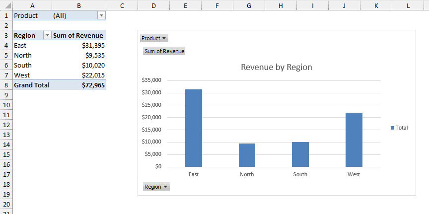
Now you don’t need to read any numbers to spot that East is the top region and North is the lowest. That’s the whole point of a pivot chart.
You’ll also notice the gray buttons on the chart (Product, Sum of Revenue, and Region).
These are field buttons. They let you filter and sort right from the chart itself.
Here are the steps to create a pivot chart from an existing pivot table:
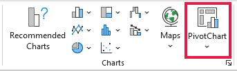
- Select any cell in the pivot table, then go to the Insert tab and click PivotChart.
- In the Insert Chart dialog box, pick a chart type (I went with Clustered Column) and click OK.
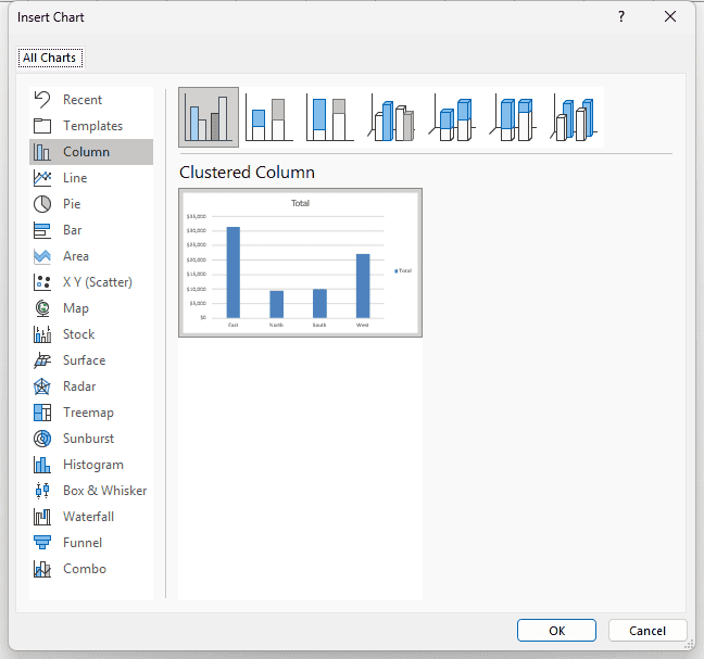
Excel places the pivot chart on the same sheet as the pivot table.
Note: You don’t need a pivot table first. If you select a cell in your data and go to Insert > PivotChart, Excel creates both the pivot table and the pivot chart for you.
How a Pivot Chart Stays Linked to Its Pivot Table
This is the part that trips people up. A pivot chart and its pivot table are not two separate things. They share one layout.
So whatever you do to one, happens to the other. Filter the pivot table, and the chart filters too. Filter the chart, and the table follows.
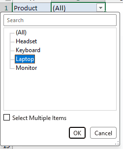
Let me show you. Here, I’ll filter to show only Laptop sales using the Product filter in the pivot table.
- Click the drop-down arrow next to Product in the pivot table’s filter area, select Laptop, and click OK.
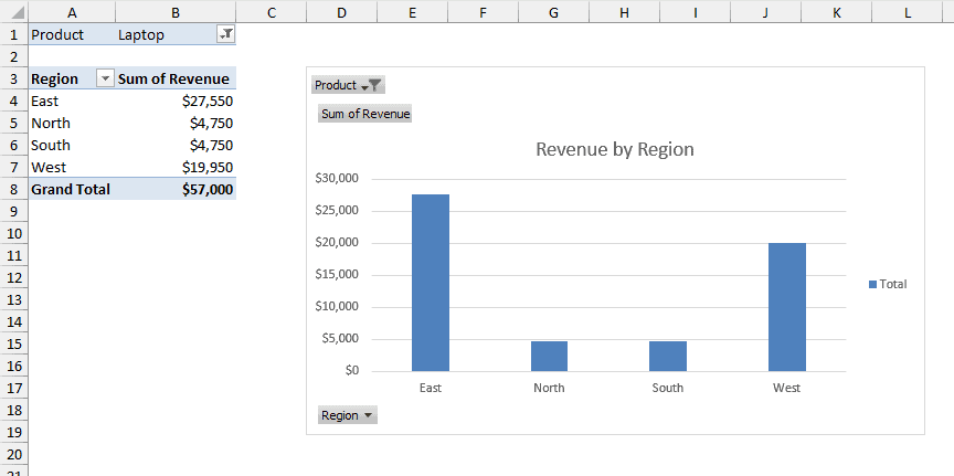
Both the pivot table and the pivot chart now show only Laptop revenue. East drops to $27,550, and the grand total becomes $57,000.
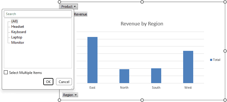
You can do the same thing from the chart side. Click the Product field button on the chart, and you get the exact same filter list.
The same goes for moving fields around. If you drag a different field into Rows, both the table and the chart change their layout together.
Pivot Table vs Pivot Chart: Key Differences
Here’s a quick side-by-side comparison of the two.
| Feature | Pivot Table | Pivot Chart |
|---|---|---|
| What it shows | Exact numbers in rows and columns | A visual chart of the same summary |
| Needs a pivot table? | No, it works directly off your data | Yes, it always has a linked pivot table |
| Best for | Looking up and checking exact values | Spotting trends and comparing at a glance |
| Filtering | Filter area, row and column filters, slicers | Field buttons on the chart, slicers |
| Changing the layout | Drag fields in the PivotTable Fields pane | Same pane, and the linked table changes too |
| Chart types | Not applicable | Most types, but not XY (scatter), bubble, stock, or newer ones like treemap and histogram |
| Drill-down | Double-click a value to see the source rows | Not available on the chart itself |
So remember, a pivot table can live on its own, but a pivot chart always needs its pivot table.
Pivot Chart vs Regular Chart
A regular Excel chart plots a fixed range of cells. A pivot chart plots its pivot table, so it reshapes itself whenever the pivot table changes.
That link comes with a few trade-offs you should know about:
- No row/column switch in Select Data. In a regular chart, you can swap rows and columns in the Select Data Source dialog box. In a pivot chart, you rearrange the pivot table fields instead.
- Fewer chart types. You can’t make a pivot chart an XY (scatter), bubble, or stock chart. Newer types like treemap and histogram aren’t available either.
- Some formatting doesn’t survive a refresh. Most formatting stays, but trendlines, data labels, and error bars are not preserved when you refresh.
When Should You Use a Pivot Table?
Go with a pivot table when you need the actual numbers.
For example, if your manager asks for the exact revenue per region, or you need to plug a total into another report, a pivot table gives you that directly.
It’s also the better choice when you’re summarizing by several fields at once, like Region in rows and Product in columns.
A chart with that many bars gets hard to read quickly.
When Should You Use a Pivot Chart?
Go with a pivot chart when you want someone to get the story in a few seconds.
If you’re building a dashboard or a slide, a pivot chart shows which region is ahead without anyone reading a single number.
And since it’s linked, you can add a slicer or use the field buttons to let people filter the chart themselves.
In most cases, you’ll use both. Keep the pivot table for the exact figures and put the pivot chart right next to it for the quick visual.
Additional Notes About Pivot Tables and Pivot Charts in Excel
- Refresh is manual. If you change the source data, right-click the pivot table and click Refresh (or use Data > Refresh All). The pivot chart updates along with it.
- Deleting the pivot table breaks the link. The chart stays, but it turns into a regular chart with its values frozen, and you can’t pivot it anymore.
- Clear All affects both. Using Clear All on a pivot table also clears the fields, customizations, and formatting of its pivot chart.
- Convert your data into an Excel Table first. When you add new rows to a table, a refresh picks them up without you having to change the source range.
Frequently Asked Questions
Can I create a pivot chart without a pivot table?
Not really. Even if you insert a pivot chart straight from your data, Excel creates a pivot table for it in the background. The chart always needs one.
Can I have two pivot charts from one pivot table?
Yes. But since both charts are linked to the same pivot table, filtering one will filter the other too. If you want them independent, make a second pivot table.
Why can’t I switch rows and columns in my pivot chart?
A pivot chart takes its layout from its pivot table. To swap them, move the fields between the Rows and Columns areas in the PivotTable Fields pane.
What happens to the pivot chart if I delete the pivot table?
The chart stays on the sheet, but it becomes a regular chart with fixed values. It no longer updates or responds to filters.
Conclusion
A pivot table gives you exact numbers, and a pivot chart turns those numbers into a picture.
They’re linked, so any filter or layout change you make to one shows up in the other.
My default is to build the pivot table first for accuracy, then add a pivot chart when I need to share the result visually. I hope you found this article helpful.
Other Excel articles you may also like: