An interactive dashboard in Excel puts your key numbers and charts on one sheet, and lets anyone filter all of them with a click.
Pick a store or a date range, and every chart updates together.
Everything you need is built into Excel. PivotTables do the math, PivotCharts draw it, and slicers give you the buttons.
The step that trips people up is the connection. A new slicer only filters the PivotTable it came from.
The rest of the dashboard ignores it until you link them.
In this tutorial, I’ll show you how to set up the PivotTables, add KPI cards with GETPIVOTDATA, create the charts, and connect slicers and a Timeline to everything.
What the Finished Dashboard Looks Like
Here’s the dashboard you’ll have by the end of this tutorial. It tracks a year of orders for a small bike shop chain with three stores.
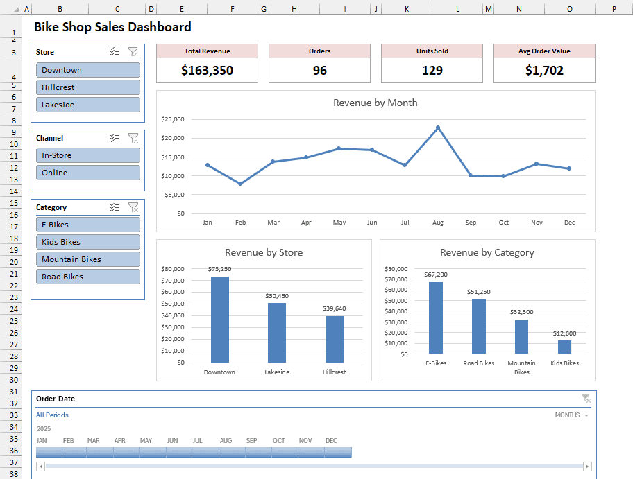
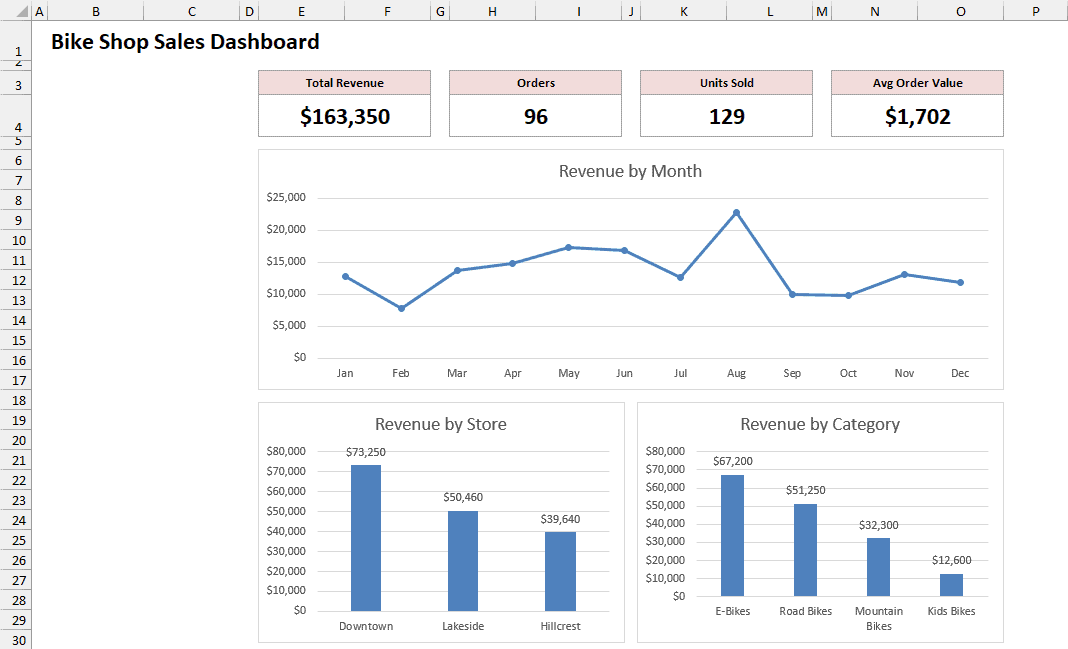
Four KPI cards sit at the top. Below them, a line chart shows revenue by month, and two column charts split it by store and by bike category.
The slicers on the left filter by store, sales channel, and category. The Timeline at the bottom filters by date.
All of it reads from four PivotTables on a separate sheet. Because they share one source, a single slicer can filter every one of them.
Step 1: Convert Your Data Into an Excel Table
A dashboard needs tidy data underneath it. Each row should be one record, and each column needs a header.
Below I have the order data for the bike shop chain. There are 96 orders from 2025, each with an order date, store, sales channel, bike category, units, and revenue.
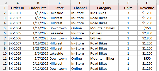
The first thing I’ll do is turn this into an Excel Table.
When you add new orders later, the Table grows to include them, and the dashboard picks them up on refresh.
Here are the steps to convert the data into a Table:
- Select any cell in the data and press Ctrl + T (Command + T on a Mac).
- In the Create Table dialog, make sure My table has headers is checked.
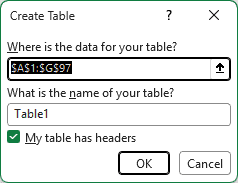
- Replace Table1 in the table name box with BikeSales and click OK. In older versions without this box, type the name in the Table Name box on the Table Design tab.
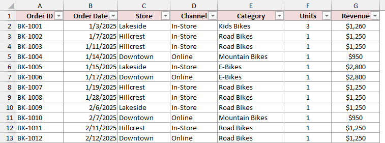
The data is now a Table called BikeSales. Every PivotTable in this dashboard will use it as its source.
Step 2: Create the PivotTables That Feed the Dashboard
A dashboard shows the same data in several ways. Here, I want revenue by month, revenue by store, revenue by category, and four headline totals.
Each of those gets its own PivotTable. I’ll build the first one, then copy it to make the rest.
Here are the steps to create the first PivotTable:
- Select any cell in the Table, go to the Insert tab, and click PivotTable.
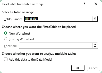
- Make sure the Table/Range box says BikeSales, select New Worksheet, and click OK.
- Double-click the new sheet’s tab and rename it Pivots.
- In the PivotTable Fields pane, drag Order Date to the Rows area and Revenue to the Values area.
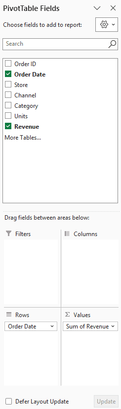
Newer versions of Excel often group dates by month automatically. If you see individual dates instead, group them yourself:
- Right-click any date in the PivotTable and click Group. Select Months only and click OK.
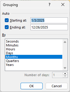
All the orders are from 2025, so months are enough.
If your data covers more than one year, select Years as well. Otherwise, January 2024 and January 2025 get lumped together.
- Go to the Design tab, click Report Layout, and choose Show in Tabular Form. The header now shows the field name instead of “Row Labels”.
- Double-click the Sum of Revenue header, change the Custom Name to Total Revenue, and click OK.
- Go to the PivotTable Analyze tab (called Analyze or Options in older versions) and type RevenueByMonth in the PivotTable Name box.
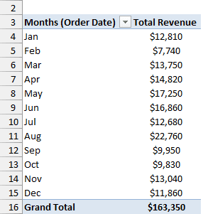
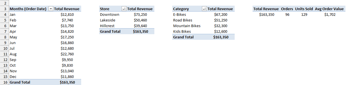
Here’s the first PivotTable. It shows the total revenue for each month of the year.
Now I need three more. Instead of building each one from scratch, I’ll copy this PivotTable.
A copied PivotTable shares the original’s data connection (its pivot cache). That shared connection is what lets one slicer control all of them later.
Here are the steps to make the other three PivotTables:
- Click inside the PivotTable, go to PivotTable Analyze > Select > Entire PivotTable, and press Ctrl + C.
- Select cell D3 and press Ctrl + V. In the Fields pane, drag the date field out of the Rows area and put Store there instead. Name this PivotTable RevenueByStore.
- Paste another copy in cell G3, swap in Category, and name it RevenueByCategory.
- Paste a fourth copy in cell J3 and drag the date field out of the Rows area, leaving it empty. Then drag Order ID, Units, and Revenue into Values, below Total Revenue.
- Rename those three value fields Orders, Units Sold, and Avg Order Value. For the last one, also change Summarize value field by to Average. Name this PivotTable KPITotals.
- In the Store and Category PivotTables, right-click any revenue number and go to Sort > Sort Largest to Smallest.
Excel counts Order ID automatically because it’s text, so Orders shows the number of orders.
Here are all four PivotTables on the Pivots sheet.
Note: A custom name can’t be exactly the same as a field in your data. That’s why the value fields are called Total Revenue and Units Sold instead of Revenue and Units.
Step 3: Add KPI Cards With GETPIVOTDATA
KPI cards are the big numbers at the top of a dashboard. I’ll add four on a new sheet: Total Revenue, Orders, Units Sold, and Avg Order Value.
Each card is a label with a number below it. The number comes from the KPITotals PivotTable through the GETPIVOTDATA function.
Here are the steps to build the KPI cards:
- Add a new sheet, name it Dashboard, and type a title in cell B1.
- Type the four card labels in cells E3, H3, K3, and N3. I merged each label with the cell to its right (E3:F3, and so on), and did the same in row 4 for the numbers.
- Select cell E4 and type =. Go to the Pivots sheet, click the Total Revenue number in cell J4, and press Enter.
Excel doesn’t write a plain cell reference here. It writes this formula for you:
=GETPIVOTDATA("Total Revenue",Pivots!$J$3)
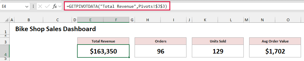
This formula returns the Total Revenue value from the PivotTable that starts at Pivots!J3.
It asks the PivotTable for the value by name, so it keeps working even if the PivotTable moves or changes shape.
For the other three cards, repeat step 3 in cells H4, K4, and N4. Click the Orders, Units Sold, and Avg Order Value numbers.
The only thing that changes in each formula is the name in quotes.
Note: If Excel writes =Pivots!J4 instead of a GETPIVOTDATA formula, the option is switched off. Go to PivotTable Analyze, click the arrow next to Options in the PivotTable group, and turn on Generate GetPivotData.
Step 4: Create PivotCharts and Move Them to the Dashboard
A PivotChart is a chart built on a PivotTable. When a slicer filters the PivotTable, the chart changes with it.
Here are the steps to create the first PivotChart:
- On the Pivots sheet, select any cell in the RevenueByMonth PivotTable.
- Go to the PivotTable Analyze tab and click PivotChart. Choose Line, pick Line with Markers, and click OK.
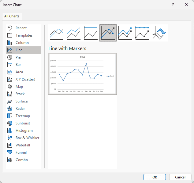
- Go to the PivotChart Analyze tab, click Field Buttons, and choose Hide All. Then click the chart title, type Revenue by Month, and delete the legend.
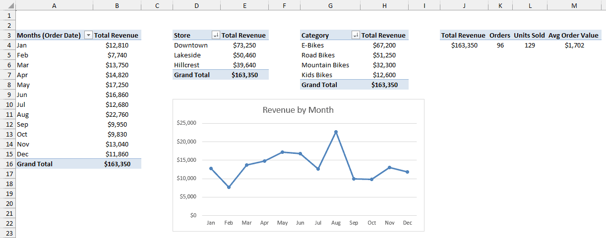
Here’s the first PivotChart, sitting next to the PivotTables.
Now repeat these steps for RevenueByStore and RevenueByCategory, choosing Clustered Column instead of Line.
I also added data labels from the Chart Elements button (the plus sign next to each chart).
Once all three charts are ready, move them to the dashboard:
- Select a chart and press Ctrl + X. Go to the Dashboard sheet, select a cell under the KPI cards, and press Ctrl + V.
- Repeat for the other two charts, then drag and resize them so they line up under the cards.
A PivotChart stays linked to its PivotTable when you move it to another sheet. Here’s the dashboard with all three charts in place.
Step 5: Insert the Slicers
Slicers are the buttons that filter the dashboard. I’ll add three: one each for Store, Channel, and Category.
Here are the steps to insert the slicers:
- Click the Revenue by Month chart on the Dashboard sheet.
- Go to the PivotChart Analyze tab and click Insert Slicer.
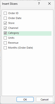
- Check Store, Channel, and Category, and click OK.
- Drag the three slicers into a column on the left of the dashboard, and resize them to fit.
Now click Lakeside in the Store slicer.
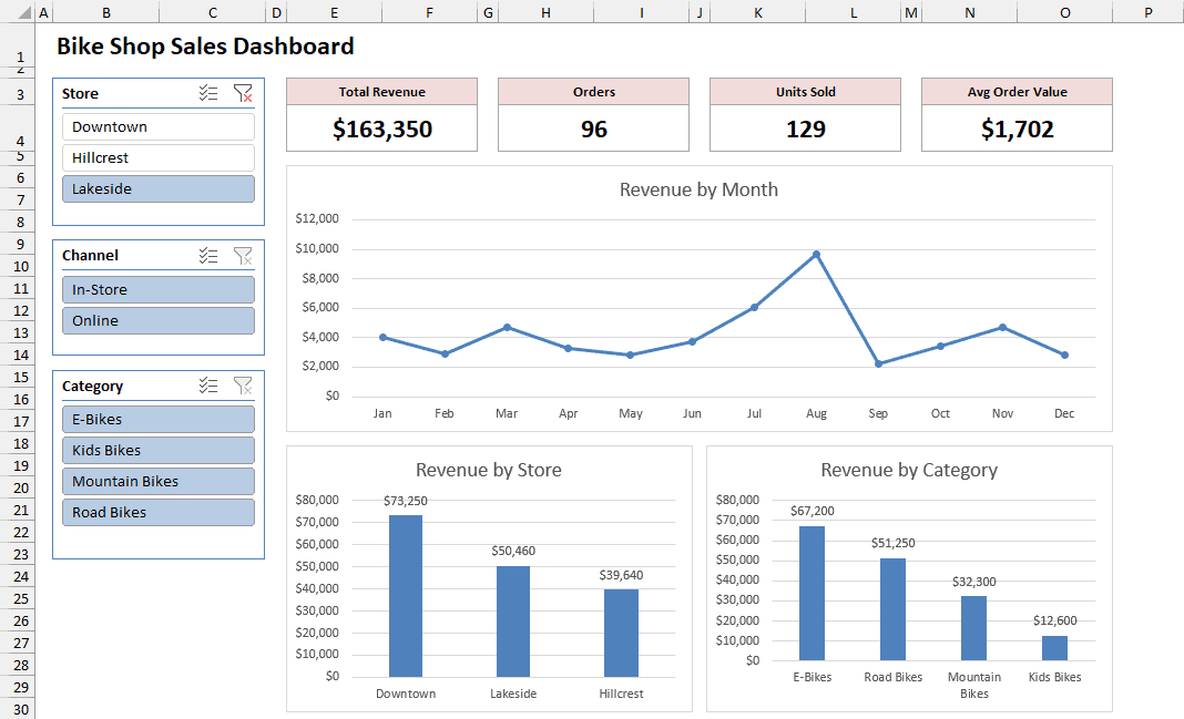
The line chart changes to show only Lakeside’s revenue. But look at the rest of the dashboard.
The KPI cards still say $163,350, and the store chart still shows all three stores.
A new slicer is connected only to the PivotTable it came from, which is RevenueByMonth here. The next step fixes that.
Step 6: Make the Slicers Control Every Chart
To make a slicer control more than one chart, you connect it to the other PivotTables with Report Connections. It works here because all four PivotTables share one data source.
Here are the steps to connect a slicer to every PivotTable:
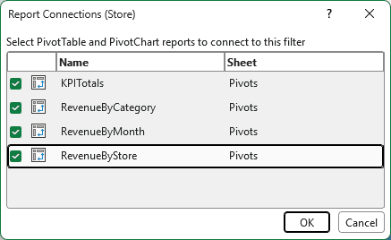
- Right-click the Store slicer and click Report Connections.
- Check all four PivotTables and click OK.
- Do the same for the Channel and Category slicers.
With Lakeside still selected, the whole dashboard now updates.
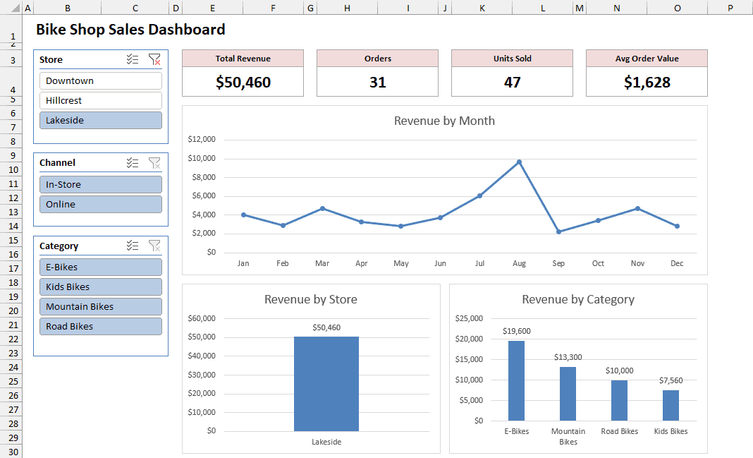
The cards show Lakeside’s $50,460 in revenue from 31 orders, and both column charts filter too. Click another store, and everything switches with it.
Note: You can also open Report Connections from the ribbon. Select the slicer, go to the Slicer tab, and click Report Connections.
Step 7: Add a Timeline for Dates
A Timeline is a slicer made for dates. Instead of clicking buttons, you drag across a bar of months to pick a date range.
Timelines work with PivotTables in Excel 2013 and later versions.
Here are the steps to add a Timeline:
- Click the Revenue by Month chart, go to the PivotChart Analyze tab, and click Insert Timeline.
- Check Order Date and click OK.
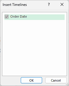
- Drag the Timeline below the charts and stretch it across the dashboard.
- Right-click the Timeline and click Report Connections. Check all four PivotTables and click OK.
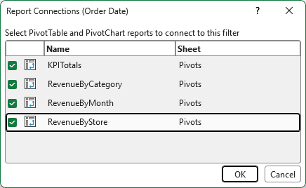
Now drag across May to Aug in the Timeline, with Lakeside still selected in the Store slicer.
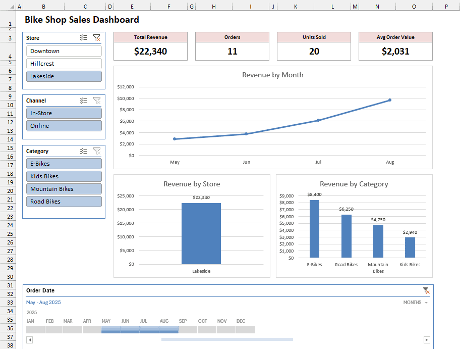
The dashboard now shows only Lakeside’s orders from May to August. That’s $22,340 from 11 orders, and revenue climbs every month.
Note: The MONTHS drop-down in the Timeline’s top-right corner switches it to years, quarters, or days.
Step 8: Add the Finishing Touches
A few small changes make the dashboard look like a report instead of a worksheet:
- Hide gridlines and headings. On the View tab, uncheck Gridlines and Headings.
- Clear filters quickly. Each slicer has a Clear Filter button in its top-right corner, or you can select the slicer and press Alt + C. The Timeline has its own Clear Filter button too.
- Hide the Pivots sheet. Right-click its tab and click Hide. The slicers keep filtering the PivotTables, and the dashboard keeps working.
Additional Notes About Creating an Excel Dashboard With Slicers
- Refresh after adding data. Add new rows to the bottom of the Table, then go to Data > Refresh All. Slicers filter what the PivotTables already have, but they don’t pull in new rows by themselves.
- Keep every PivotTable on one source. Build them all from the same Table, or copy an existing PivotTable. A PivotTable made from a different range won’t show up in Report Connections.
- Timelines need real dates. If your date column is stored as text, Insert Timeline won’t list it. Convert the text to real dates first.
- Some filter combinations are empty. For example, Hillcrest had no online E-Bike orders. Pick that combination and the cards show zeros, while the slicers gray out buttons that have no data.
Frequently Asked Questions
Here are some questions people often ask about Excel dashboards with slicers.
Can a slicer control a regular chart that isn’t a PivotChart?
Yes, if the chart is built from an Excel Table. Add a slicer to the Table from Table Design > Insert Slicer.
The slicer hides rows, and charts skip hidden rows by default, so the chart filters too.
The limit is that a Table slicer controls only its own Table. To filter several charts at once, PivotCharts are the way to go.
Is there an Excel slicer dashboard template I can use?
The example file at the top of this article works as one.
Paste your own data into the BikeSales Table with the same column headers, then go to Data > Refresh All.
If your columns are different, rebuild the PivotTables from your data and reuse the layout.
Do slicers and Timelines work on a Mac or in Excel for the web?
On a Mac, yes. Excel for Microsoft 365 for Mac, Excel 2021 for Mac, and Excel 2024 for Mac all support slicers and Timelines.
In Excel for the web, you can add a slicer to a regular PivotTable, but build the full dashboard in the desktop app.
Conclusion
In this article, I showed you how to build an interactive dashboard in Excel.
We started with a Table and four PivotTables, then added KPI cards, PivotCharts, slicers, and a Timeline.
If a slicer ever moves only one chart, Report Connections is the first place to check. I hope you found this article helpful.
Other Excel articles you may also like: