A bell curve (also called a normal distribution curve) shows how values spread out around an average.
Most values sit near the middle, and fewer show up as you move toward either end.
Excel doesn’t have a bell curve chart type.
You build one from two columns: a set of X values around the mean, and the height of the curve at each of those values.
Once those two columns are ready, a Scatter chart with smooth lines draws the familiar bell shape for you.
I’ll show you how to draw a bell curve from a known mean and standard deviation, then build one from your own data.
You’ll also see how to shade the area between two limits.
Method #1: Using NORM.DIST With a Known Mean and SD
This is the method to use when you already know the mean and standard deviation, like a target weight and its allowed variation.
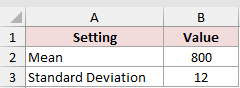
Below I have a small settings table with a mean of 800 and a standard deviation of 12. I want to draw the bell curve for these two numbers.
First, I need the X values for the curve. Enter this formula in cell D2:
=B2+B3*SEQUENCE(61,1,-30,1)/10
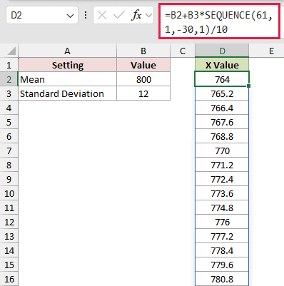
The formula spills down the column automatically and returns 61 values, from 764 to 836.
How does this formula work?
SEQUENCE(61,1,-30,1) returns 61 whole numbers from -30 to 30. Dividing them by 10 turns them into steps of 0.1, from -3 to 3.
Each step is then multiplied by the standard deviation in B3 and added to the mean in B2.
So the X values run from 3 standard deviations below the mean to 3 above it, in steps of 1.2.
That range covers almost the whole curve. About 99.7% of a normal distribution sits within 3 standard deviations of the mean.
Note: I’m stepping through whole numbers and dividing by 10 on purpose. If you use SEQUENCE(61,1,764,1.2) instead, Excel keeps adding 1.2 and tiny floating-point errors build up, so a value like 812 can end up as 812.0000001. That breaks any comparison against an exact value later on.
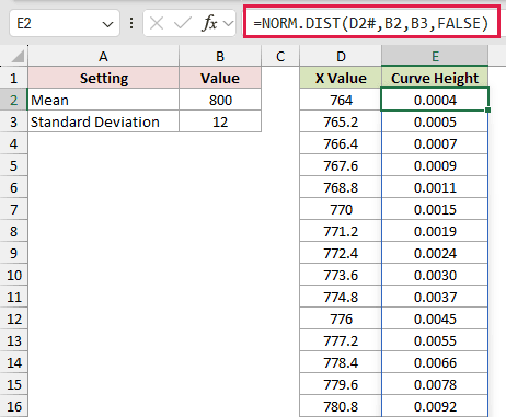
Now for the height of the curve at each X value. Enter this formula in cell E2:
=NORM.DIST(D2#,B2,B3,FALSE)
How does this formula work?
NORM.DIST takes an X value, the mean, and the standard deviation.
D2# refers to the whole spilled range in column D, so the formula returns a height for all 61 X values at once.
The last argument, FALSE, tells NORM.DIST to return the height of the curve at that point (the probability density) instead of the running total up to it.
The peak is at 800, the mean, where the height is 0.0332. The values get smaller as you move away from the mean in either direction.
Here are the steps to turn these two columns into a bell curve:
- Select D1:E62. Then go to the Insert tab, click the Insert Scatter (X, Y) or Bubble Chart icon, and pick Scatter with Smooth Lines.
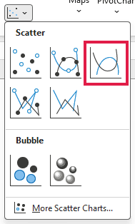
Excel inserts the chart, and you get your bell curve.
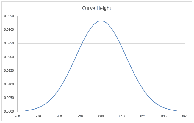
Since the whole thing runs on formulas, you can change the mean or standard deviation in B2 or B3 and the curve updates on its own.
Method #2: Using AVERAGE and STDEV.S on Your Data
If you have actual measurements instead of a known mean and standard deviation, you can work both out from the data and then draw the curve.
Below I have a dataset with the weights of 40 loaves of bread from a bakery. I want to draw a bell curve that fits these weights.
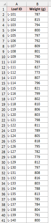
First, the mean. Enter this formula in cell E2:
=AVERAGE(B2:B41)
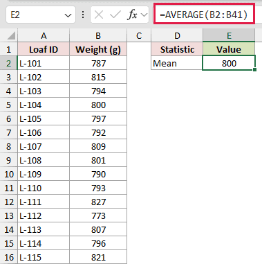
This returns 800, the average weight of the 40 loaves.
Next, the standard deviation. Enter this formula in cell E3:
=STDEV.S(B2:B41)
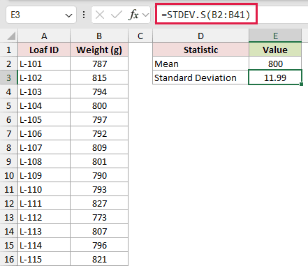
This returns 11.99, which tells you how far a typical loaf sits from the average weight.
I’m using STDEV.S because these 40 loaves are a sample of everything the bakery makes. If your data covers the whole group, use STDEV.P instead.
Now the X values for the curve. Enter this formula in cell G2:
=E2+E3*SEQUENCE(61,1,-30,1)/10
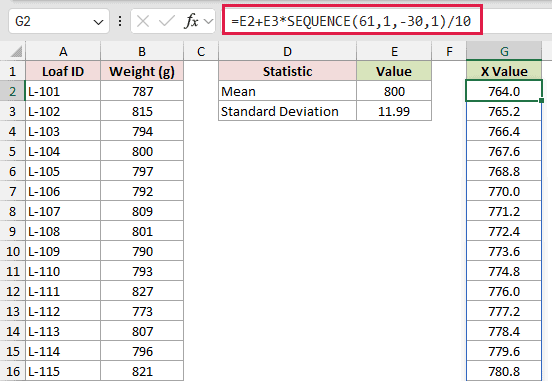
This works just like in Method #1. It spills 61 values from 3 standard deviations below the mean (764.0) to 3 above it (836.0).
The only difference is that the mean and standard deviation now come from the formulas in E2 and E3, so the curve follows the data.
Finally, the height of the curve. Enter this formula in cell H2:
=NORM.DIST(G2#,E2,E3,FALSE)
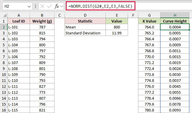
This returns the curve height for each X value in column G, with the highest point (0.0333) at the middle of the curve.
Here are the steps to create the chart:
- Select G1:H62. Then go to the Insert tab, click the Insert Scatter (X, Y) or Bubble Chart icon, and pick Scatter with Smooth Lines.
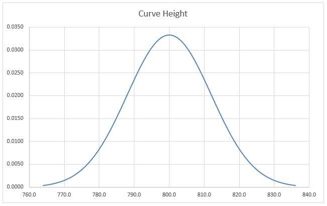
If you add more loaf weights, extend the B2:B41 range in the AVERAGE and STDEV.S formulas, and the curve redraws itself.
Method #3: Adding a Shaded Area Under the Curve
Sometimes you want to highlight part of the curve, like the loaves that fall within an allowed weight range.
You can do this with a helper column and a combo chart.
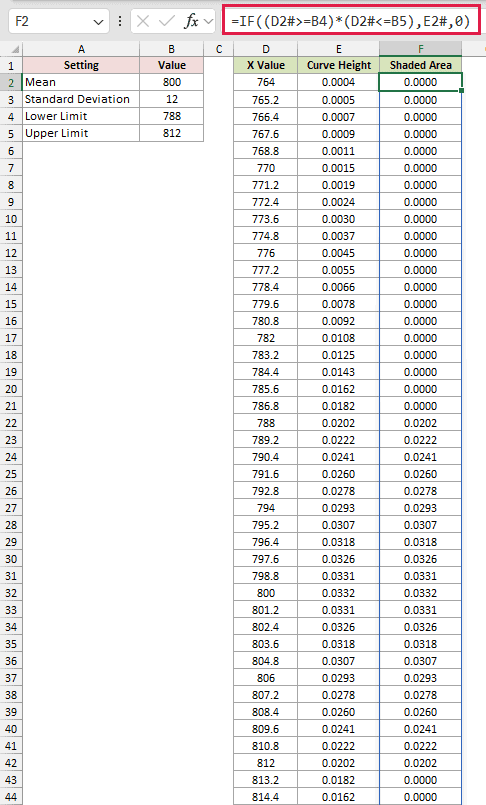
Below I have the same mean and standard deviation as Method #1, with the X values and curve heights already filled in.
I’ve also added a lower limit of 788 and an upper limit of 812.
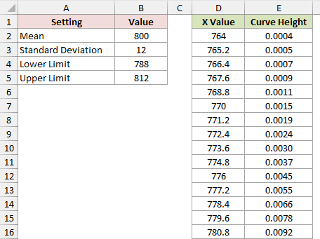
The X values in D2 and the curve heights in E2 use the same SEQUENCE and NORM.DIST formulas as Method #1.
Now I need a column that keeps the curve height only between the two limits. Enter this formula in cell F2:
=IF((D2#>=B4)*(D2#<=B5),E2#,0)
How does this formula work?
(D2#>=B4) checks whether each X value is at least 788, and (D2#<=B5) checks whether it’s at most 812. Multiplying the two returns 1 only when both are true.
When it’s 1, the IF function returns the curve height from column E. Everywhere else, it returns 0.
So the Shaded Area column matches the curve between 788 and 812 and stays flat at 0 outside that range.
Here are the steps to create the shaded bell curve:
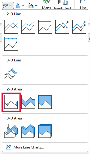
- Select E1:F62. Then go to the Insert tab, click the Insert Line or Area Chart icon, and pick Area.
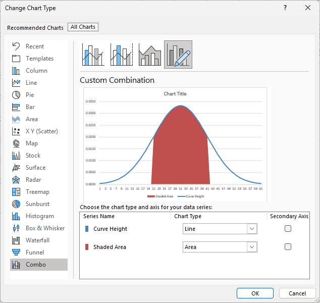
- Right-click the chart and choose Change Chart Type. Pick Combo on the left, set Curve Height to Line and Shaded Area to Area, then click OK.
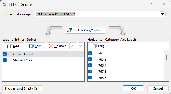
- Right-click the chart and choose Select Data. Under Horizontal (Category) Axis Labels, click Edit, select D2:D62, and click OK twice.
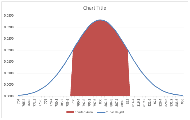
The line now draws the full bell curve, and the filled area shows the part between 788 and 812.
You can also work out how much of the curve that shaded part covers. Enter this formula in cell B7:
=NORM.DIST(B5,B2,B3,TRUE)-NORM.DIST(B4,B2,B3,TRUE)
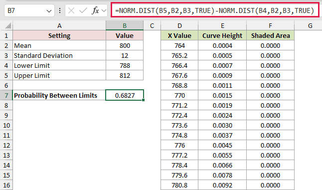
This returns 0.6827. If loaf weights follow a normal distribution with this mean and standard deviation, about 68.27% would fall between 788 and 812 grams.
With TRUE as the last argument, NORM.DIST returns the share of the curve up to a value.
Subtracting the share up to 788 from the share up to 812 leaves the share in between.
Additional Notes About Making a Bell Curve in Excel
- Use Scatter with Smooth Lines, not a Line chart, for a plain curve. A scatter chart places each point by its actual X value, so the shape stays true even if your X values aren’t evenly spaced.
- The curve heights aren’t percentages. NORM.DIST with FALSE returns a density, which is why the values look tiny. Use TRUE, like in Method #3, when you want a probability.
- The standard deviation must be greater than 0. If it’s 0 or negative, NORM.DIST returns a #NUM! error.
- SEQUENCE needs Excel 2021 or later, or Microsoft 365. In older versions, type the first X value, add a tenth of a standard deviation in each row below, and copy NORM.DIST down instead of using the # reference.
Frequently Asked Questions
Can I put a bell curve over a histogram of my data?
Yes. Make a column chart of how many values fall in each bin, add the curve as a second series, and plot it on the secondary axis.
The curve heights need scaling to match the counts first.
What’s the difference between NORM.DIST and NORMDIST?
NORMDIST is the older version of the function and is kept for compatibility.
Both take the same arguments and return the same results, but NORM.DIST is the one Microsoft recommends.
Why does my bell curve look flat or lopsided?
Check that the X values are centered on the mean and run about 3 standard deviations to each side.
If they only cover one side, you’ll only see half the bell.
How many X values do I need for a smooth curve?
Around 50 to 100 points is plenty. The 61 points used here give a smooth shape without making the table too long.
Conclusion
I used X values and NORM.DIST to draw the bell curve, then showed how to shade a range beneath it. I hope you found this article helpful.
Other Excel articles you may also like: