Excel’s native Sunburst chart is what many people mean when they refer to a multi-level pie chart.
Excel has included it since 2016, so you don’t need to hand-build nested doughnut rings unless you’re using Excel 2013 or earlier.
The source data matters as much as the button you click. A good Sunburst source describes each branch of the hierarchy, including branches that end early.
I’ll show you two native ways to insert it and use the supplied Wrong Layout sheet to check your source.
You’ll also see a doughnut workaround for older versions.
Method #1: Using the Insert Hierarchy Chart Button
This is the route I recommend for most readers because it goes straight to the Sunburst command.
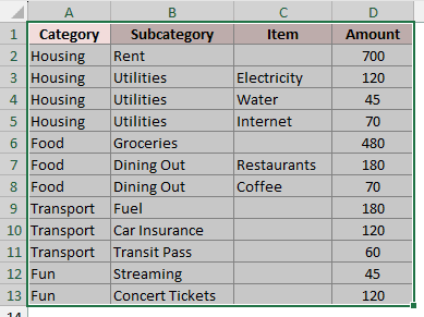
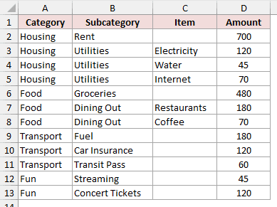
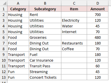
Below I have monthly household spending on the Spending Hierarchy sheet. The source occupies A1:D13, and I want to show its category levels in one chart.
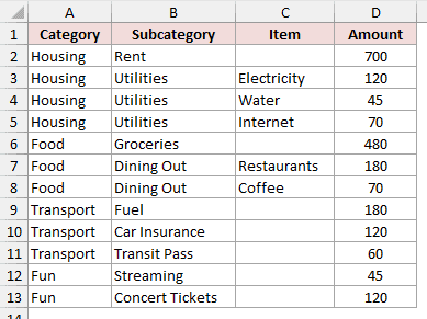
Here are the steps to create the Sunburst chart:
- Select
A1:D13on theSpending Hierarchysheet.
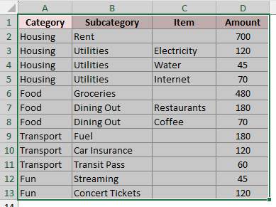
- On the Insert tab, open Insert Hierarchy Chart in the Charts group, then choose Sunburst.
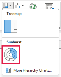
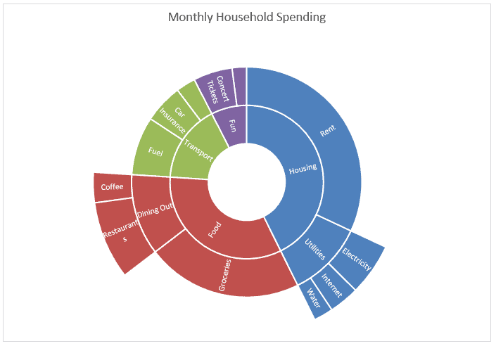
Excel creates the Sunburst from the selected household spending hierarchy.
Note: On a Mac, the ribbon path is Insert > Hierarchy > Sunburst.
Method #2: Using Recommended Charts
Here’s another way to reach the same native chart when you prefer browsing Excel’s full chart gallery.
Below I have the household spending hierarchy in Spending Hierarchy!A1:D13. I want Excel to chart the Category, Subcategory, Item, and Amount fields.
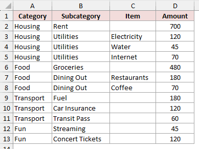
Here are the steps to insert it through Recommended Charts:
- Select
A1:D13on theSpending Hierarchysheet.
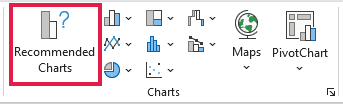
- Open the Insert tab and click Recommended Charts.
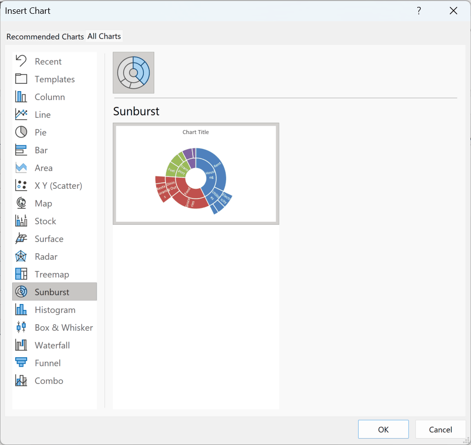
- Open All Charts and choose Sunburst.
Method #3: Reordering the Source Columns
If your chart looks wrong, the problem may be the source arrangement rather than the chart command.
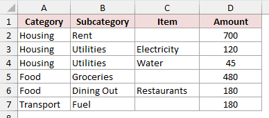
Below I have Wrong Layout!A1:D7. Its headers are Category, Amount, Subcategory, and Item, and I want to compare it with the working source layout.
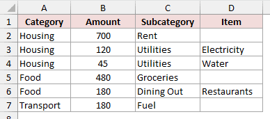
The Wrong Layout sheet puts Amount in column B. The Spending Hierarchy sheet uses Category, Subcategory, Item, and Amount across columns A through D.
Here are the steps to test the corrected arrangement:
- On
Wrong Layout, reorder the columns soA1:D1reads Category, Subcategory, Item, Amount.
- Open
Spending Hierarchyand compare its complete source inA1:D13.
- Check the branches that end at Subcategory. Their Item cells are blank in
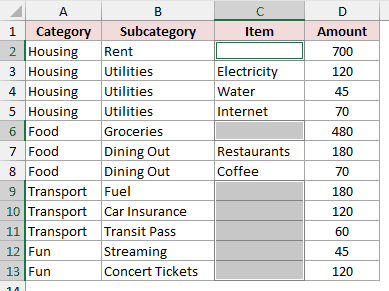
C2,C6, andC9:C13.
- Select
A1:D13, then choose Insert > Insert Hierarchy Chart > Sunburst.
Note: Blank cells inside a hierarchy are supported. You don’t need to invent an Item for Rent, Groceries, Fuel, Car Insurance, Transit Pass, Streaming, or Concert Tickets.
Method #4: Using a Doughnut Chart (Excel 2013 and Earlier)
If you’re using Excel 2013 or earlier, the native Sunburst option isn’t available. A nested doughnut is the manual workaround.
The source below has three hierarchy levels. The Doughnut Data sheet in the download has prepared category and subcategory totals for a simpler two-ring chart.
Here are the steps to build the manual version:
- On
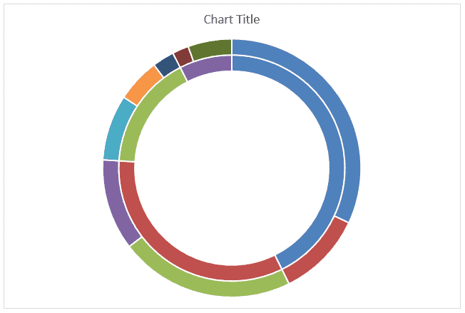
Doughnut Data, selectB1:B5and insert a Doughnut chart. Open Chart Design > Select Data, click Add, and set the second series name toC1and its values toC2:C10.
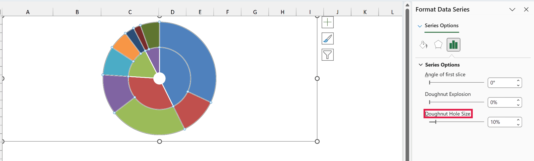
- Right-click a ring, open Format Data Series, and set Doughnut Hole Size to 10%, the smallest supported value.
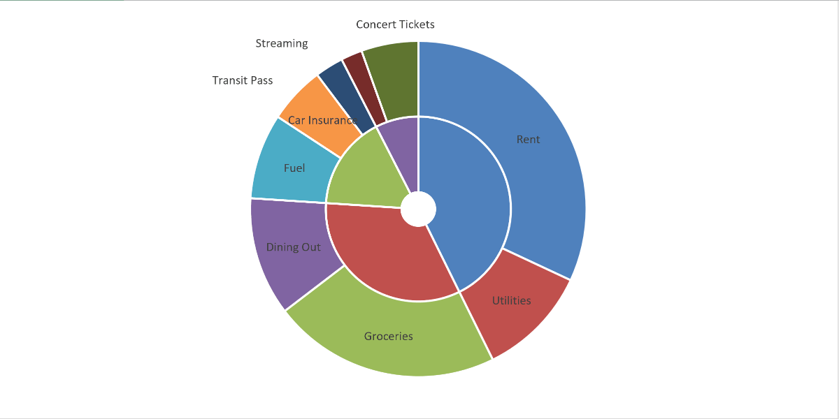
- In Select Data, set Horizontal (Category) Axis Labels to
A2:A10. Add Category Name data labels to the outer ring for its nine subcategories.
- Click the chart, choose Insert > Text Box, and place Housing, Food, Transport, and Fun beside the matching inner-ring segments.
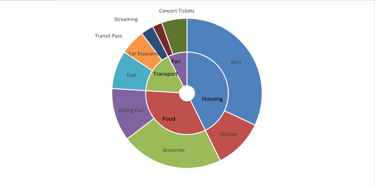
This two-ring chart shows Category and Subcategory. It takes more work than Sunburst and does not include the Item level of the original source.
Sunburst vs Treemap: Which One to Use
Both chart types show hierarchical data, but each is better at a different job.
| Chart | When it fits |
|---|---|
| Sunburst | Use it when the levels between the largest categories and each data point need to be clear. |
| Treemap | Use it when comparing proportions within the hierarchy matters more than showing the levels between them. |
For this household spending example, Sunburst makes the category levels easier to follow.
Additional Notes About Sunburst Charts in Excel
- The native chart is available in Microsoft 365 for Windows and Mac, Excel 2024, 2021, 2019, and 2016, plus Excel for iPad and iPhone.
- Blank cells are supported within the hierarchy, so a branch doesn’t need a made-up lower level.
- Windows uses Insert > Insert Hierarchy Chart > Sunburst. Mac uses Insert > Hierarchy > Sunburst.
Frequently Asked Questions
Is a sunburst chart the same as a multi-level pie chart?
Sunburst is Excel’s name for the native chart that people often mean when they search for a multi-level pie chart.
Is Sunburst available in Excel 2013 or earlier?
No. Those versions don’t include the native Sunburst chart. Use the doughnut workaround in Method #4.
Conclusion
I used Excel’s Sunburst command with an arranged hierarchy, then showed a two-ring doughnut workaround for older versions. I hope you found this article helpful.
Other Excel articles you may also like: