A stacked waterfall chart shows how a total moves from a starting value to an ending value, step by step.
It also splits each step into the parts that caused it.
For example, you can show how total sales changed each month, and how much of each change came from online, retail, and wholesale.
Excel’s built-in Waterfall chart (Excel 2016 and later) only handles one series.
So if you want the split by channel, you need to build the chart yourself from a stacked column chart.
In this article, I’ll show you how to set up the running total, build a small helper table for the chart, and hide the base series so the columns float.
Step 1: Set Up the Data
Below I have a dataset with the opening sales for three channels (Online, Retail, and Wholesale), their changes from January to May, and a closing row.
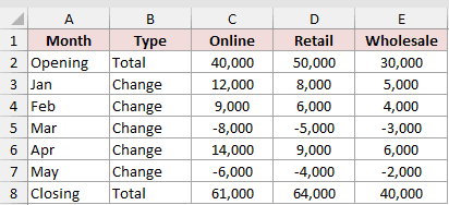
The Type column marks each row as either a Total or a Change. The closing row adds up each channel with a formula like =SUM(C2:C7).
This tells the formulas which bars should start from zero (Opening and Closing) and which ones should float.
First, I’ll add a Net Change column that adds up all three channels for each row. Enter this formula in F2 and copy it down to F8:
=SUM(C2:E2)
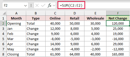
For Jan, this gives 25,000 (12,000 + 8,000 + 5,000). For Mar, it gives -16,000, since all three channels went down.
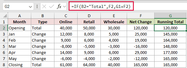
Next, add a Running Total column. Enter this formula in G2 and copy it down to G8:
=IF(B2="Total",F2,G1+F2)
How does this formula work?
If the row is a Total row, the formula returns the Net Change, so Opening shows 120,000.
For a Change row, it adds the Net Change to the running total in the row above. So Jan becomes 120,000 + 25,000 = 145,000.
The Closing row is also a Total row, so it returns its own Net Change of 165,000.
That matches the running total for May, which is a good sign your numbers add up.
I’m using a regular formula copied down here because each row needs the result from the row above it.
Step 2: Build the Chart Helper Table
The chart can’t use the data above directly. It needs an invisible “Base” value under each floating column, plus positive values for each channel.
So I’ll build a small helper table in columns I to M. It has five columns: Label, Base, Online, Retail, and Wholesale.
First, the labels. Enter this formula in I2 and copy it down to I8:
=A2
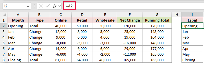
This simply pulls the month names across, so the chart labels always match your data.
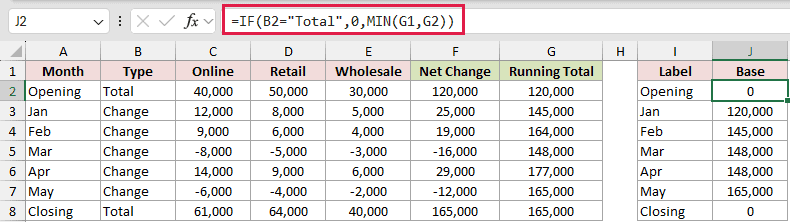
Now the Base column. Enter this formula in J2 and copy it down to J8:
=IF(B2="Total",0,MIN(G1,G2))
How does this formula work?
Total rows get a base of 0, so the Opening and Closing columns start from the bottom of the chart.
For a Change row, the base is the smaller of two numbers: the running total before this month (G1) and the running total after it (G2).
When sales go up, the smaller number is the previous total. So Jan’s base is 120,000, and its segments stack up to 145,000.
When sales go down, the smaller number is the new total. So Mar’s base is 148,000, and its segments stack back up to Feb’s 164,000.
Finally, the channel values. Enter this formula in K2, copy it across to M2, and then copy it down to row 8:
=ABS(C2)
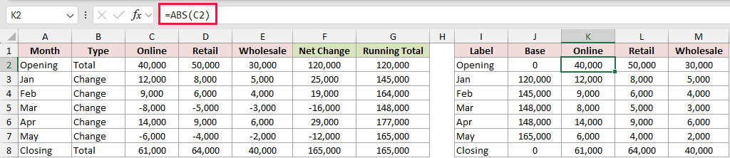
The ABS function removes the minus sign from a number.
A stacked column can’t show a negative segment sitting on top of a base, so every segment needs to be positive.
The minus sign isn’t lost, though. The Base formula already put decreasing months lower, so the chart still shows the drop.
Note: This setup works when every channel moves in the same direction in a given month. If Online goes up while Retail goes down in the same month, the segments can’t show that correctly.
Step 3: Insert a Stacked Column Chart
Now that the helper table is ready, you can create the chart from it.
Here are the steps to insert the chart:
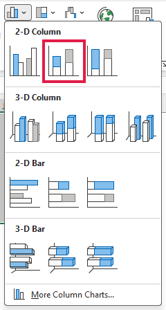
- Select the helper table, including its headers (I1:M8). Then go to the Insert tab, click the Insert Column or Bar Chart icon, and pick Stacked Column.
Excel inserts a stacked column chart with four series: Base, Online, Retail, and Wholesale.
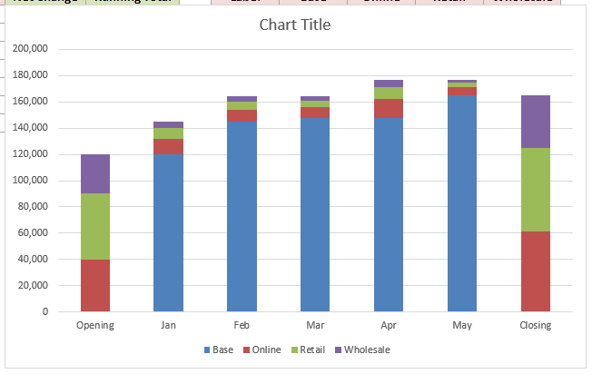
It doesn’t look like a waterfall yet, because the Base series is still showing at the bottom of every column. Let’s fix that next.
Step 4: Hide the Base Series
The trick behind this chart is making the Base series invisible. It still pushes the channel segments up, but you won’t see it.
Here are the steps to hide it:
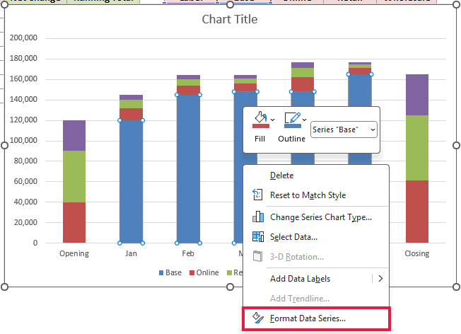
- Right-click the Base series (the bottom segment of any column) and click Format Data Series.
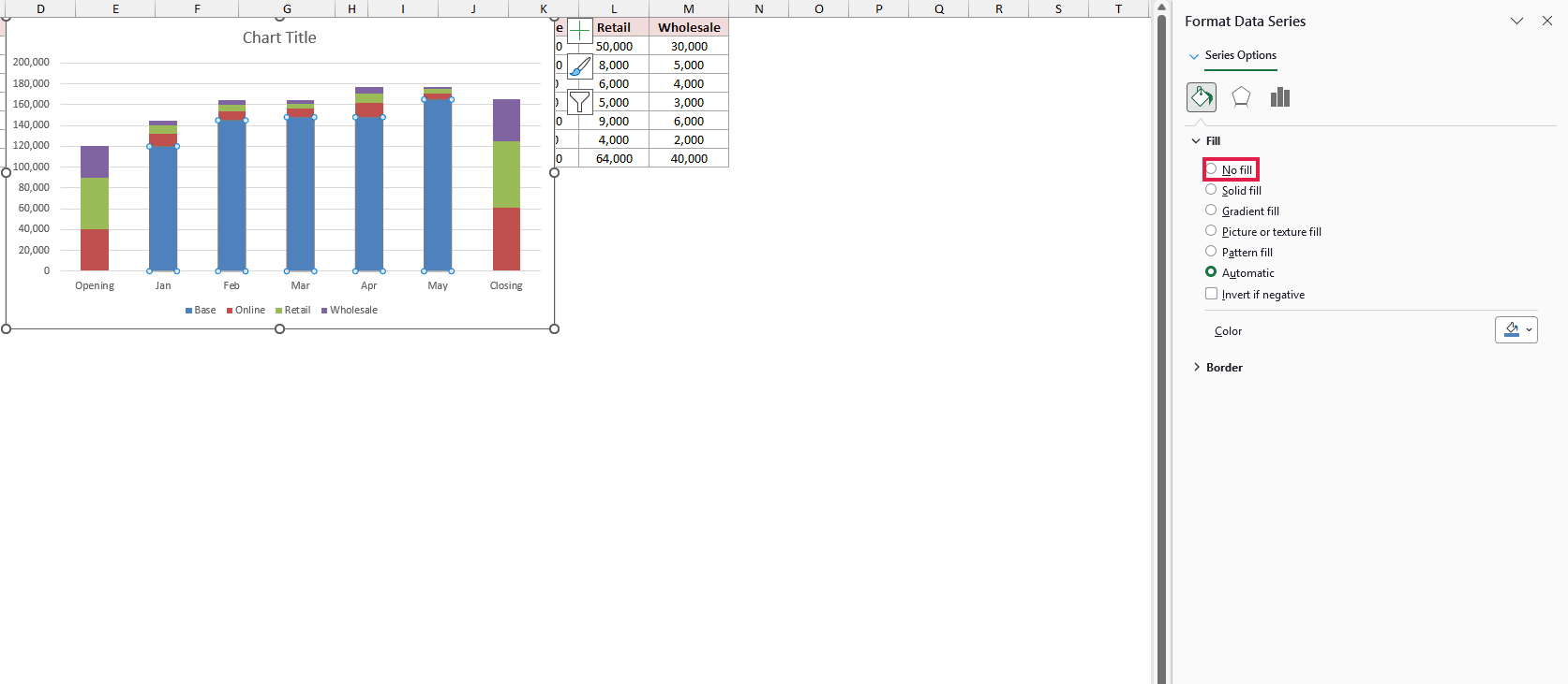
- In the Format Data Series pane, click the Fill & Line icon, expand Fill, and select No fill.
The Base series disappears, and the channel segments now float at the right height.
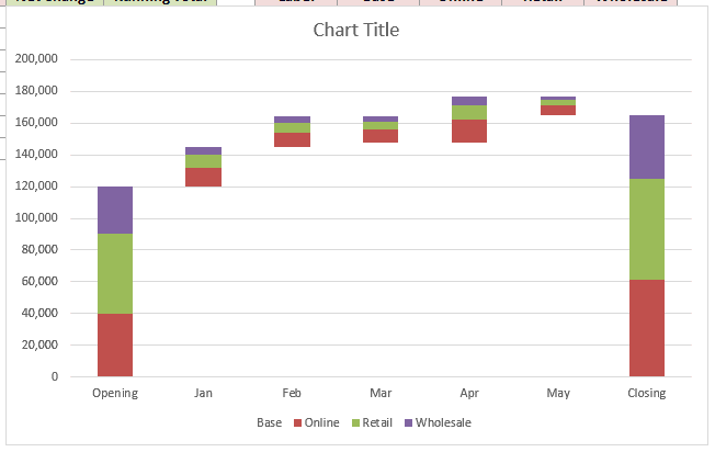
Opening and Closing still start from zero, while each month sits where the previous month ended.
Note: If you see a thin outline where the Base series used to be, expand Border in the same pane and select No line.
Step 5: Clean Up the Chart
The chart works now, but a few small changes make it easier to read.
Here are the steps to tidy it up:
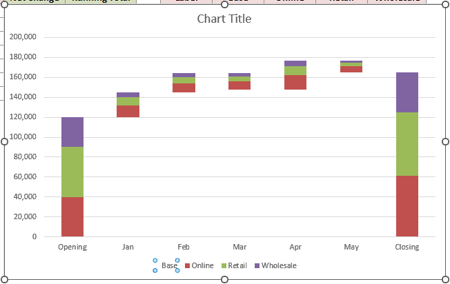
- Click the legend once, then click the Base entry in it and press the Delete key. This removes Base from the legend without deleting the series.
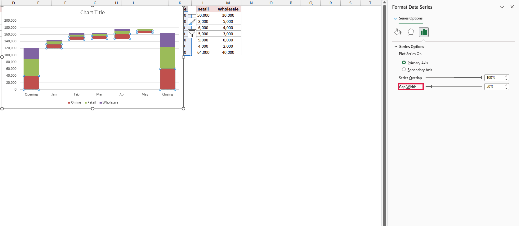
- Click any visible segment and press Ctrl + 1 to open the Format Data Series pane. Under Series Options, set Gap Width to 50%.
- Click the chart title and type a title of your own, such as Sales by Channel.
Here is the finished stacked waterfall chart:
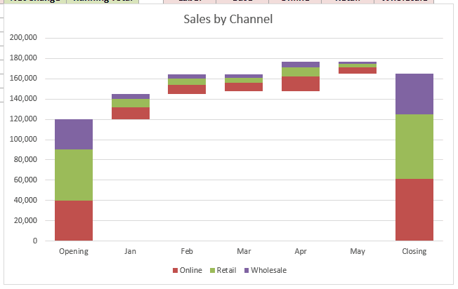
You can see total sales climb from 120,000 to 165,000. You can also see which channel drove each move, like Online adding 14,000 in April.
Since the chart runs on formulas, you can change any number in C2:E7 and the chart updates on its own.
Additional Notes About Creating a Stacked Waterfall Chart in Excel
- Keep the running total above zero. If the total drops below zero at any point, the Base values stop making sense and the columns land in the wrong place.
- Type “Total” exactly in the Type column. Both the Running Total and Base formulas check for that word, so a typo turns a total row into a change row.
- Add new months above the Closing row. Insert a row, fill in the Type and channel values, and copy the formulas down. Then check the chart range covers the new row.
- Decreases look the same color as increases. Each color stands for a channel, not a direction. The only thing that shows a drop is the column sitting lower than the one before it.
Frequently Asked Questions
Can I make a stacked waterfall chart with Excel’s built-in Waterfall chart?
No. The built-in Waterfall chart only accepts one series, so it can show the total change but not the split by channel.
Does this method work in older versions of Excel?
Yes. The stacked column chart and the SUM, IF, MIN, and ABS functions are all available in older versions, so this works even where the Waterfall chart doesn’t.
How do I add data labels to each segment?
Right-click a channel series and click Add Data Labels. Keep in mind the labels show the ABS values, so a decrease shows up as a positive number.
Can I use more than three series?
Yes. Add a column for each extra series in the data and in the helper table. Then widen the Net Change formula and the chart range to include it.
Conclusion
I built a stacked waterfall from a stacked column chart. The running total and hidden Base series let each channel’s change float at the right height.
I hope you found this article helpful.
Other Excel articles you may also like: