A trendline, also known as the ‘line of best fit‘ is an important visual tool in data analytics. It is a straight (or curved) line that helps us understand data in a chart.
You can add a trendline to almost any type of chart, but it is most often used with scatter charts, bubble charts, and column charts.
In this tutorial, we will discuss how to add a trendline to an Excel chart, how to format it, extend it, add an equation to it, as well as how to delete it.
What does a Trendline Indicate in a Chart?
The trendline is often used to make sense of data points in a chart.
It gives us an idea of the overall direction of a given variable, and is often used to understand the relationship between two variables or how data moves over time.
A trendline can also be extrapolated to help you make forecasts about unplotted data points.
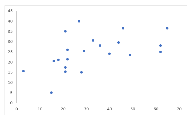
For example, when you look at the scatter chart shown below, it’s difficult to infer much just by looking at the data points.

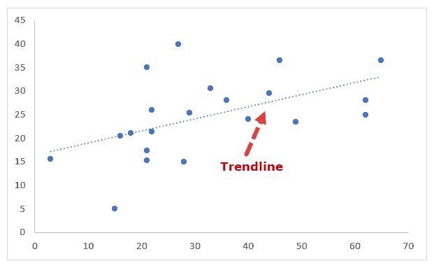
But when you add a trendline to the chart, as shown below, you can now see the direction in which the data is moving.
Moreover, you can also clearly see which data points are probably outliers, or at least completely different from the general trend.

How is a Trendline Different from a Line Chart
Although a trendline can often be mistaken for a line chart, the two are quite different.
In a line chart, the line is used to visually connect the data points, while a trendline is used to show the general trend in the data.

Line Chart
Trendline
You can add a trendline to a scatter chart, bubble chart, or other kinds of charts, while a line chart is a type of chart in itself.
How to add a Trendline in Excel Charts?
Adding a trendline to an Excel chart is really easy. For example, consider the following scatter chart:
To add a trendline to this chart, simply do the following:
- Click on the chart to select it.
- Click on the ‘+’ icon to the top-right of the chart.

- You should see a list of Chart elements with checkboxes next to them.

- Check the box next to ‘Trendline’.

You should now see a trendline added to your Excel scatter chart:

Looking at the above chart, the trendline shows that the two variables have a positive relationship since the trendline shows the movement of the points in the positive direction.
This means that as the value of x increases, the value of y increases too.
Note that the trendline is shown here as a simple dotted line by default. However, you can further customize this line according to your requirement.
We will see how to do that in the next section.
Also read: How to Add Secondary Axis in Excel Charts?
How to Format the Trendline
Excel provides a number of options to customize trendlines in charts.
- You can change the color, width, and style of your trendline
- You can set different types of caps on either end of the trendline (like arrows, squares, etc.)
- You can add different effects (like drop shadow, glow, etc.)
- You can change the type of trendline (eg: linear, polynomial, moving average, etc.)
- You can add additional information on your trendline (like an equation, R2 value, etc.)
Let us first see how to format general settings for the trendline:
- Click on the chart to select it.
- Click on the ‘+’ icon.
- Hover over the ‘Trendline’ option.
- You should see a dropdown arrow next to this option. Click on this arrow.

- You should now see a list of options to format/customize your trendline.

- If the formatting option you need is in this list, you can go ahead and select it. If not, then click on ‘More Options’.

- You should now see the Format Trendline sidebar to the right of the Excel window.

- There should be three tabs in the sidebar – Fill & Line, Effects, Trendline Options.
- Select the Fill & Line option to set the color, width, and style of your trendline. Click on the ‘Line’ section in this tab to show all the line formatting options. Let’s change the color to ‘Orange Accent 2’, the Dash type to ‘Solid’, and the width of the line to 2.75pt. This tab also lets you set caps on your trendline’s ends, for example, if you want the line to end with an arrow or if you want the ends rounded, etc. Let’s change the Cap type to ‘round’ and the End arrow type to ‘Open Arrow’.

- Select the Effects option to add a drop shadow, or glow or soft edge effect to your line. For our example, let’s avoid adding any effects and leave the trendline plain.

- Select the Trendline Option if you want to change the type of trendline. We will discuss this in more detail in the next few sections.

Different Kinds of Trendlines
Excel lets you add different types of trendlines to your chart using the ‘Trendline Options’ tab of the Format Trendline sidebar.
Some of the trendline type options include:
- Exponential
- Linear
- Logarithmic
- Polynomial
- Power
- Moving Average

Usually, the type of trendline you use depends on the type of data you’re representing.
The linear trendline best represents simple linear data, one that shows values increasing or decreasing at a steady rate.
An exponential trendline is a curved line that represents data that increases or decreases at higher rates. This trendline does not work with data that has 0 or negative values.
The logarithmic trendline is a curved line that best represents data that changes (increases or decreases) at a high rate initially and then levels out.
The polynomial trendline is also a curved line that usually represents data that fluctuates. The order of the polynomial represents the number of fluctuations in the data trend.
So, an order 2 polynomial usually shows a single fluctuation (hill or valley), while an order 3 polynomial shows two fluctuations, and so on.
The power trendline is a curved line that represents data that increases or decreases a constant rate. A power trendline does not work on data that has 0 or negative values.
A moving average trendline is usually used to smooth out fluctuations in the data so that you can see the trends in the data more clearly.
You can set the number of data points that you want to smooth out (or average) using the ‘period’ option.
So a period value of 2 means you want the data averaged in pairs (1st and 2nd, 3rd and 4th, etc.).
To change your trendline to any of the above types, follow the steps below:
- Click on the chart.
- Click on the ‘+’ icon to the top-right of the chart.
- Hover over the ‘Trendline’ option and click on the dropdown arrow that appears next to it.
- From the Format Trendline sidebar, select the Trendline Options tab.
- Click on the radio button next to your required type of trendline.
- If using a Polynomial trendline, enter the order of the polynomial in the input box to the right. Similarly, if using a moving average trendline, enter the period value in the input box to the right.

Note: If you’re using a moving average trendline, make sure you sort your data by the independent variable.
How to Display the Trendline Equation in a Chart
The trendline is usually based on an underlying equation that mathematically best fits the data points.
Excel uses the least-squares method to compute this equation, and each of the trendline types discussed in the above section has a different equation.
If you want to display the equation of the trendline on your chart, simply click on the checkbox next to ‘Display Equation on Chart’ in the Format Trendline sidebar (under the Trendline Options tab).


Similarly, if you want to display the R-squared value of the line, then check the box next to ‘Display R-squared value on the chart’.
The R2 value (also known as the Coefficient of Determination) indicates how well the trendline fits the data. The closer it is to 1, the better the line fits the data.

Also read: How to Interpolate in Excel
How to Extend a Trendline in Excel Charts
Trendlines don’t just help you understand the available data, they also help you get forecasts for data that is not explicitly available in the dataset.
You can predict unknown values by projecting the data trends into the past or future. This is essentially achieved by extending the trendline backward or forward.
The Forecast section of the Format Trendline sidebar (in the trendline options tab) lets you specify how many periods (of the independent variable) you want to forecast (forward and backward).
For example, in the following chart, we have specified that we want to forecast trends for the next 10 periods:

Here’s the extended part of the trendline:

How to Delete a Trendline from an Excel Chart
Finally, if you want to delete a trendline from your chart, the process is really easy. Follow the steps below:
- Right-click on the trendline of your chart.
- Select the Delete option from the context menu that appears.

Alternatively, you can click on the ‘+’ icon (Chart Elements) and uncheck the box next to the Trendline option from the list that appears.

This tutorial was all about trendlines. We explained what trendlines are, how they work, how to add them to an Excel chart, and how to format them as needed.
We hope you found this tutorial useful and easy to follow.
Other Excel tutorials you may also like:
- How to Create Win/Loss Sparklines Chart in Excel?
- How to Add Gridlines in a Chart in Excel?
- How to Add Axis Titles in Excel?
- 10 Best Excel Books (that will make you an Excel Pro)
- How to Insert Chart Title in Excel?
- How to Create Bar of Pie Chart in Excel?
- How to Add Border to a Chart in Excel
- How to Create Dynamic Chart Titles in Excel