An Org chart is a great way to visualize hierarchy or the flow of information/command in an organization.
You will find Org charts available through the SmartArt feature in most Microsoft applications (eg: in Word, Excel, and PowerPoint).
In this tutorial, we will show you how to create an Org chart from scratch or from a list in MS Excel.
We will also show you how to edit either parts of the chart or the entire layout, as well as how to format the chart to make it visually appealing.
What is an Org Chart (Organization Chart)?
An Org Chart or Organization Chart is a diagram that helps us visualize relationships between individuals or groups of employees (or their titles).
Using an Org chart, we can clearly see the organizational hierarchy, including things like:
- How does information flow from one person to another?
- How does command flow in the organization?
- Who is in charge of which individuals or groups?
- Who reports to whom in the organization?
The hierarchy in the Org chart is represented using a row of boxes (also known as ‘Nodes’), with each level of hierarchy represented one on top of the other, making it look similar to a pyramid structure.
Lines are drawn in the org chart between hierarchy levels or between individual hierarchy boxes/nodes to represent relationships between them.
What is an Org Chart Used For?
Org charts can be used to represent any sort of hierarchical structure, be it that of a large organization or a simple family tree.
Besides the basic purpose of visualizing the reporting structure in the organization, an Org chart can also have a number of other applications.
For example, it can be used to track the workload of employees, so you can clearly see who has too much to do and who doesn’t.
This can be useful in planning your work structure and distributing the workload more proportionately.
It is also helpful in the onboarding of new employees, so they can clearly see how different departments in the organization are structured, and what their (and other employees’) functions are as part of this structure.
Also read: How to Make Box Plot (Box and Whisker Chart) in Excel?
How to Create an Org Chart in Excel?
The SmartArt feature in Excel lets you create different types of diagrams quickly and easily.
It offers a wide range of layouts like pyramids, cycles, block-lists, and more.
You can use these layouts to depict processes, a chain of events, hierarchy, relationships, interactions, dependencies, and a whole lot of other phenomena.
There are around 15 hierarchy layouts offered by SmartArt, the most basic and widely used ones of which are the Organization charts.
Let us see how to create an Organization chart in Excel using the SmartArt feature.
Creating an Org Chart in Excel from Scratch
Let us say you want to create the following Org chart in Excel from scratch:

We used a simple hierarchy so that we can help you understand the steps easily. In the next section, we will look at a more complex hierarchy.
To create this simple Org chart, follow the steps outlined below:
- From the Insert tab, click on the SmartArt button (under the Illustrations group).

- This will open a window that lets you select a SmartArt graphic.

- Since we want to create an Org chart, click on the Hierarchy category from the list on the left of the window.
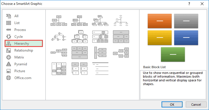
- Select the Organization Chart icon from the list of layouts on the right side of the window.

- Click OK.
This will create a rudimentary Org chart for you that you can now edit.

To enter a text or title in a block, simply click inside the block.
When you see a text cursor blinking inside it, you can go ahead and type in the title. We want the top-most node to contain the title ‘COO’, so let us type it in, as shown below:

To remove a node from the chart, simply click on the chart that you want to remove in order to select it.
Then press the Delete key from your keyboard.
We don’t want the little assistant node just below the ‘COO’, so let us remove it from our chart. Once you do this, the chart should look like this:

Notice that deleting the node got rid of one level in the hierarchy too, so that you now have 3 nodes directly under the COO.
Next, let us enter the titles for the 3 nodes that are already present in the second level:

We also want to add a fourth node (for the ‘Tech/ IT’ title).
To add a node to a given hierarchy level, we can click on the node after which we want to create the new one. So let us click to select the ‘Sales’ node.

Then, from the Design tab (under SmartArt Tools), click on the dropdown arrow next to Add Shape, as shown below:

From the dropdown menu that appears, select ‘Add Shape After’.

This will create a new node next to the ‘Sales’ node. Simply fill in the title ‘Tech/IT’ for this new node.

Finally, we want to add the ‘Sales Team’ node in the next level under the ‘Sales’ node.
To add a new hierarchy level to an existing node, simply select the node and click on the ‘Add Shape’ button (from the Design tab).

Alternatively, you could select ‘Add Assistant’ from the ‘Add Shape’ dropdown list.

Once the new node appears under your selected node, simply add the text for it. Here’s how our final org chart looks:

Once you’re done creating the chart, you can change the size of the entire chart or individual blocks of the chart manually.
You can also move the chart around by dragging its edges. Moreover, you can go ahead and format your chart too at this point.
We will discuss how to format an Org chart in a separate section of this tutorial.
Creating an Org Chart in Excel from a List
If you have a more complex Org chart to create, it would be more practical to create it from a list and then use the Org chart’s Text Pane to edit it.
As an example, let us try to recreate the Org chart shown below in Excel:
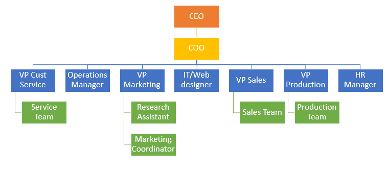
Let us first create a list of all the titles of the org chart in separate cells as shown below:

In the above list, we made sure that we added the titles hierarchically. So, each title has the titles that report to it listed under it.
For example, the ‘VP Marketing’ has the ‘Research Assistant’ and ‘Marketing Coordinator’ report to him, so we added these two right below the VP of Marketing in our list.

Once your list is ready, create the Org chart, by navigating to Insert->SmartArt->Hierarchy->Organization Chart.
You should see the Text Pane next to the Org chart, as shown below:

If you cannot see the Text Pane, click on the little arrow that is placed on the left edge of the Org Chart:

Alternatively, you can click on the Text Pane button in the Design tab to toggle between displaying and hiding the Text Pane.

Select the default bullets displayed in the Text Pane and remove them by pressing the Backspace key on your keyboard.

Notice that by doing this, all the nodes get removed from the chart, and you are left with just a single bullet point in your Text Pane (and just one really large node in your Org Chart).
Now copy the list of titles that you had created, select the first bullet point in the Text Pane, and paste the copied list by pressing the keyboard shortcut CTRL+V.

You should now see all the titles of your list displayed as separate nodes in a single hierarchy level of your Org Chart.
Now there are two ways to make this single-level chart look like our desired Org Chart (with multiple levels).
Method 1:
Select each node and demote them by navigating to Design->Demote, as shown in the image below:

Keep demoting each node till it reaches the level that you require (till they are just below their respective manager).
For example, select the COO node and demote it once.

Then select the VP Cust Service node and demote it twice.

After that, select the Service Team node and demote it three times (till it is just below the VP Cust Service node).

In this way, keep selecting one node at a time and demoting them till all the nodes are just where you need them to be.

Method 2:
In the Text Pane, indent a title to bring it to the next hierarchical level.
This means since the COO is one level lower than the CEO, click on the COO’s bullet point and press the tab once to indent it by one tab space.

The VP Cust Service is one level under the COO, so click on its bullet point and press the tab twice to indent it by two tab spaces (or one tab space more than COO).

Similarly, the Sales team should be one level below the VP Sales, so press the tab key until it is indented by one tab space more than VP Sales.

Keep indenting one title at a time till your Org chart is organized the way you need it to be.
To create our sample Org chart, your Text Pane’s bullets should be organized as follows:

Here’s how the Org chart looks at this point:

Once you’re done building the Org Chart, you can go ahead and hide the Text Pane by toggling the Text Pane button.
Formatting the Org Chart
Once your Org chart’s basic structure is ready, you can go ahead and format it any way you like. For example, you can change the font size, color, or style.
You can also change the background color of the blocks, change the shape or individual (or all) blocks, rotate the shape, change the outline color, add text effects, and basically perform any kind of formatting that you would usually do with a regular Excel graphic.
You can also use some of the preset styles offered under the SmartArt Styles group to quickly style your whole Org chart.
For example, you can give it a 3D effect or a lightly shaded effect, a metallic effect, a brick effect, etc.

SmartArt offers an added feature that lets you change the colors of your Org chart based on hierarchy.
Using this feature helps viewers easily distinguish between blocks from each level of the hierarchy.
For example, in the image below, all level 1 blocks are orange in color, all level 2 blocks are yellow in color, and so on:

To get this effect, simply select your chart. Then, from the Design tab, select the Colors dropdown (under the SmartArt Styles group).
Select one of the color palettes under the ‘Colorful’ category. For our sample Org chart, we used the palette marked in the screenshot below:

Promoting / Demoting Nodes
After your Org chart is ready, you can always come back and edit it as needed.
Consider a situation where an employee of the company (say the Marketing Coordinator) gets promoted, and now reports directly to the COO.
To promote a node, simply select the node and navigate to Design->Promote.

Here’s how the chart looks after prompting the Marketing Coordinator:

Similarly, to demote a node, you need to select the node and navigate to Design->Demote.
Changing the Order of Nodes
You can also change the order of nodes that are on the same hierarchy level.
For example, if you want to move a single node, simply click on the node and navigate to Design->Move Up or Design->Move Down until you’ve placed it exactly at the right position.
For example, say we want the VP Marketing to be placed right after VP Sales. In that case, simply move the VP Marketing node up three times.

If you want to change the orientation of the level, i.e. reverse the direction from Left->Right to Right->Left, then navigate to Design->Right to Left.
For example, if we select this button at this point, here is how our chart is going to look:

Changing Layout of the Org Chart
Excel lets you choose from a number of different layouts for your Org chart.
You get to choose your layout when you create your diagram from the ‘Choose a SmartArt Graphic’ window.

However, if you do decide that you want a different layout for your Org chart after you’re already done creating it, you can easily do so.
All you need to do is select your Org chart, click on the Design tab and select the diagram of your choice from the ‘Layouts’ group.

For example, we can change our basic Org Chart to a Half Circle Org chart by selecting its icon from the list of Layouts:

This will simply use the data and hierarchy of the already present Org chart and convert it to our selected layout:

You can even convert it to a picture hierarchy by selecting the ‘Picture Organization Chart’ or ‘Circle Picture Hierarchy’ layout and adding images for each node.

Picture Org charts are not only fun to look at, but can be quite visually effective.
Moreover, they can help quickly convey to your audience the faces behind each of the organization’s titles.

An Org chart can be really effective in displaying the management structure or hierarchy in an organization.
They also help demonstrate clear reporting structures for all employees in a company or members of a team.
In this tutorial, we showed you how to create, format, and edit Org charts in Excel.
We hope you found it interesting and useful.
Other articles you may also like:
- How to Create Bar of Pie Chart in Excel?
- How to Create Bubble Chart in Excel
- How to Move a Chart to a New Sheet in Excel
- How to Create a Waterfall Chart in Excel?
- How to Create Win/Loss Sparklines Chart in Excel?
- Save Excel Chart as Image (High Resolution)
- How to Create Sankey Diagram in Excel
- Insert an Image in a Cell in Excel