Charts are always a great tool to visualize data.
However, sometimes instead of a full-blown chart, you might prefer smaller charts that are more dedicated to a smaller subset of data.
One example of these miniature charts is a Sparkline.
In this tutorial we discuss Win/Loss Sparkline charts in detail, going over what they do, as well as how to create them and customize them.
We will also discuss how you can create these charts when your data is in text form.
What is a Win/Loss Sparkline Chart?
Sparklines are little charts that fit inside a single cell of your Excel worksheet. These charts show trends and patterns in your data over a given time period.
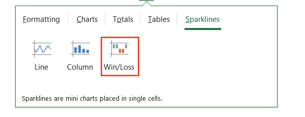
A win/loss sparkline displays positive and negative variations in the data in different colors.
A typical win/loss chart uses dashed lines to represent data. It displays positive numbers (or ‘wins’) in one color, and negative numbers (or ‘losses’) in a different color.
In this way it helps you get a quick overview of your data, drawing attention to important changes. These insights can then be used to make decisions about the next course of action.
Note: The width and height of the dashes (or sparkline points) are proportional to the width and height of the cell they are in.
Following is a chart displaying the differences in scores of 3 students over three terms, in comparison to the average score for those three terms.
The sparkline charts representing the students’ performances are shown in column E.
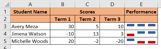
We see all the positive numbers displayed in blue, and the negative numbers displayed in red.
In other words, a student did better than average in a term if the sparkline point corresponding to the term is blue, and he/she performed lower than average in a term if the sparkline point corresponding to the term is red.
In just one glance, you can point out which numbers are negative, so that you now know which cases you need to focus on, and which cases need more positive reinforcement.
The best thing about these Sparkline charts is that they are super easy to make in Excel. Moreover, they are simple and really easy to interpret.
Also read: How to Create Bubble Chart in Excel
How to Create a Win/Loss Sparkline Chart in Excel?
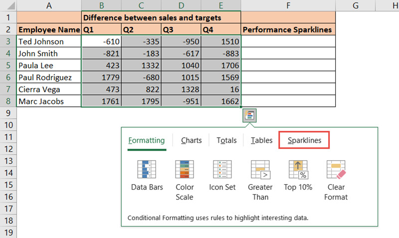
Consider the following dataset:
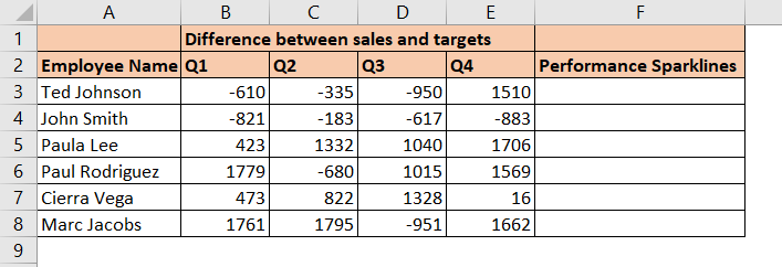
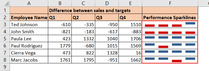
The above data shows employee performances over four quarters, in comparison to their targets.
Let us create a simple win/loss sparkline chart for each employee in Excel. Here are the steps:
- Select your data (cells B3:E8).
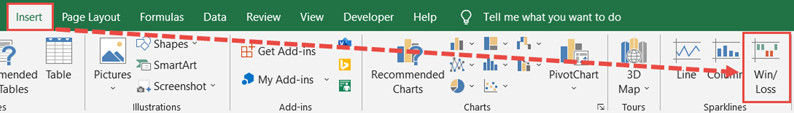
- Click on the Insert tab.
- Under the Sparklines group, click on Win/Loss.
- This opens the Create Sparklines dialog box.
- Make sure the correct data range for your chart is selected in the box next to “Data Range”.
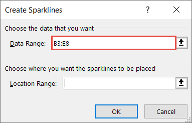
- Click on the box next to “Location Range” and select the cells where you want the sparkline for your data displayed (F3:F8 in our case).
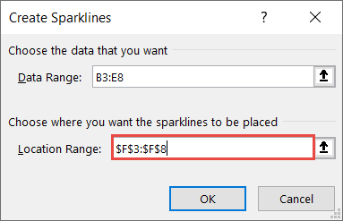
- Click OK.
You should see the win/loss sparkline for your selected data displayed in the location range that you specified (F3:F8).
Also read: How to Create Org Chart in Excel?
Using the Quick Analysis Tool to Quickly Create a Win/Loss Sparkline Chart
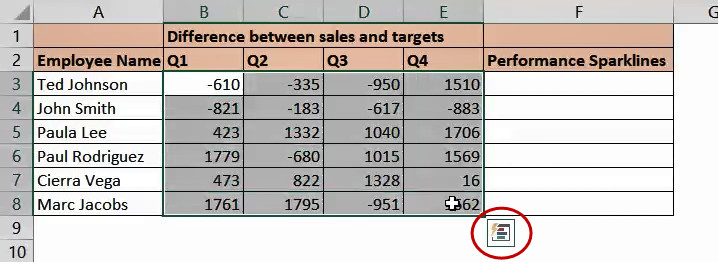
An alternate (and quicker) way to create a sparkline chart is by using the Quick Analysis Tool. This tool appears when you select the data and press CTRL+Q or click on the little Quick Analysis Tool icon, shown in the image below:
The Quick Analysis Tool helps you quickly analyze your data using some useful Excel tools like charts, color coding, and formulas. The tool appears as a floating menu near your selected data and shows you quick visualizations and analytics of your selected data as you roll your mouse over each option.
Here are the steps if you want to use this tool to quickly create your win/loss sparkline:
- Select your data.
- Click on the Quick Analysis tool that appears or press CTRL+Q.
- This displays a small floating menu with the different Quick Analysis tool options.
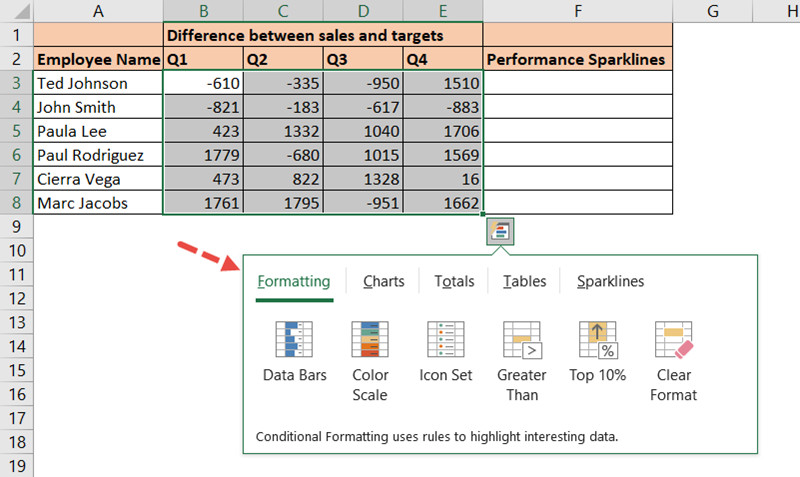
- Click on the Sparklines tab from this menu.
- Click on Win/Loss.
You should see your win/loss sparkline displayed in the column next to your selected data (column F in our case).

Customizing the Sparkline Charts
Once your win/loss charts are created, you might want to customize them to your own requirement. Here are some customizations that you can apply:
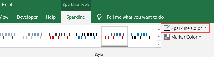
Changing the Sparkline Colors
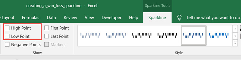
By default, the sparklines use blue for positive points and red for negative. However, you might want a different color combination.
Interestingly, the Sparkline Color menu in Excel only lets you change the color for the positive points. To change the negative points, you need to use the Marker Color menu.
So, to change the color of your sparkline points, here are the steps:
- Click on the cell(s) containing your sparkline chart (s).
- You should see a Sparkline Tools tab appear in your main menu. Click on this tab.
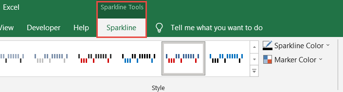
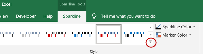
- Under the Style group, you should see some default style options for your sparklines. You can click on the ‘More’ button to see more default color options and select the styling that you like, and you’re done.
- If you would rather like to select your own color combination, then do the following:
- To change the color of the positive sparkline points, click on the Sparkline Color dropdown and select your required color.
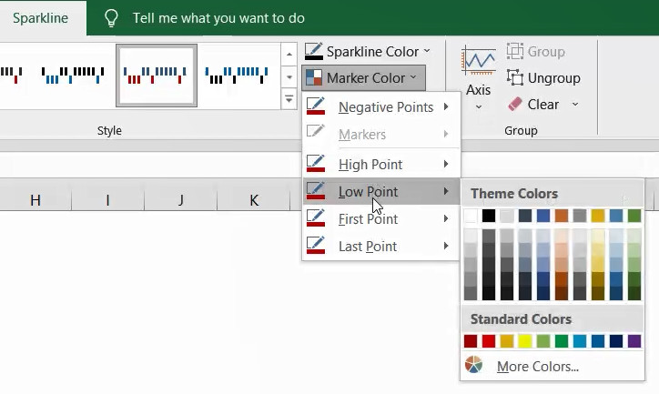
- To change the color of the negative sparkline points, click on the Marker Color dropdown, hover over the Negative Points option and select your required color.
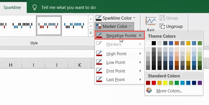
- To display the low point and/or high point of each sparkline in a different color, click on the Low Point and/or High Point dropdowns that are under the Marker Color dropdown and select your required color(s).
- If you prefer not to show the negative and positive points in different colors, you can uncheck the box next to ‘Negative Points’ under the Show group.
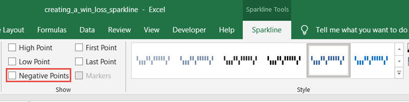
- Similarly, if you don’t want to highlight the low point and/or high point, then simply uncheck the box next to your required option.
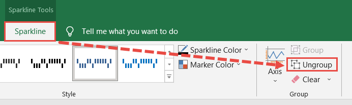
Note: By default, once you’ve created your sparklines, Excel groups them together. So whatever styling you apply, they get applied to all the charts in the group. If you want to style or work with individual sparklines, then you need to ungroup them by clicking on the Ungroup button under the Sparkline tab.
How to Remove a Sparkline Chart
If you want to remove the sparkline charts, simply select the chart and click on the Sparkline tab. Then click on Clear (under Group).
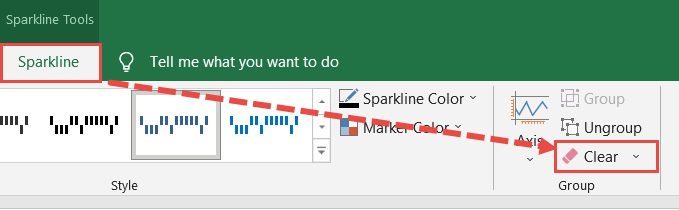
If your sparklines are grouped together, this is going to clear all your sparklines. If you want to remove individual sparklines, you will need to ungroup them before clearing.
Creating a Win/Loss Sparkline when you have Data in Text Form
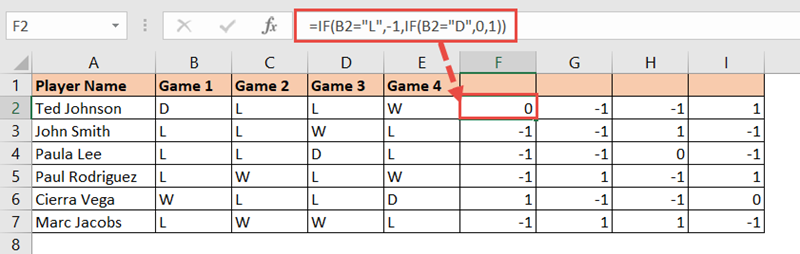
Finally, let’s look at a special case where you have data in the form of text. Take for example the data shown below:
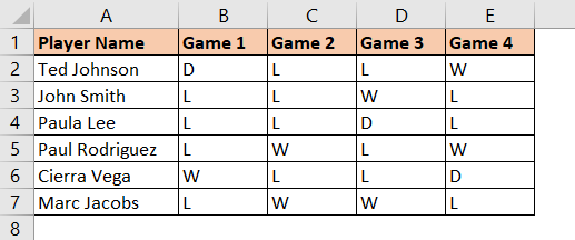
The above data displays the win/loss status of a sports team. The W here stands for a Win, while the L stands for a Loss.
The D is for when there was a Draw. You can use a Win/Loss Sparkline in this case, if you want to create a league table for the sports team.
The only problem is that the Excel Win/Loss sparkline does not directly work with text data. The solution here is to represent the text with numbers that the sparkline chart understands.
There are just three cases here (Win, Loss, Draw). So, we can represent a Win with a -1, a Loss with a 1, and a Draw with a 0. To do this we can use a nested IF formula, as follows:
=IF(B2="L",-1,IF(B2="D",0,1))
Enter this formula in cell F2 and copy it down to the rest of the cells in the column. Then copy these cells right to the next 3 columns. The result will be a set of -1s, 0s and 1s, as shown below:
Now you have something that the sparkline template can crunch. All that’s left to do is create a sparkline based on the range F2:I7. This will give you the league table based on your original game data.
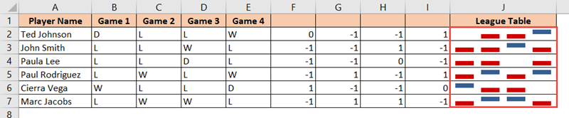
You can also go ahead and change the sparkline colors to green for positive and red for negative, as is used in most league tables.
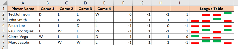
That’s it! Our league table is now ready.
In this tutorial, we showed you how to create a win/loss sparkline in Excel, along with how to style and customize it.
We also showed you how to work with data that is in text form, since the chart only works with numerical data.
We hope this was helpful.
Other articles you may also like: