To make the data in a chart/graph easier to read, it helps to add horizontal and/or vertical gridlines.
Gridlines are lines that go horizontally and vertically across your chart plot to show divisions in the chart axes (below is a chart that shows horizontal gridlines).
These gridlines usually align with points on the chart’s axes, so it is easier to trace the value corresponding to a point on the graph.
They are especially helpful when you have large and complicated charts, or when data points on the chart are unlabeled.
Excel lets you display three kinds of gridlines:
- Horizontal gridlines
- Vertical gridlines
- Depth gridlines (for 3-D charts)
Gridlines can also be displayed for both major and minor units.
Those that align with major tick marks on the axes are called major gridlines. Minor gridlines separate the units defined by the major gridlines and as such let you mark the finer details in your chart.
In this tutorial we will show you how to add major and minor gridlines to your chart and how to format them:
- Using the Chart Elements button
- Using the Chart Tools menu
We will also show you how you can hide or remove gridlines from your chart if you need to.
Two Ways to Add and Format Gridlines in Excel
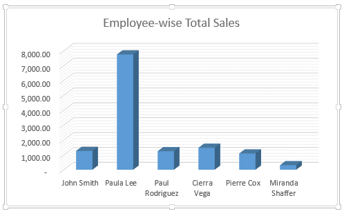
Let’s say you have the following chart:

Notice that without gridlines it’s hard to tell what value each of the bars corresponds to.
So we need to insert some gridlines into the chart to make it easier to read the values the bars represent.
Of course, you have the option to add data labels as well, but in many cases, having too many data labels can make the chart look cluttered. So having gridlines can be useful in such cases
Let us now see two ways to insert major and minor gridlines in Excel.
Method 1: Using the Chart Elements Button to Add and Format Gridlines
The Chart Elements button appears to the right of your chart when it is selected.
This button allows you to add, change or remove chart elements like the title, legend, gridlines, and labels.
Here’s what the button looks like:

Adding the Gridlines
To add the gridlines, here are the steps that you need to follow:
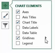
- Click anywhere on the chart
- Click on the Chart Elements button (the one with ‘+’ icon).
- A checklist of chart elements should appear now. Make sure that the checkbox next to ‘Gridlines’ is checked.
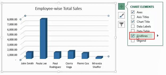
- This will display the major gridlines on your chart.
- When you hover over the Gridlines checkbox, you will notice a small arrow to its right, as shown below.
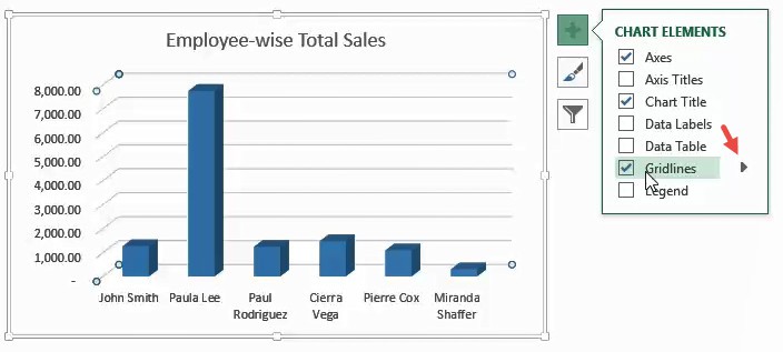
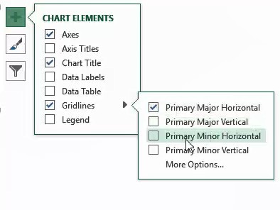
- Click on this arrow to see additional options for the gridlines. These include:
- Primary Major Horizontal – select this if you want to display major horizontal gridlines
- Primary Major Vertical – select this if you want to display major vertical gridlines
- Primary Minor Horizontal – select this if you want to display minor horizontal gridlines
- Primary Minor Vertical – select this if you want to display minor vertical gridlines
- More Options – select this option if you want to format the gridlines.
Select checkboxes next to the gridlines that you want to display on your chart.
Formatting the Gridlines
Select ‘More Options’ if you want to format the gridlines.

This will open a sidebar to the right of the Excel window that lets you format your chart elements. Format your selected gridlines as you see fit.
Once you’re done, you can close the sidebar.
Editing the Gridlines
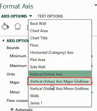
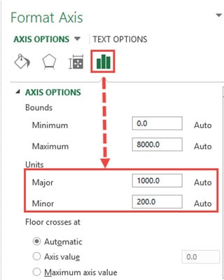
The next time you need to edit the gridlines, double-click on the axis corresponding to the gridlines that you want to change.
For example, if you want to change the horizontal gridlines, double-clock on the x-axis.
In other words, select the axis that is perpendicular to the gridlines that you want to change.

This will open the Format Axis sidebar to the right of the Excel window.

Select the dropdown arrow next to ‘Axis Options’. Select the gridlines option that you want to change. For example, if you want to change the format for the major horizontal gridlines, select the ‘Vertical (Value) Axis Major Gridlines’ option.
Here, you’ll find two tabs:
- Fill & Line : This tab lets you set the outline and fill color/pattern of the selected gridlines.
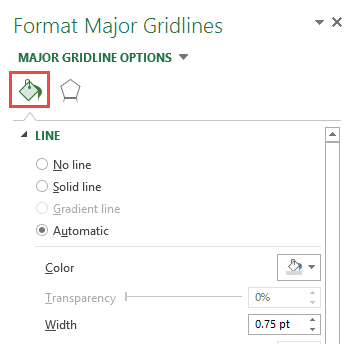
- Effects: This tab lets you set effects like Shadow, Glow and Soft Edges to the selected gridlines.

Use the tabs to change your gridline formats to whatever you need.
Note: If you want to see or change the number of gridlines displayed on your chart, you can take a look at the Major and Minor input boxes (under the Units category of the Axis Options tab). Try increasing or decreasing these numbers to change the number of gridlines displayed.
Also read: How to Add Axis Titles in Excel?
Method 2: Using the Chart Tools Menu to Insert and Format Gridlines
The Chart Tools ribbon can be seen in the main menu when you click on your chart. This menu consists of two tabs – Design and Format.
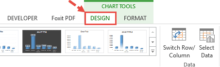
So, a second way to add and format gridlines is to use the Design tab from the Chart Tools. Here’s how:
- Click on your chart.
- You should see the Chart Tools menu appear in the main menu.
- Select the Design tab from the Chart Tools menu.
- Click on ‘Add Chart Element’ (under the ‘Chart Layouts’ group).

- A dropdown menu should appear, with different chart element options.
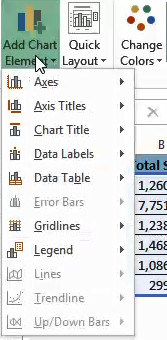
- Hover over ‘Gridlines’.

- A submenu consisting of different options relating to gridlines should appear. Select the type of gridlines that you want to add. You can add more than one type of gridlines in your chart.

- The gridlines should now appear on your chart.
Note: Notice the vertical axis is categorical and basically has no minor divisions. So even though there is an option to display minor vertical gridlines, they will not show on this chart when selected. Minor divisions don’t make sense for category axes.
Removing Gridlines in Excel
To remove gridlines, follow the steps demonstrated below:
- Click anywhere on the chart.
- Click on the Chart Elements button.

- If you want to remove all the gridlines, then uncheck the box next to ‘Gridlines’.

- If you want to remove a specific set of gridlines, then hover over the Gridlines checkbox.
- Click on the small arrow to its right.
- Uncheck the box next to the gridlines that you want to remove/ hide.
Here’s what the chart would look like with the only minor horizontal gridlines removed:

Another quick way to remove gridlines (or any element in an Excel chart) is to select them and hit the delete button. In the case of gridlines, you will see that all the gridlines have been selected (and hitting the Delete button will only delete the ones that were selected.
In this tutorial, we showed you two ways to add and format gridlines in Excel.
We also showed you how to quickly remove the specific gridlines and what to do if you want to edit the formatting of gridlines s(like color, style, etc.)
We hope this tutorial was useful for you and easy to follow.
Other Excel charting tutorials you may also find useful:
- How to Insert Chart Title in Excel?
- How to Create Bar of Pie Chart in Excel?
- How to Move a Chart to a New Sheet in Excel
- How to Print Gridlines in Excel (3 Easy Ways)
- How to Make Box Plot (Box and Whisker Chart) in Excel?
- How to Add a Trendline in Excel Charts?
- How to Remove Gridlines in Excel (Shortcut + VBA)
- How to Add Border to a Chart in Excel
- How to Add Secondary Axis in Excel Charts?